TL;DR
#Augmented Reality #3DScanning #Prototype
#Service Design
We sought to help people responsibly declutter their homes—without the need for a storage unit (or adding to the landfill). Rentable is a person-to-person furniture rental service connecting furniture owners to individuals in need of a temporary furniture solution.
Role
UX Design, Prototyping, Video Shooting & Editing
Tools
Figma, Premiere Pro, Photoshop, Blender, After Effects, Keynote
Team
Madison Stemmler, Eric Yu, Heejun Park
Timeline
6 months
Have a minute? Check out the prototype & concept video below ↓
The secondhand furniture market is as cluttered as our homes.
I mean, really cluttered. The average American home has 300,000 items in it. We have more stuff than any other generation in history, which means responsibly decluttering has never been more difficult.
If your're getting rid of furniture, it's likely ending up in one of two places: 1. The Landfill or 2. Facebook Marketplace.
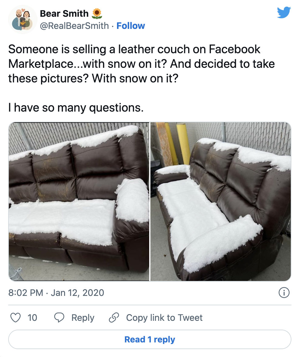
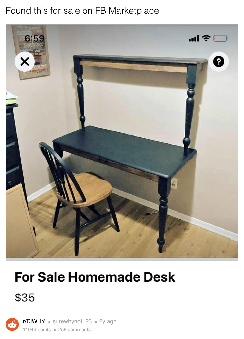
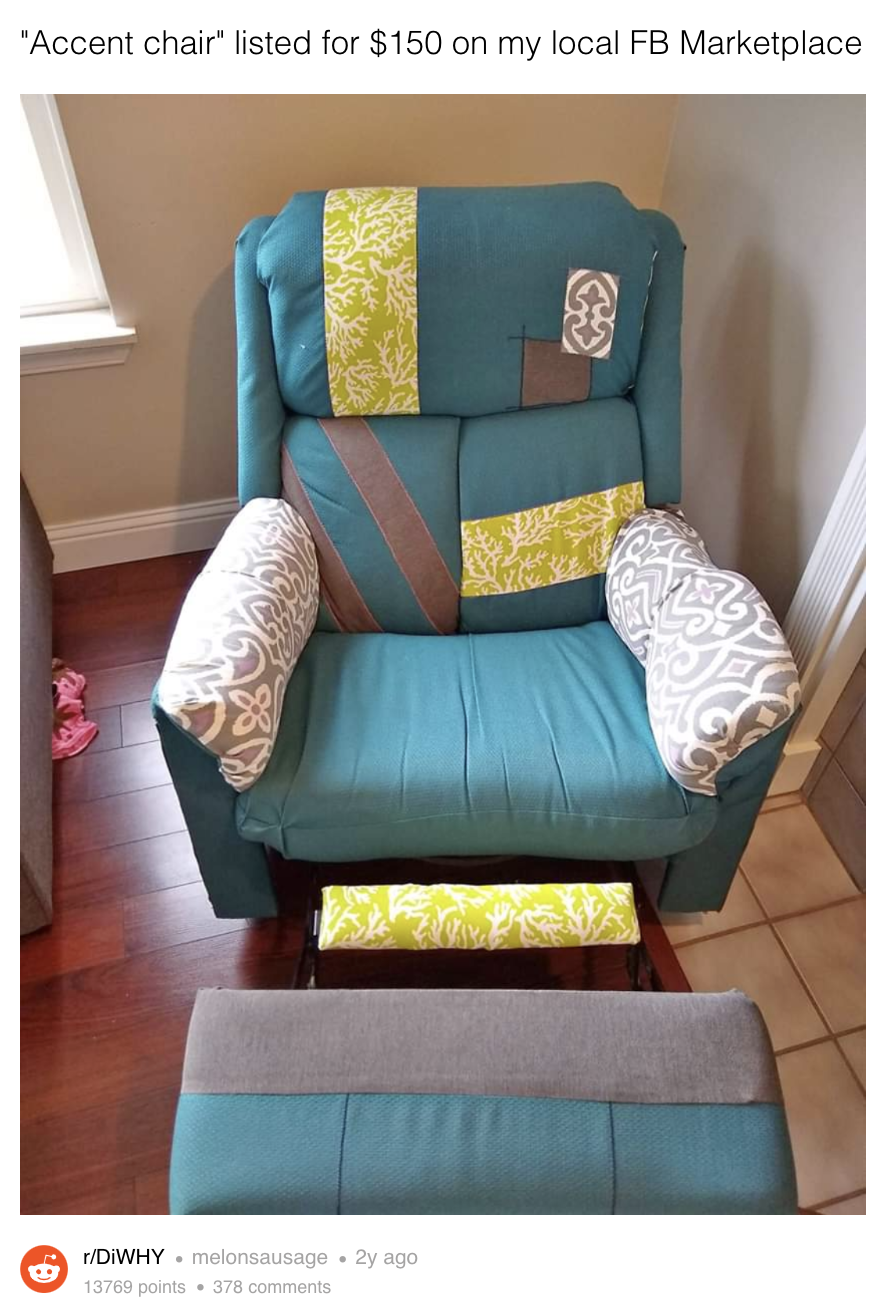
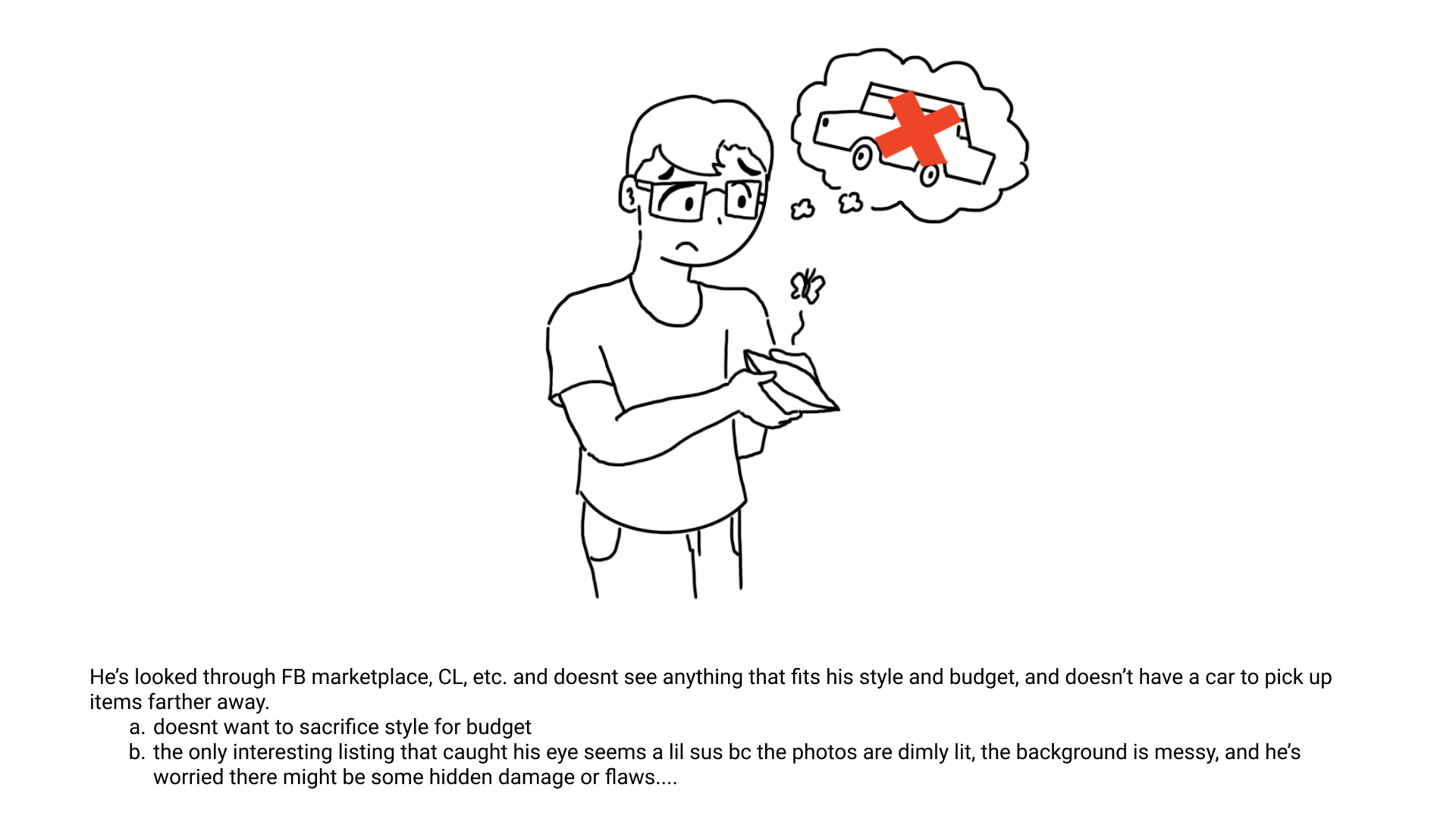
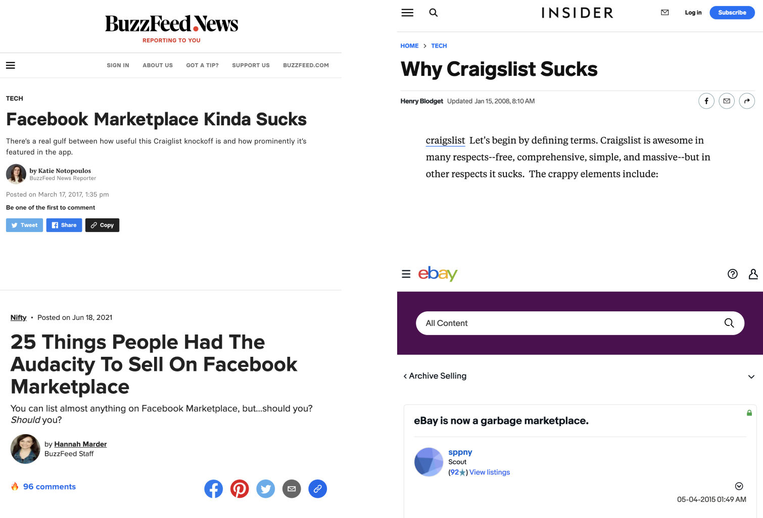
For secondhand furniture buyers, this means having to sort through thousands of furniture listings that, well, leave something to be desired →
You could spring for a storage unit, but...
They're expensive! The average cost of a storage unit in Seattle, for example, is $185 a month.
Source: https://www.buzzfeed.com/ajanibazile/funny-facebook-marketplace-posts
Our Design Solution
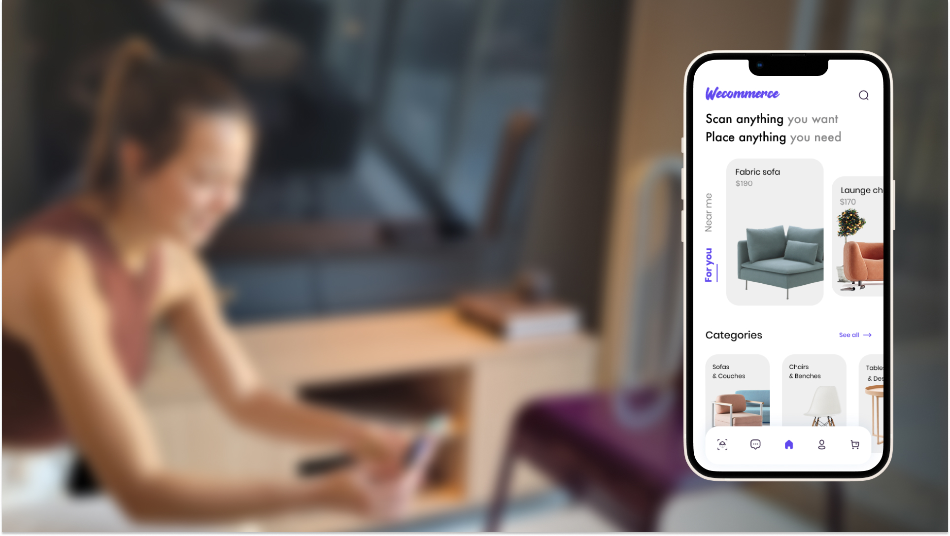
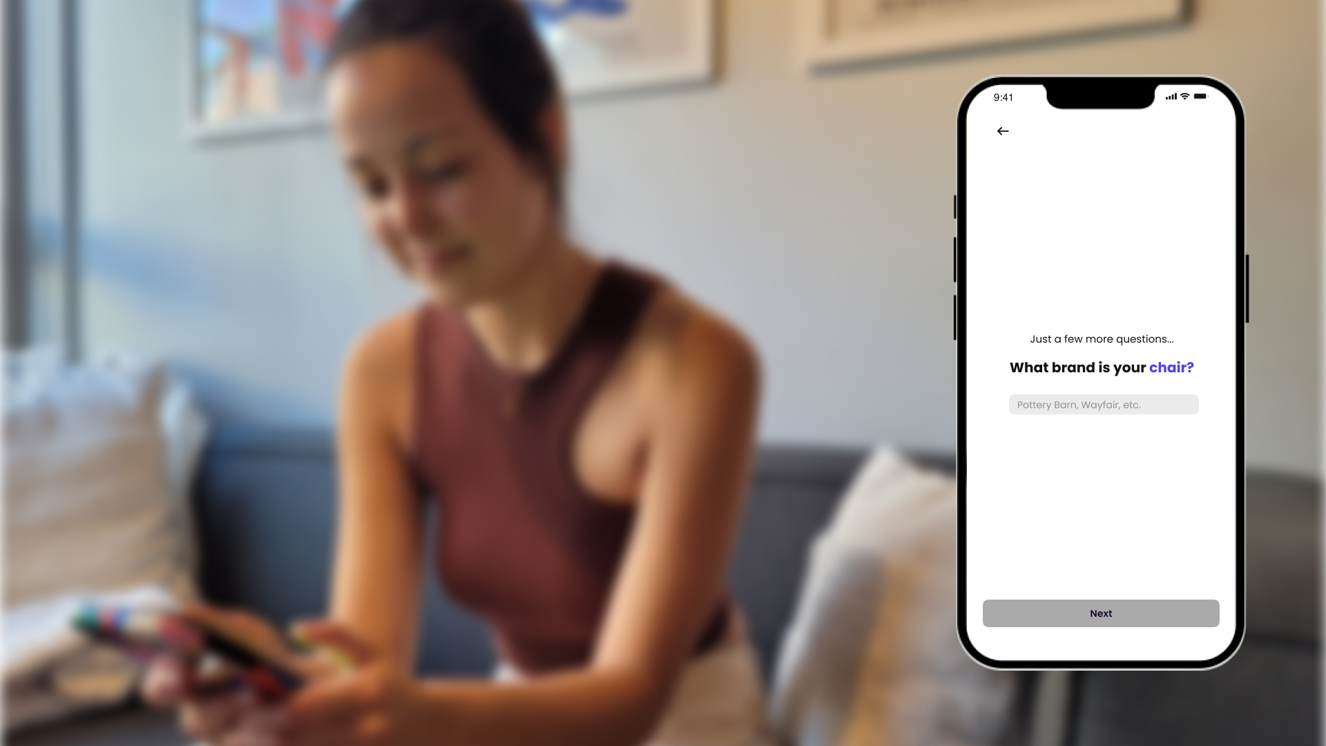
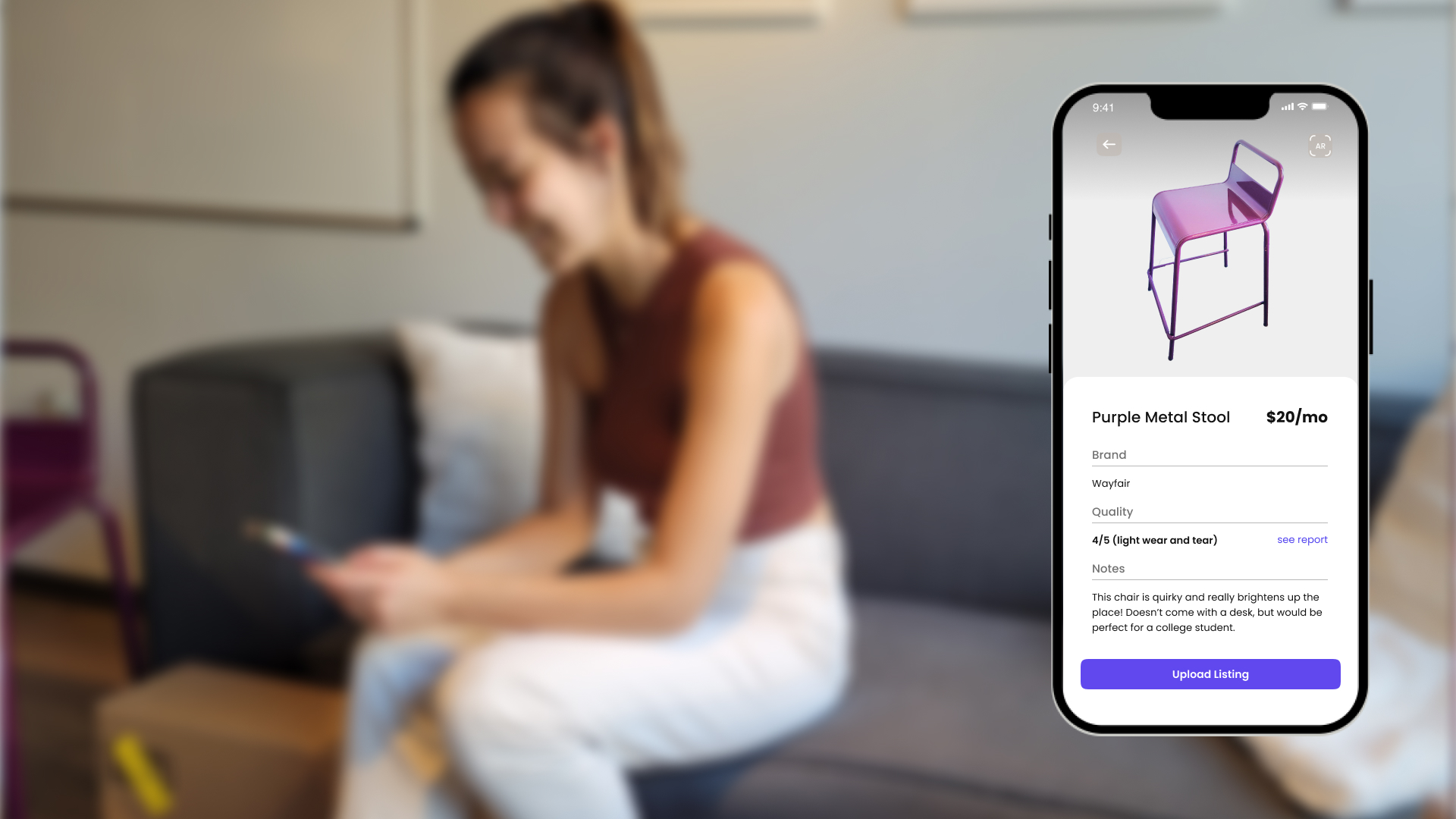
Rentable is a person-to-person furniture rental service that connects furniture owners with individuals in need of a temporary furniture solution. Our platforms and service offer an easy way to responsibly declutter your home while making income on idle furniture that would otherwise be gathering dust in your basement.
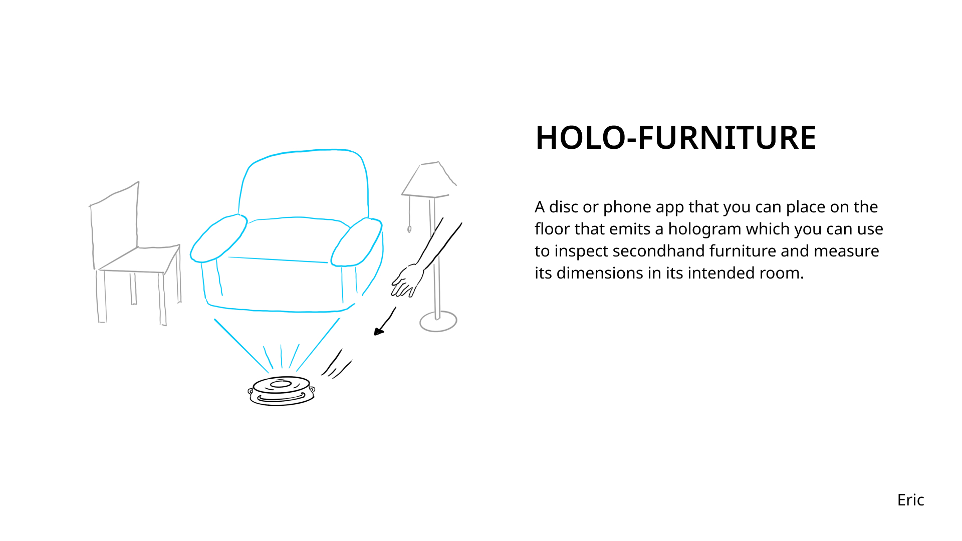
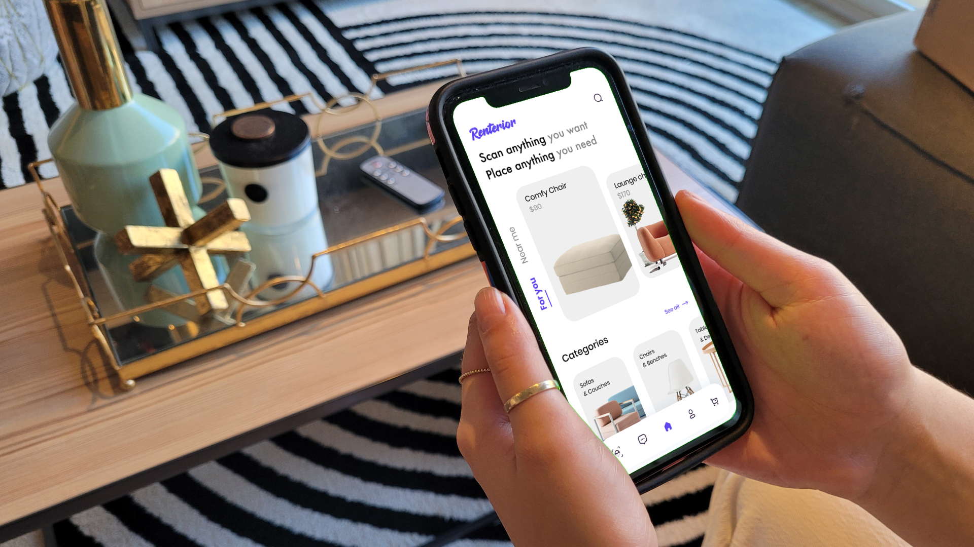
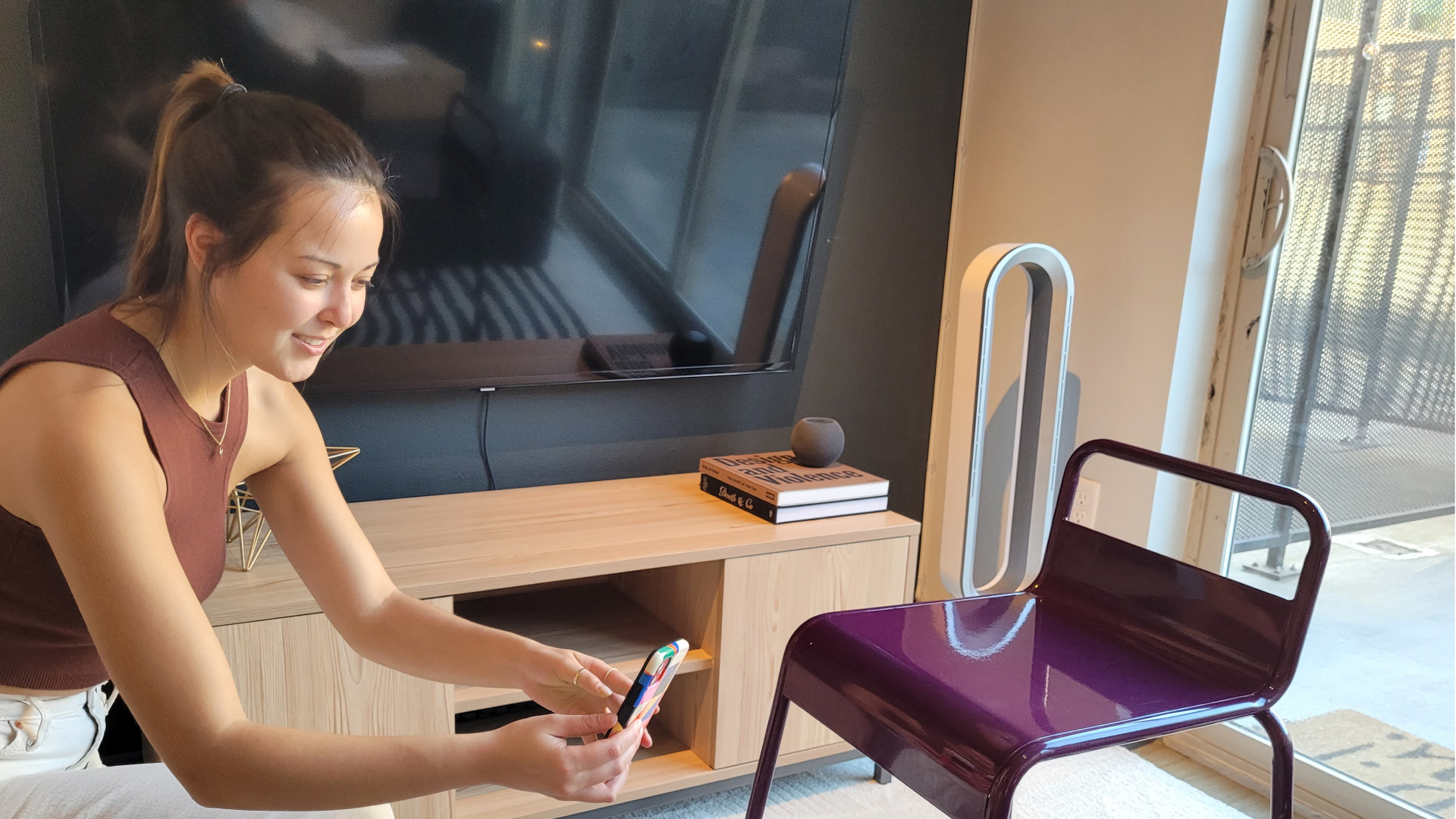
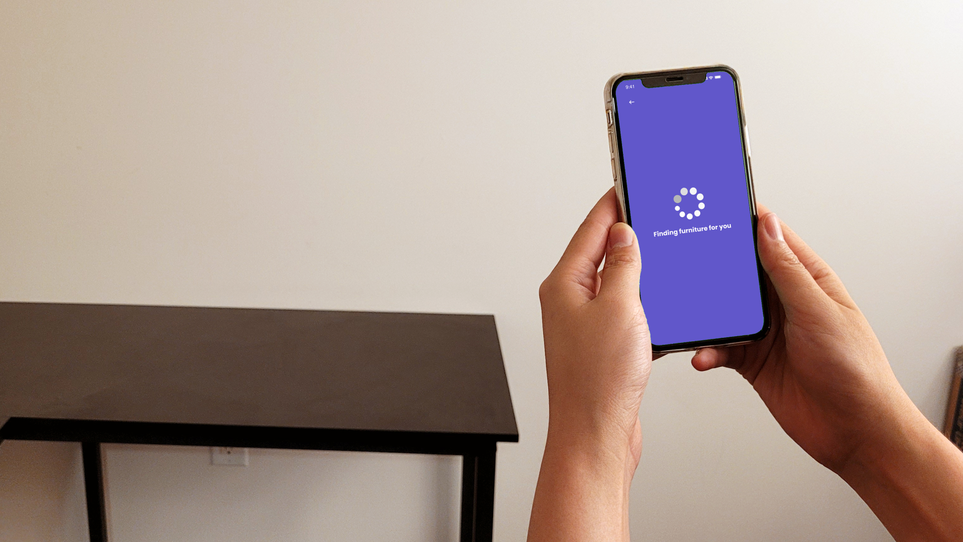
Leveraging 3D LiDAR scanning and phone-enabled augmented reality, our platform gives furniture owners to create and upload to-scale 3D models of their furniture, which can be previewed and tested in the homes of
potential renters.
So. How'd we get there? ↓
EXPLORATION
Research Methods Overview
Literature review, competitive analysis, semi-structured interviews, card sorting exercise, speculative design + sketching exercise
Constraints
With hardly any budget (we were given $500 for the entire project....oof) we were somewhat limited in terms of recruitment for our study. In addition, we had a timeline of 3 weeks to conduct our primary research study and present our insights, a very quick turnaround for the amount of data we collected.
Want an in-depth look at our methods? Check out our study plan →
Secondary Research Findings & Early Assumptions
The best place to start any research? The trusty Google Search, of course. I scoured the internet to learn everything about secondhand furniture and ecommerce platforms. Our team compiled a comprehensive literature review from articles, research papers, and anecdotes from social media. I also conducted a competitive analysis among different secondhand ecommerce platforms, including Mercari, eBay, Craigslist, Amazon Warehouse, Facebook Marketplace and OfferUP.
Secondhand Ecommerce Platforms Kinda, Well, Suck.
But don't take it from me—spend five minutes on one of these sites, and you're likely to run into some major painpoints. People will list almost anything on these sites (the Virgin Mary on a piece of toast, for example) leaving buyers to sort through all the clutter.
"The vibe is definitely more 'I need to get rid of this crap' than great finds. This is shit you do not want. I mean, maybe you do, I don’t know your tastes. But probably you don’t want it."
Primary Research
I recruited for this study by leveraging online communities. In addition to sending a link to our screener and survey to my LinkedIn network, I posted the link on public forums and Facebook Groups dedicated to the resale of secondhand furniture.
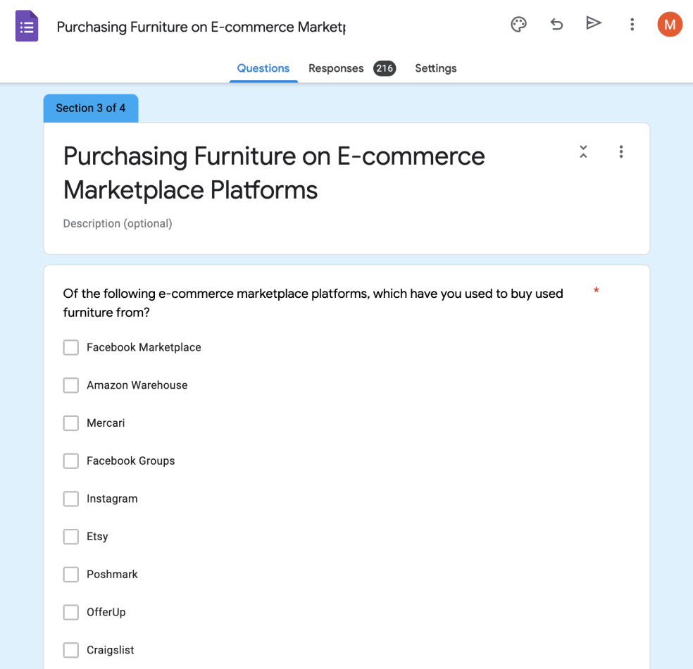
Screener + Survey: 216 Respondents
We screened potential study participants based on their answers to questions about their furniture buying habits, their opinions on secondhand furniture, their experience on existing secondhand ecommerce platforms, and demographic information (like their age).
Semi-Structured Interviews: 11 Participants
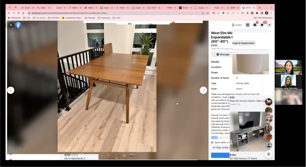
We selected individuals to paarticipate in an hour-long semi-structured interview and workshop. I created a discussion guide, broken up by topic, and interviews were conducted via zoom. I had the chance to moderate several interviews while a fellow teammate took notes.

Walk-Through Exercise: 7 Participants
Following our interview, we requested that participants share their screen over Zoom as they browsed for secondhand furniture on their ecommerce site of choice. We prompted them to speak aloud as they did so, earning us a glimpse into their "filtering behaviors" as they identified acceptable or intersting listings.
*Due to some participants having difficulty with wifi while conducting interviews over zoom, not every participant was able to complete this exercise.
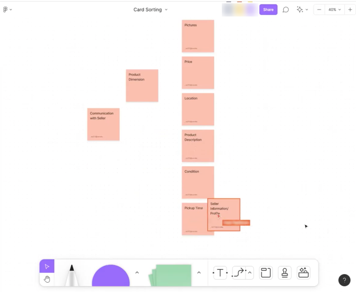
Card Sorting Exercise: 9 Participants
Using FigJam, we supplied participants with a few sticky notes with attribbutes of furniture listings we identified in our research as important to potential buyers. Participants were asked to sort the cards in order of most importance to least, and could add any additional attributes that were missing from the list.
*Due to some participants having difficulty with wifi while conducting interviews over zoom, not every participant was able to complete this exercise.
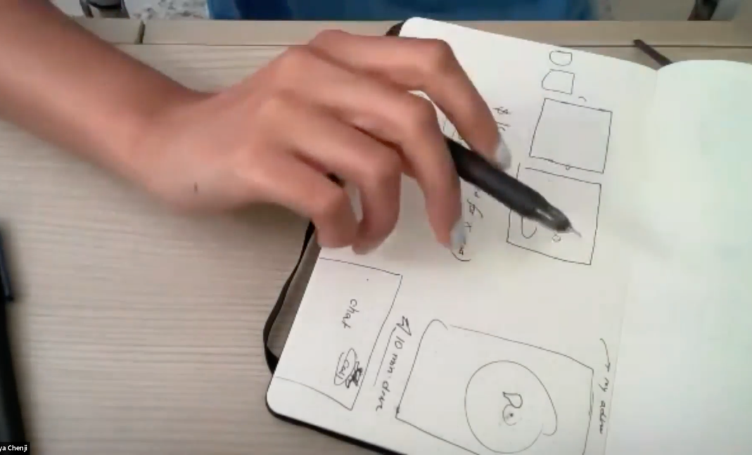
Speculative Design Exercise: 5 Participants
Lastly, we requested participants to sketch what an "ideal" listing would look like on an ecommerce platform. We were intersted in learning what existing features of listings they included—like photos of the furniture, a description, etc.—and what features they wished existed, like 360 images.
*Due to some participants having difficulty with wifi while conducting interviews over zoom, not every participant was able to complete this exercise.
Insight Mining through Affinity Diagramming
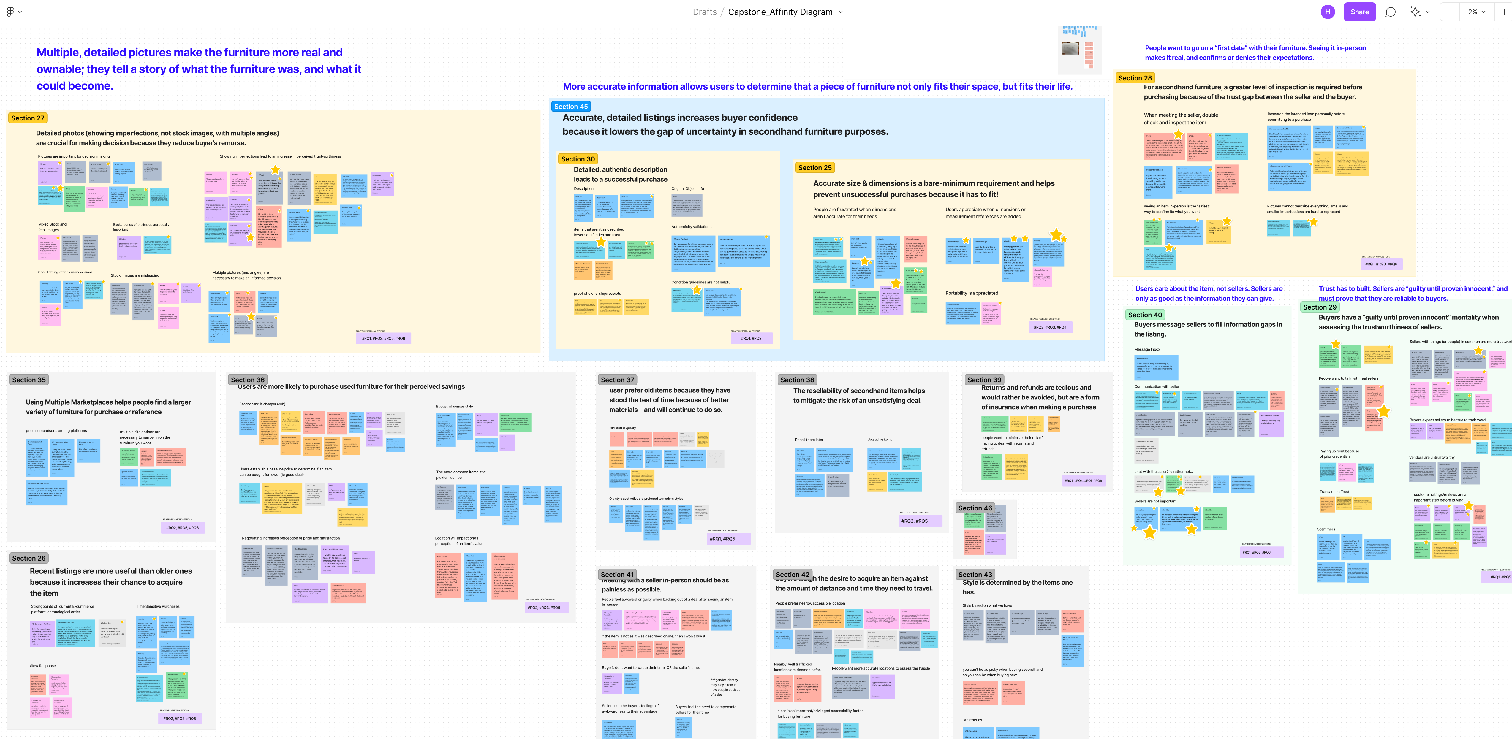
We had SO. MUCH. DATA. After pulling out key quotes from each particpant's session, we had nearly 1,000 sticky notes to code and sort through. Through affinity diagramming, I learned the value in being able to pick apart and discard quotes that aren't useful so I wouldn't get lost in the weeds. Sorting our data into categories and themes was enormously helpful in the insight-mining process.
INSIGHT #1
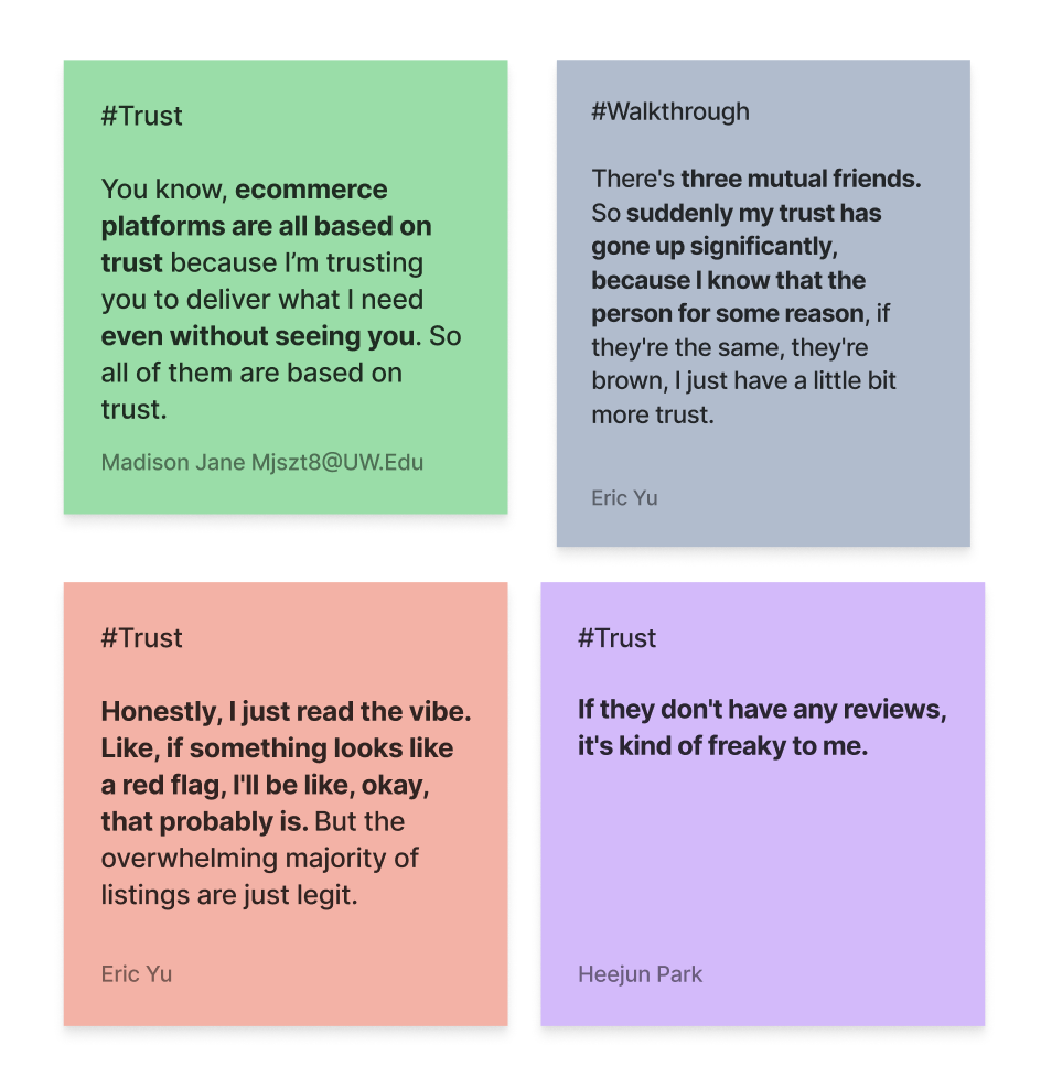
Trust has to built. Sellers are “guilty until proven innocent,” and must prove that they are reliable to buyers.
Buyers look for cues of seller credibility—mutual friends, ratings and reviews, and seller transparency—that make a seller more trustworthy and mitigate risk.
With horror stories of scammers, counterfeit items and safety concerns, buyers of secondhand furniture don’t default to trusting sellers the same way they do when buying new furniture. Therefore, more is required of sellers to prove they’re credible.
INSIGHT #2
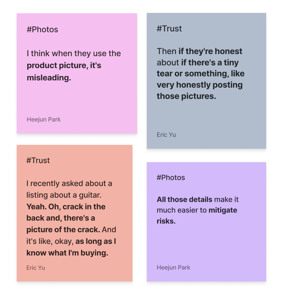
If it looks too good to be true, it probably is. Exposing an item’s imperfections signals that a seller is trustworthy.
Buyers know they are purchasing secondhand furniture—they don’t expect it to be perfect, but they do expect transparency.
Stock and photoshopped images are easy to identify and are deemed deceptive. Buyers are willing to tolerate mild damage and imperfections—as long as they know about it upfront. Seller transparency enables buyers avoid awkward confrontation if the furniture isn’t as described.
INSIGHT #3
More really is more. High-quality photos and detailed information make the furniture feel real and ownable.
There’s no such thing as too much information.
Buyers need to be sure the furniture in question fits their life, both physically and functionally. Detailed and accurate information including dimensions, condition, aesthetics and materials help buyers imagine the item as their own and how it will interact with their entire space.
INSIGHT #4
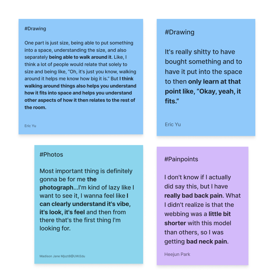
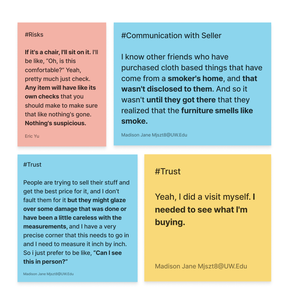
People want to go on a “first date” with their furniture. Seeing it in-person makes it real, and confirms or denies their expectations.
Like a first date, you can only tell so much about furniture from its online profile.
Buyers don’t want to be catfished by photos and descriptions that gloss over imperfections. Arranging an in-person meeting allows buyers to perform a deeper inspection of the furniture and vet any factors that can’t be assessed through photographs, like comfortability or smell.
INSIGHT #5
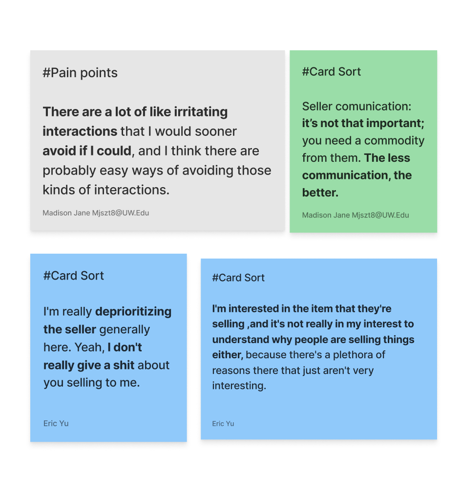
The less communication, the better. Sellers are only as good as the information they can give.
In other words, buyers would prefer to avoid the seller, but it’s sometimes a necessary hassle.
Purchasing furniture from a stranger can be—understandably—awkward or irritating, frought with communication challenges. To buyers, the seller’s only purpose is to fill in information gaps about the furniture in question. They reach out as a last resort if they can’t find the answers to their questions elsewhere.
Want to learn more about our findings? Check out the research report →
IDEATION
Design Pillars
As our team moved into the ideation phase, I knew we'd benefit from identifying key pillars for our design solution. The following pillars are what we attempted to strive for with all of our proposed design solutions:
1. Trustworthy/Transparent
2. Accessible
3. Sustainable
From Zero to Sixty
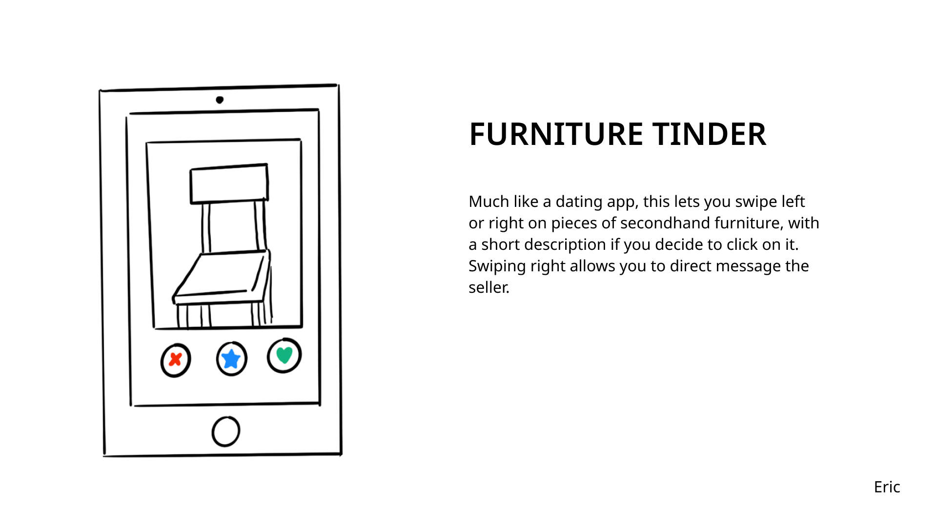
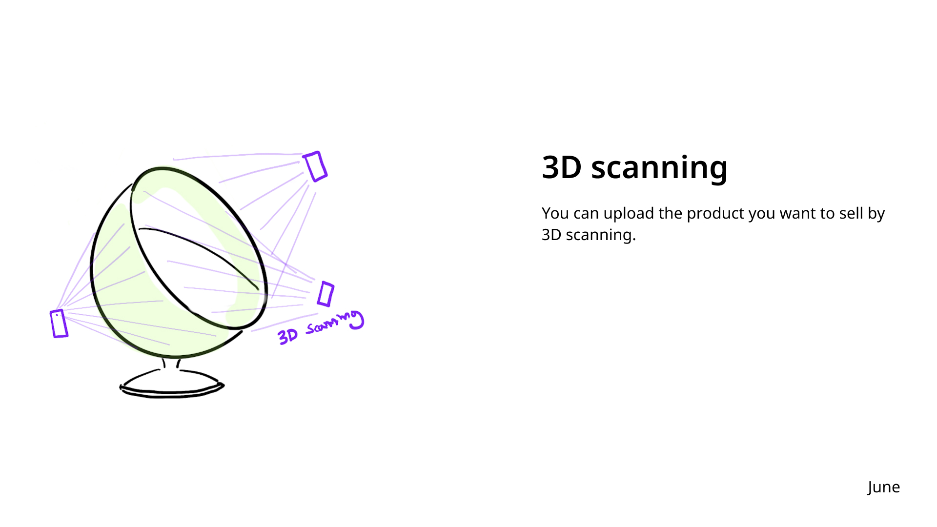
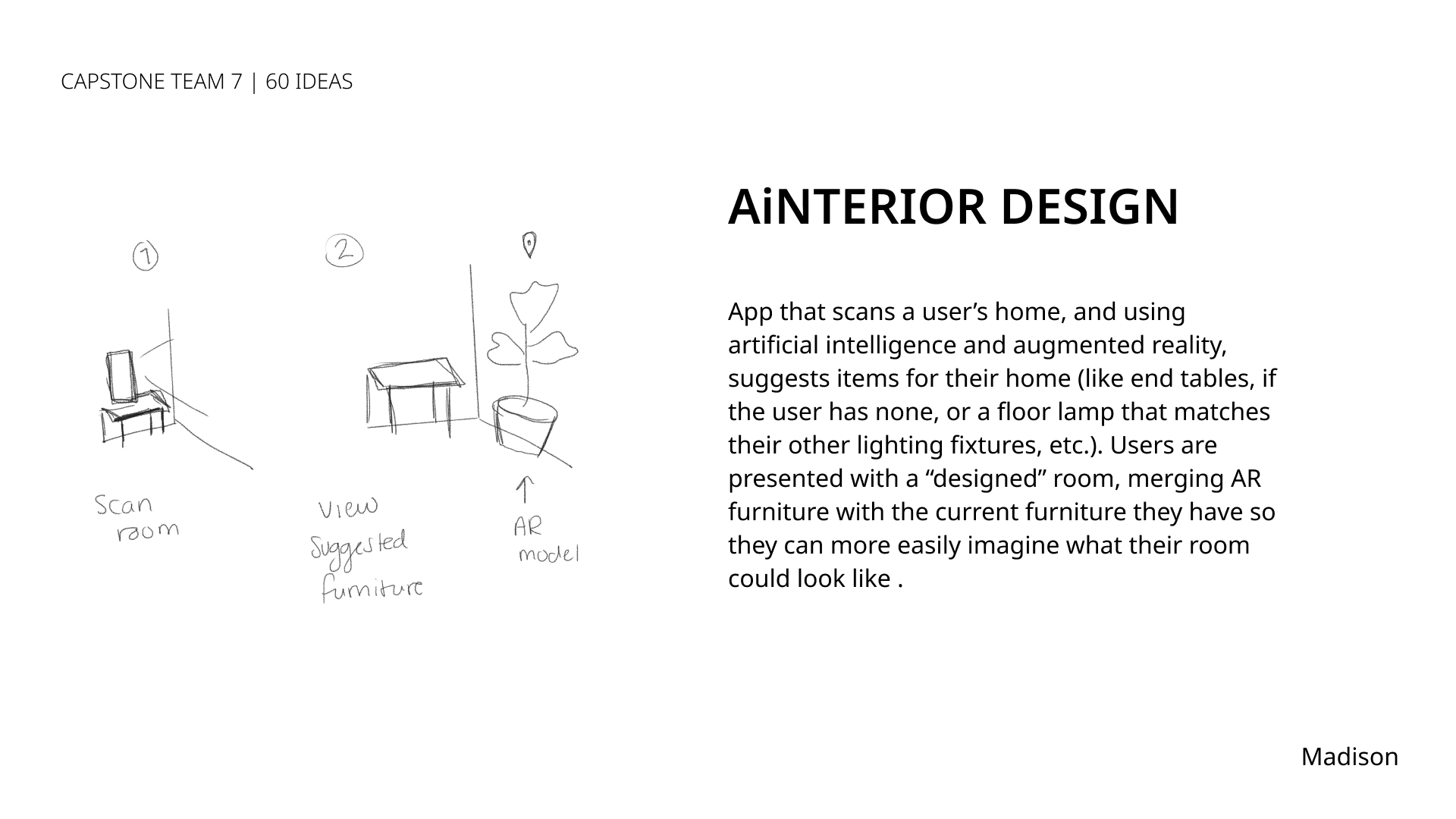
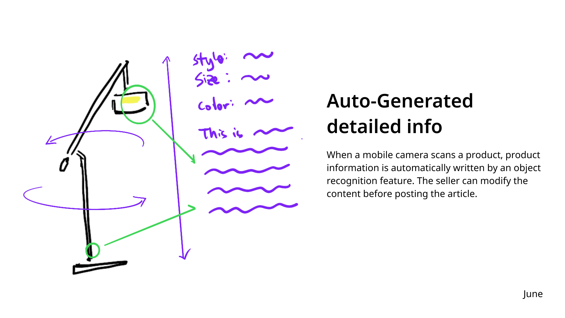
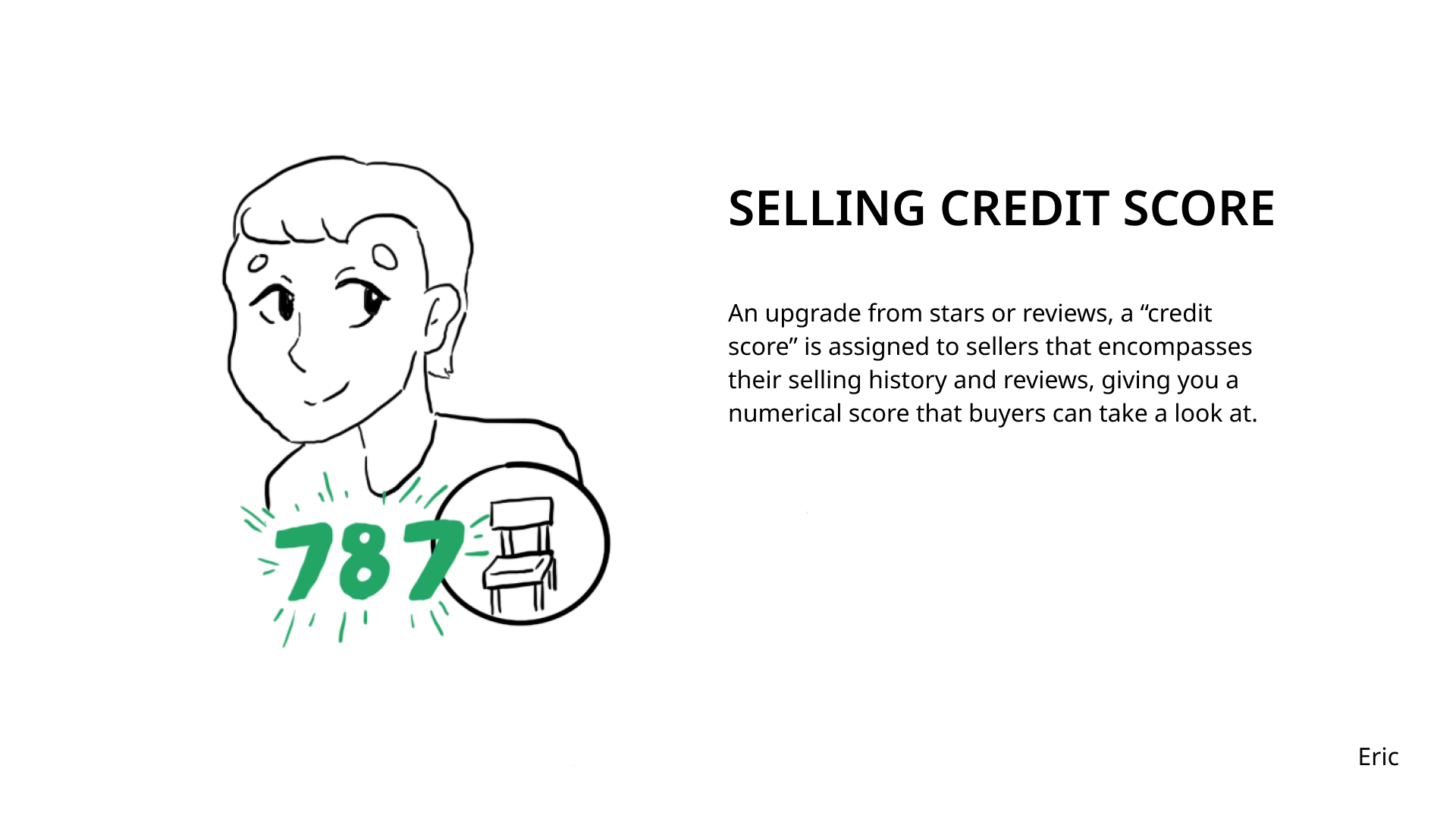
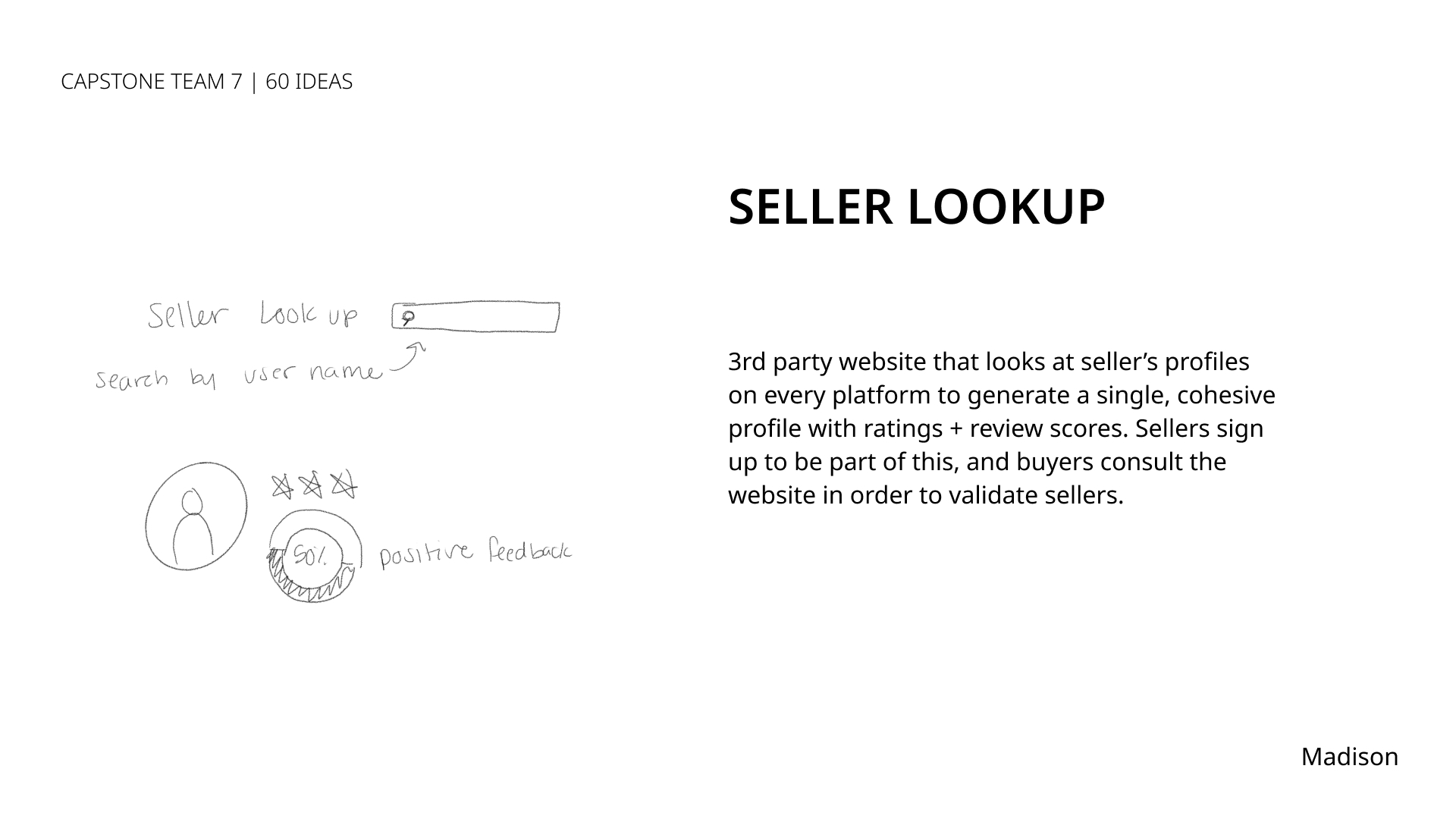
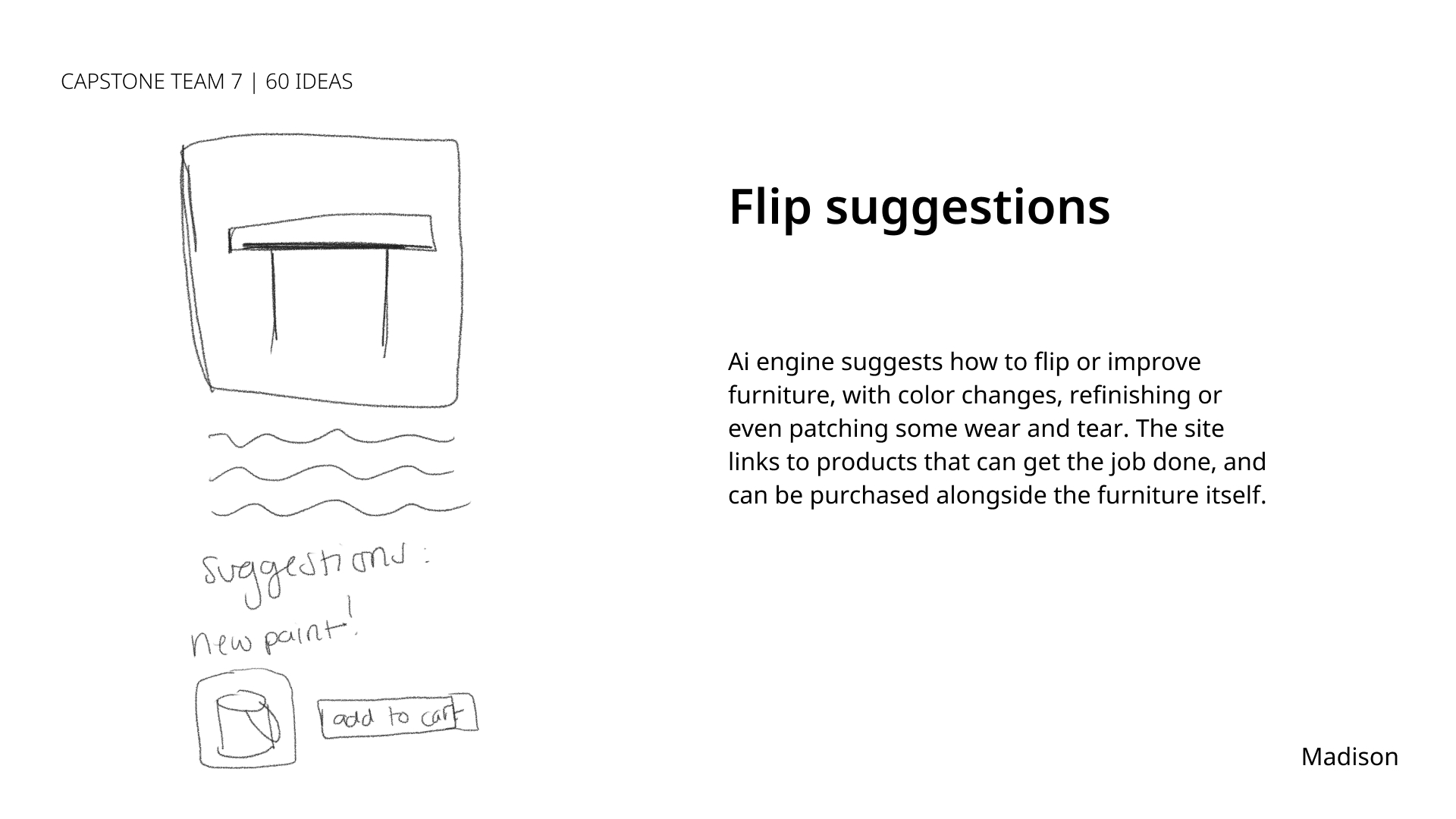
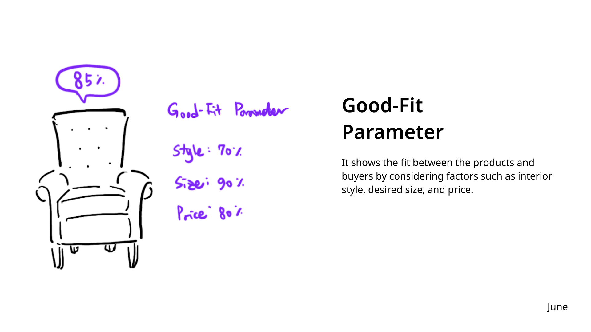
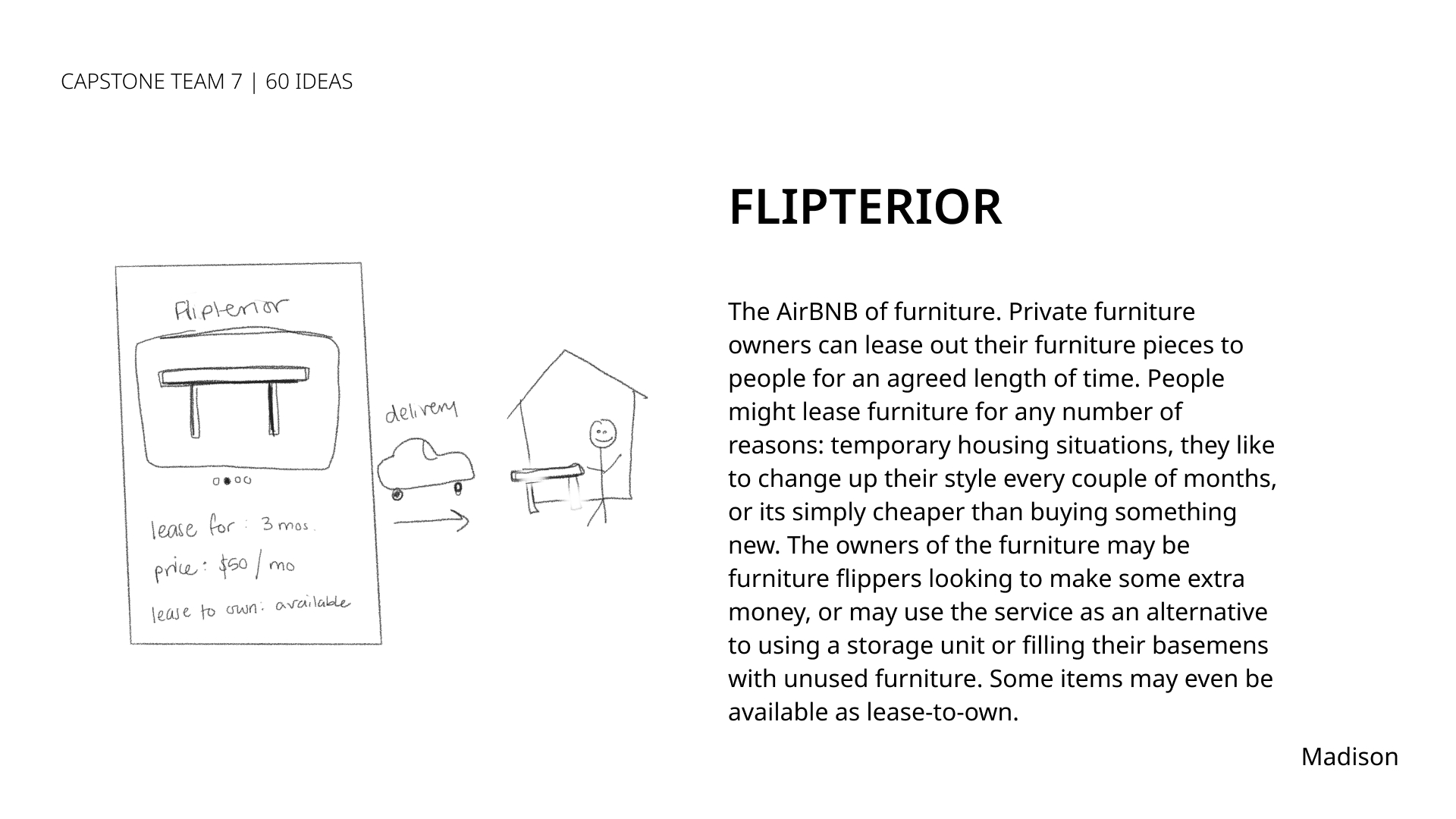
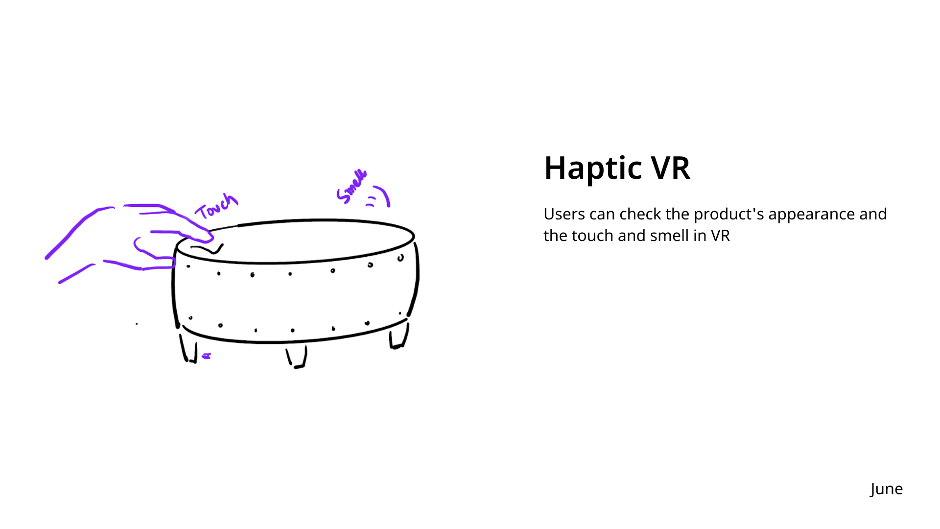
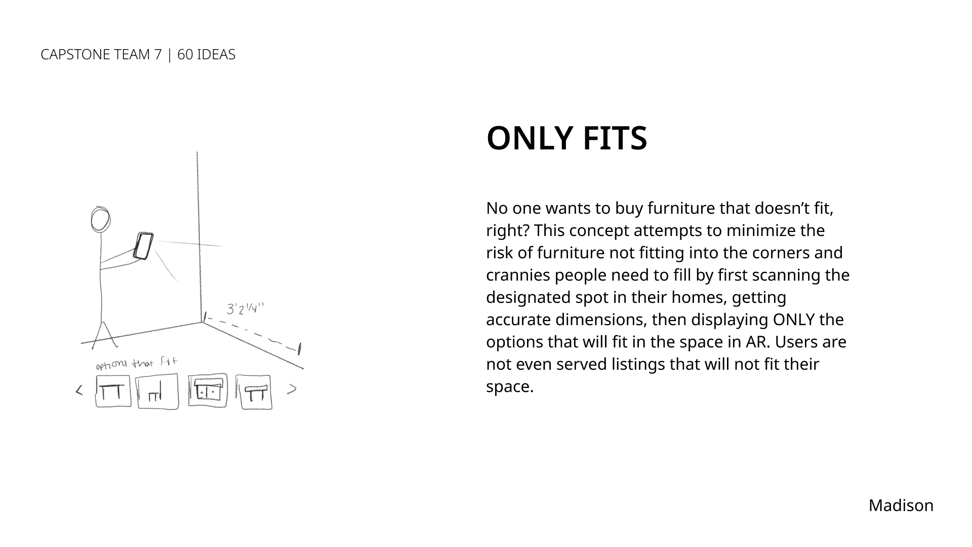
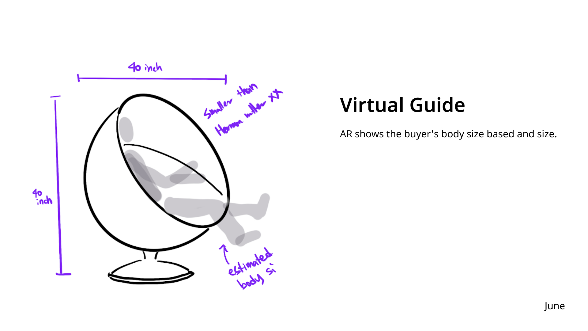
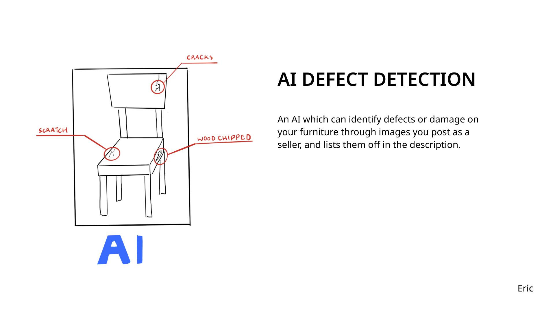
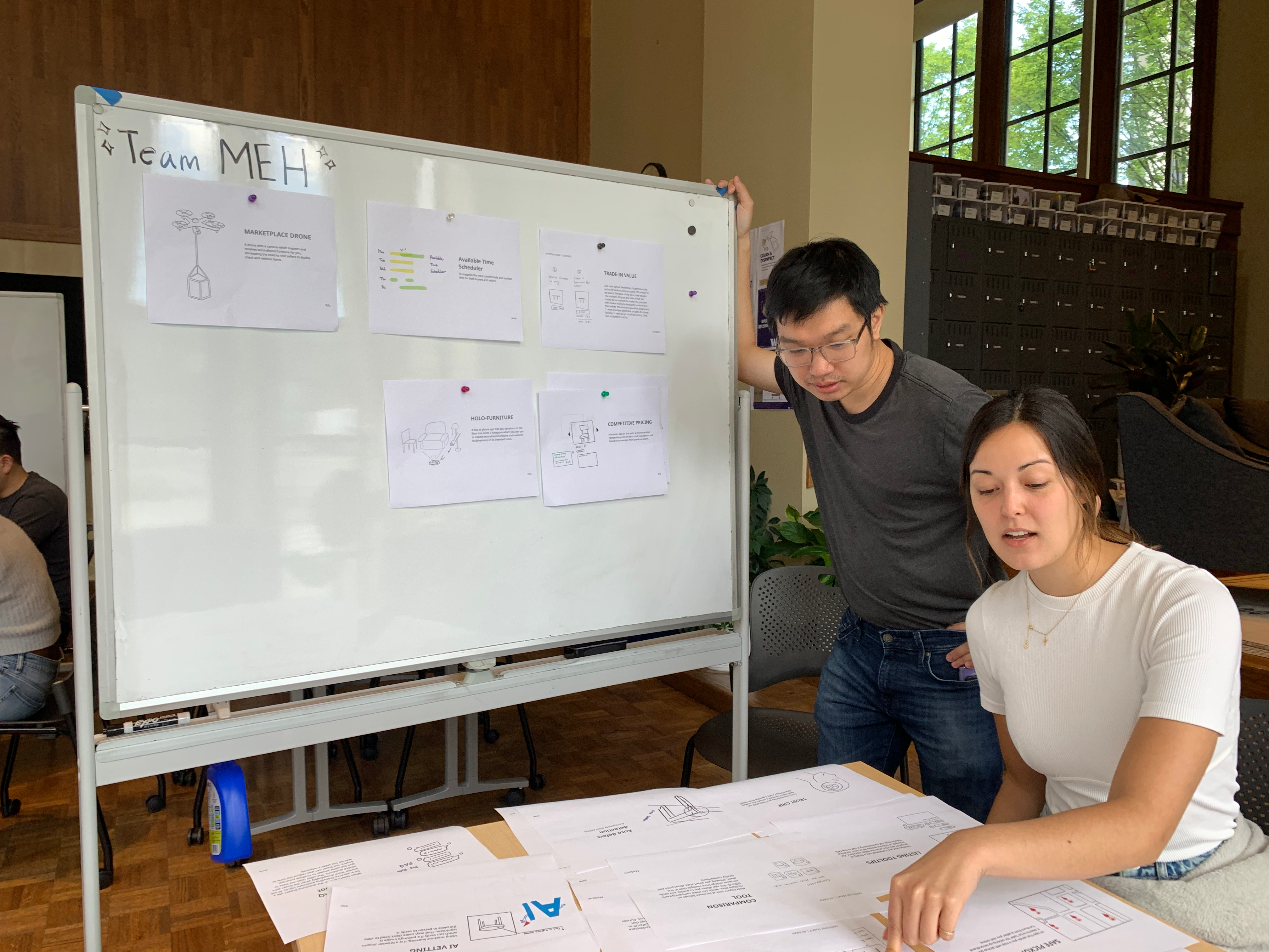
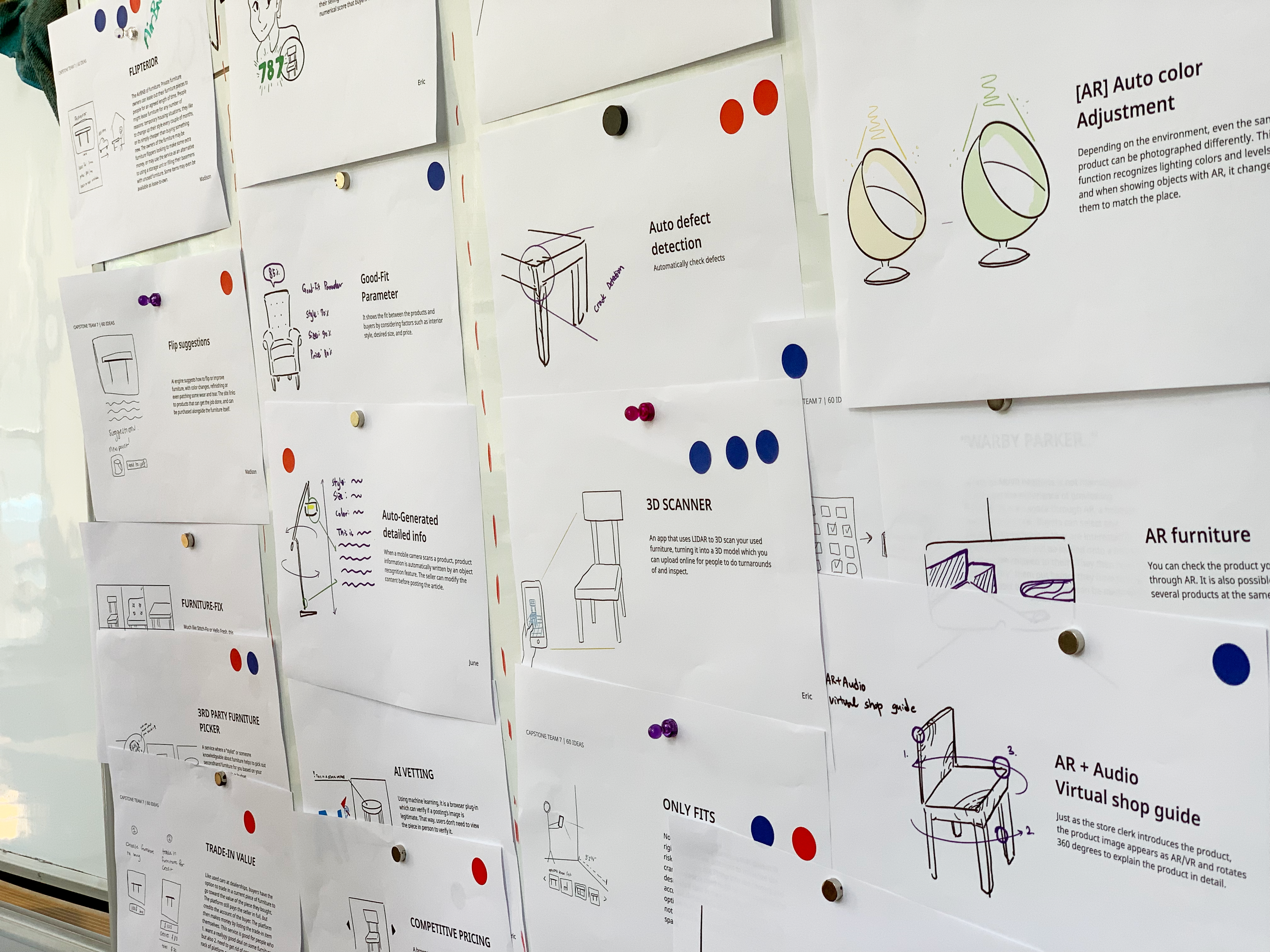
Armed with our research insights, we dove head-first into ideation. Our weapon of choice? The trusty (Apple) pencil and paper (*ahem* iPad). Each of us conceptualized, sketched and pitched 20 ideas to the team, leaving us with 60 initial design solutions to refine and down-select from. Check out a few of our first sketches:
Down Selection
For several days we refined and narrowed our focus, identifying overlapping themes, technologies and opportunity areas amongst our ideas. Using the dot method, we evaluated each concept aainst our pillars and down-selected to the solution we wanted to build and test.
PROTOTYPING
Two Sides to Every Story(board)
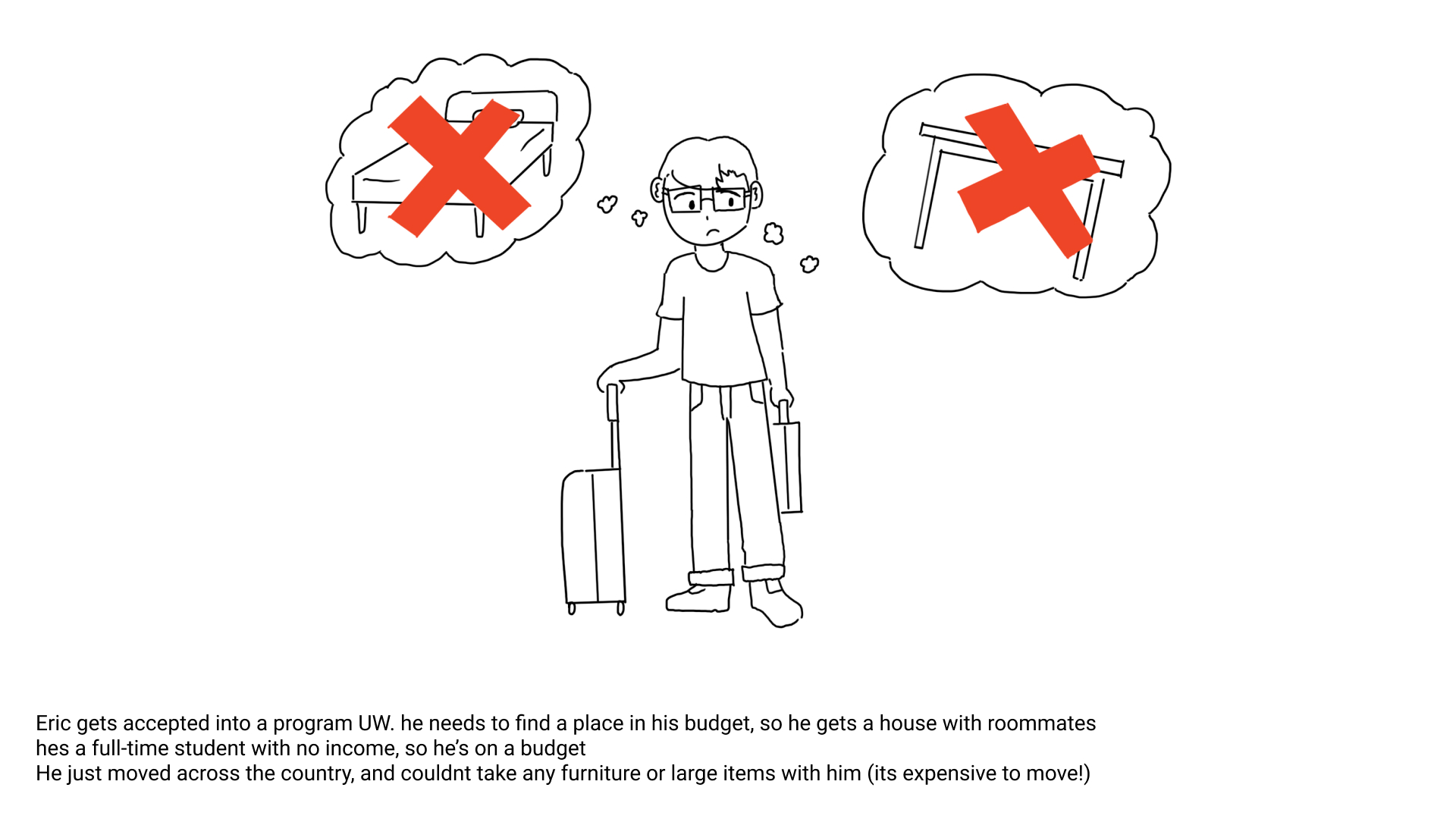
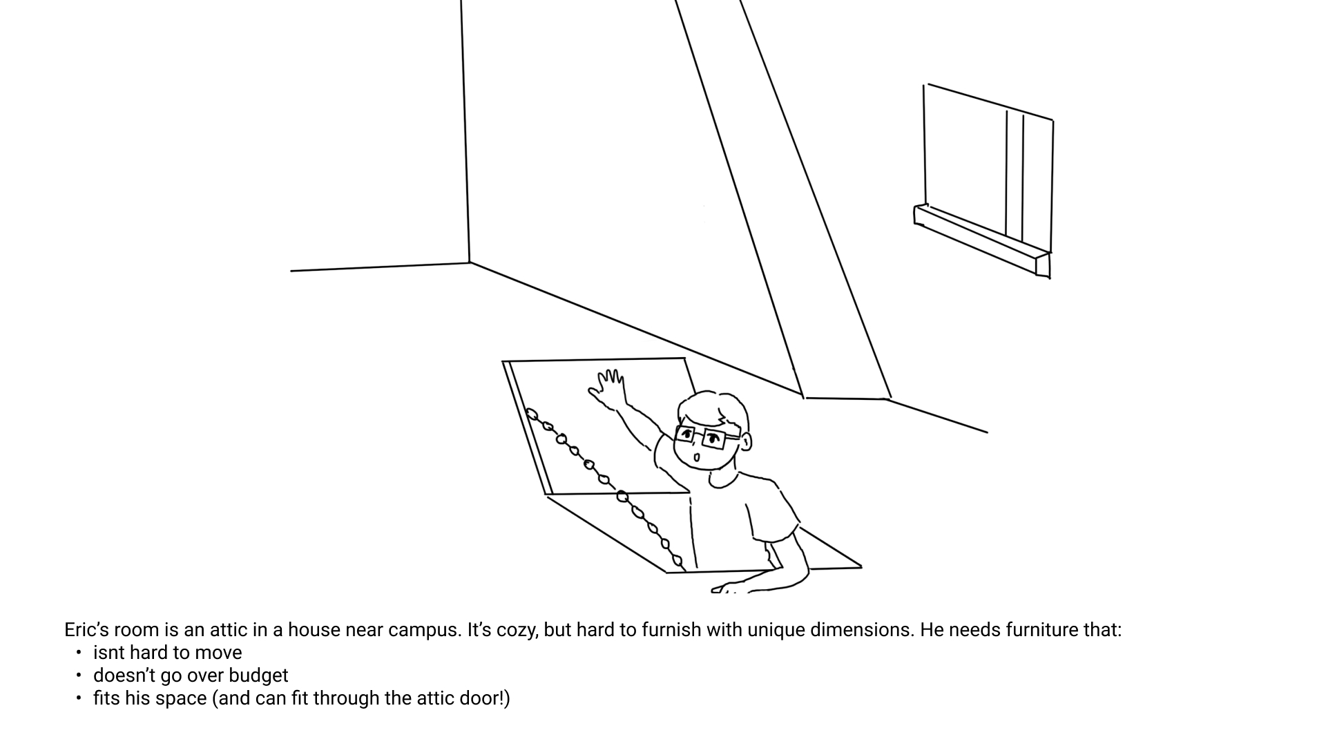
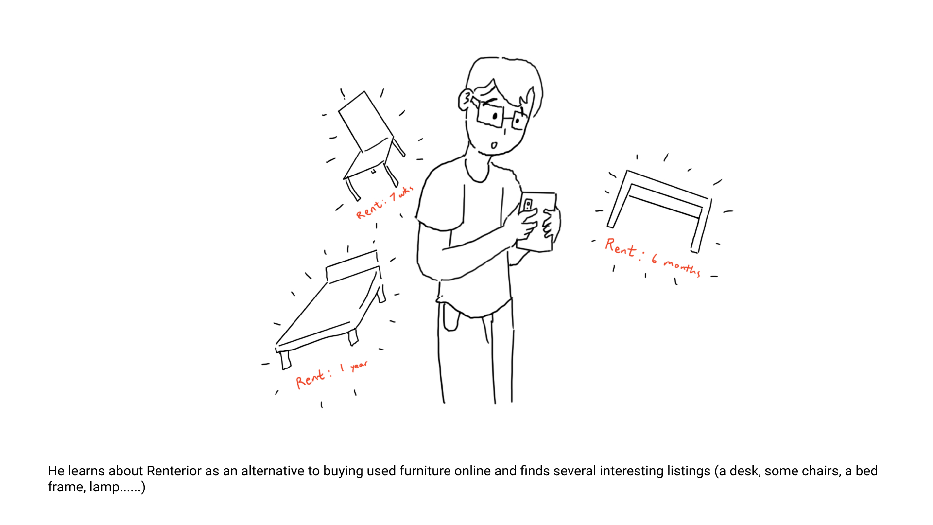
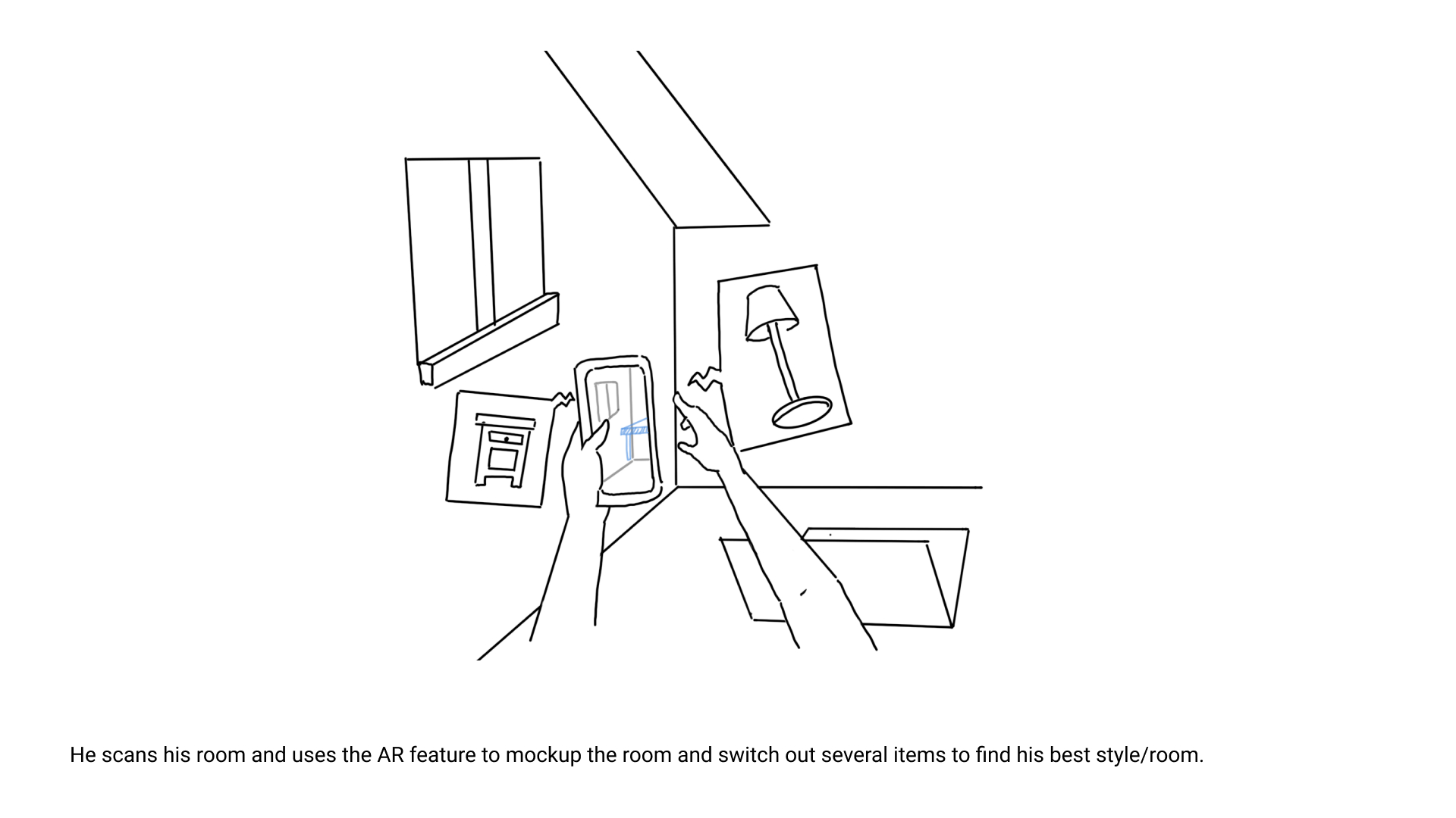
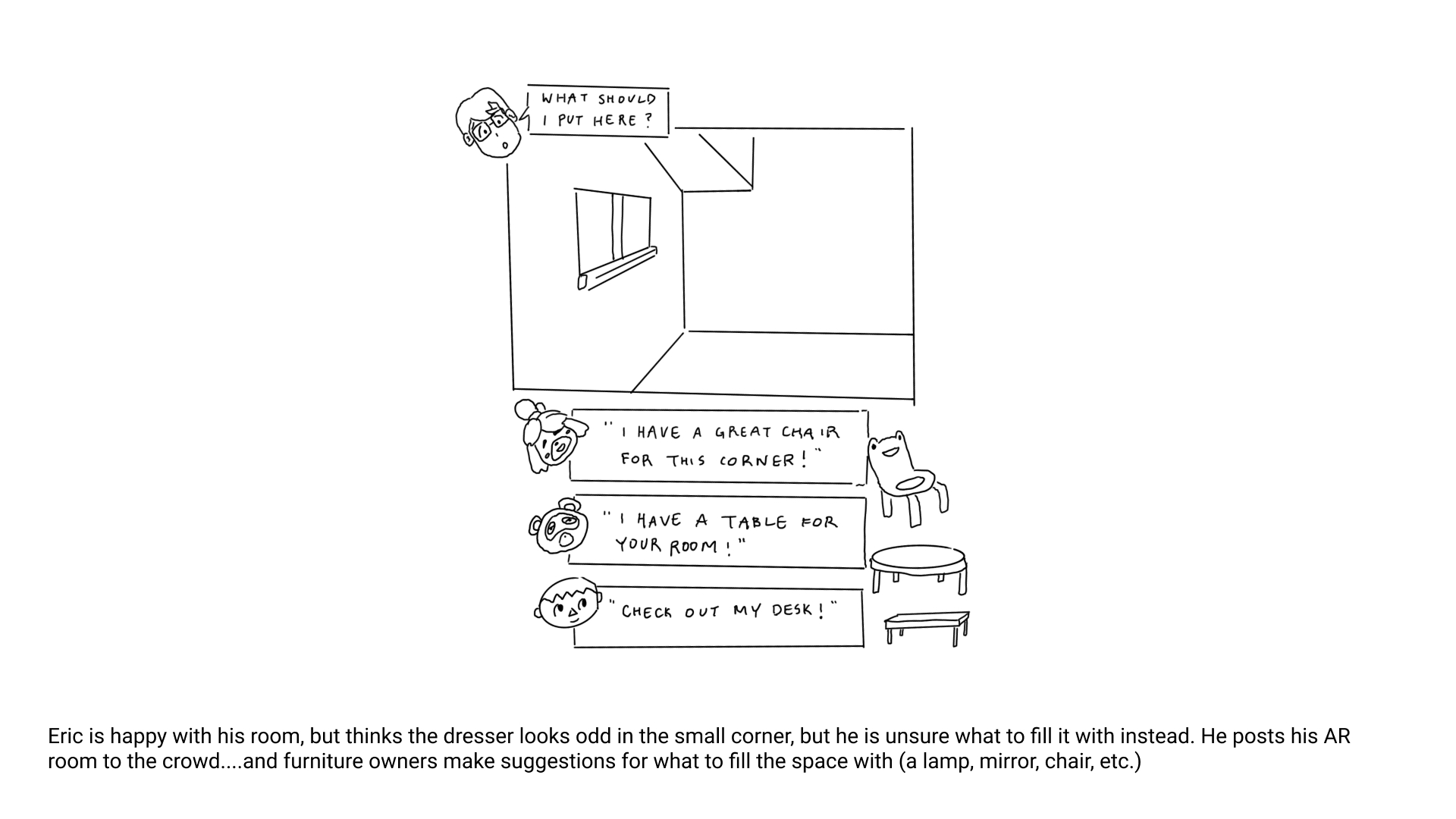
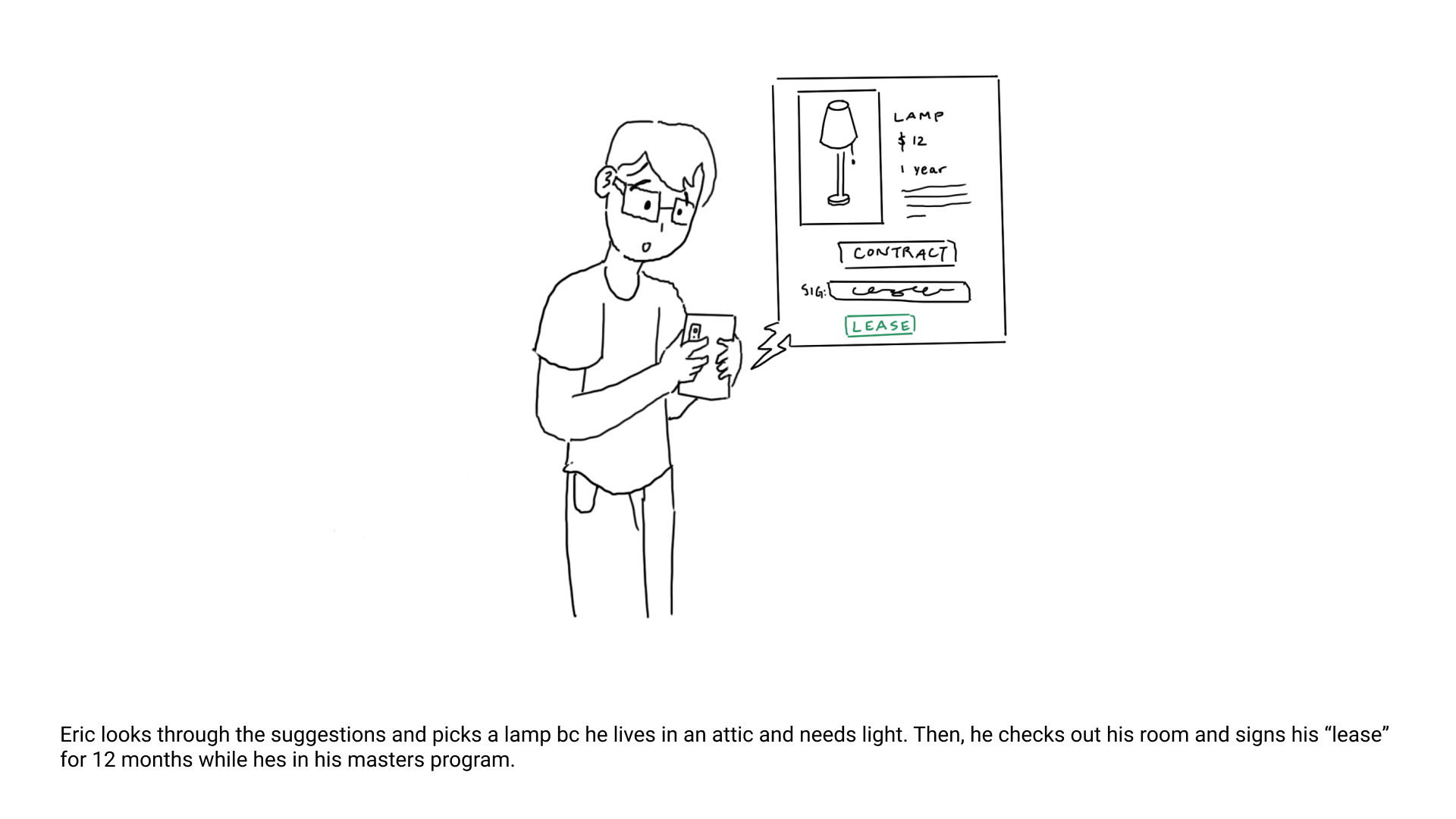
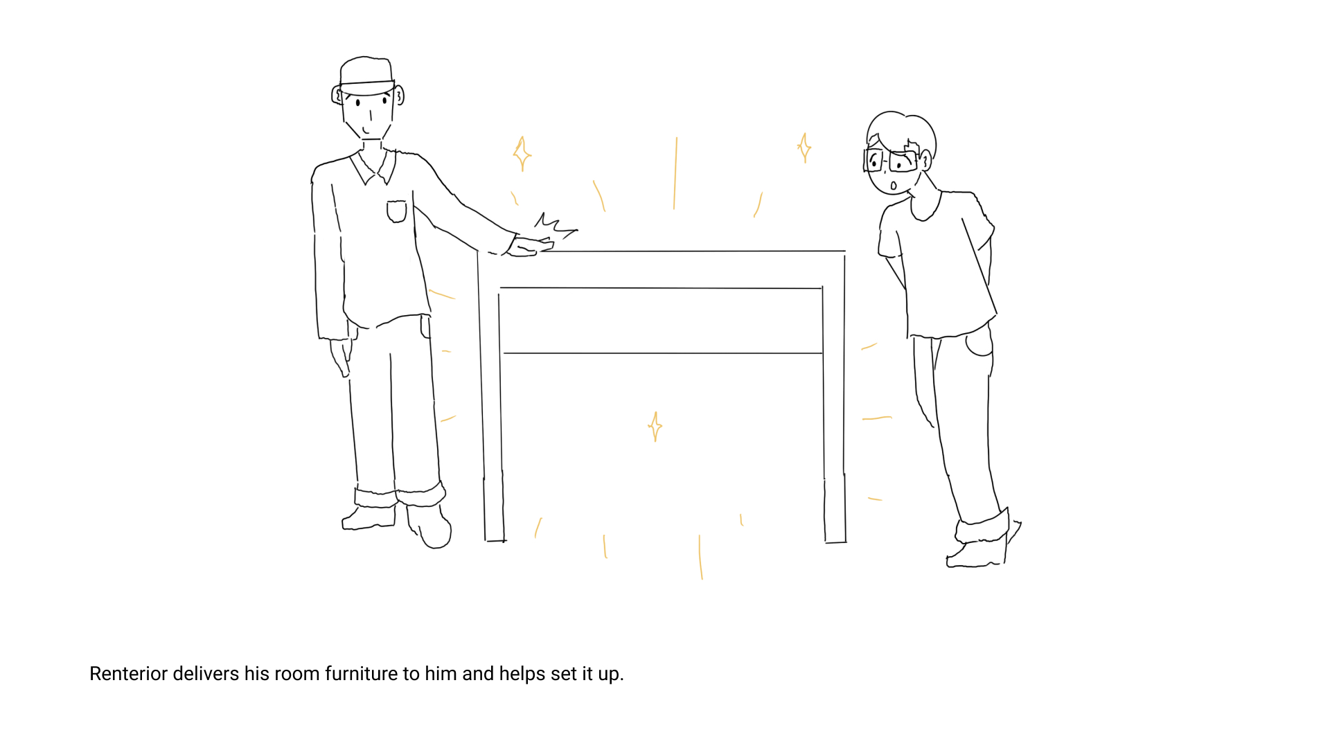
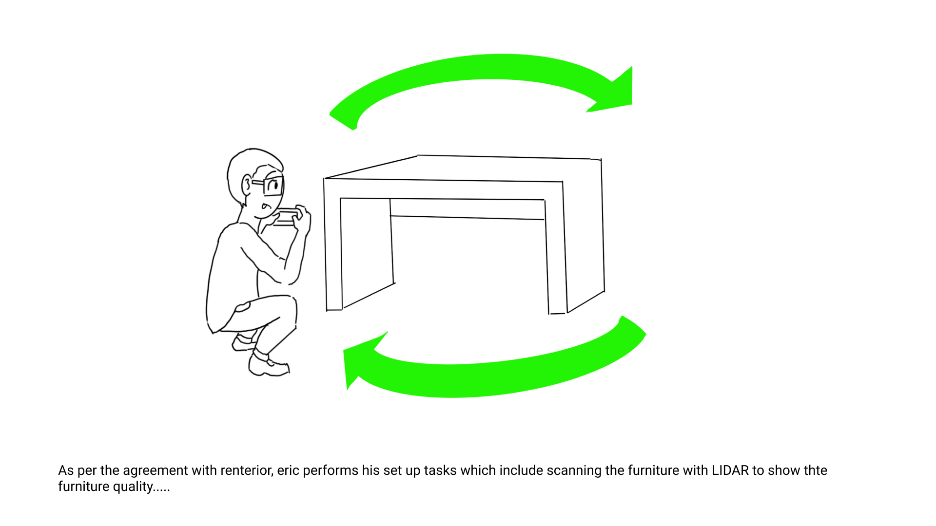
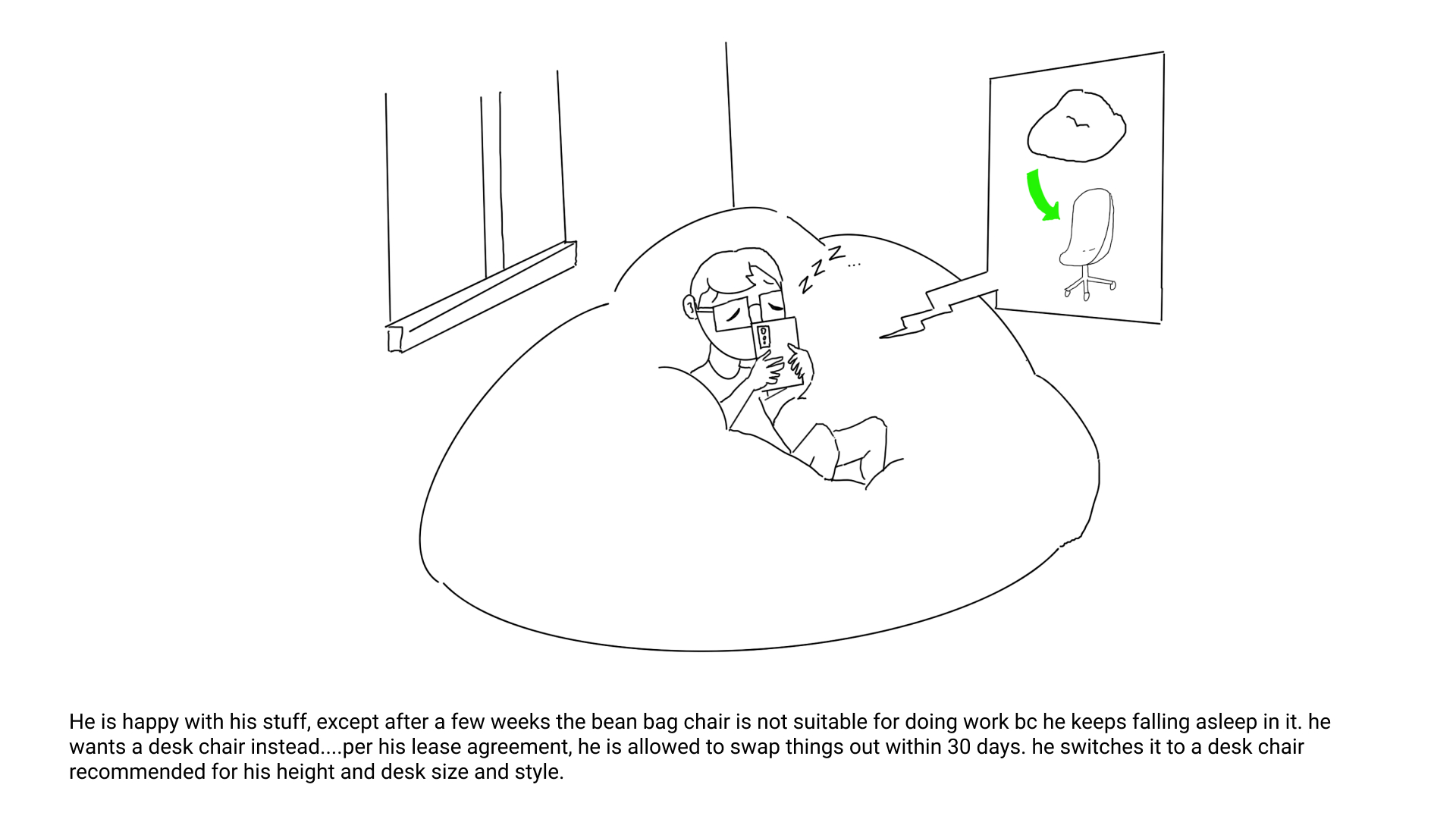
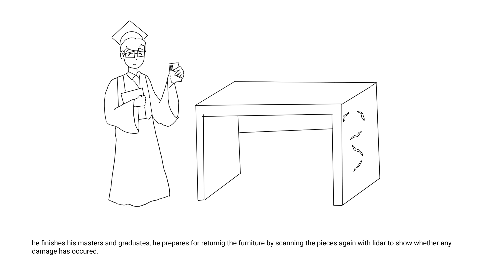
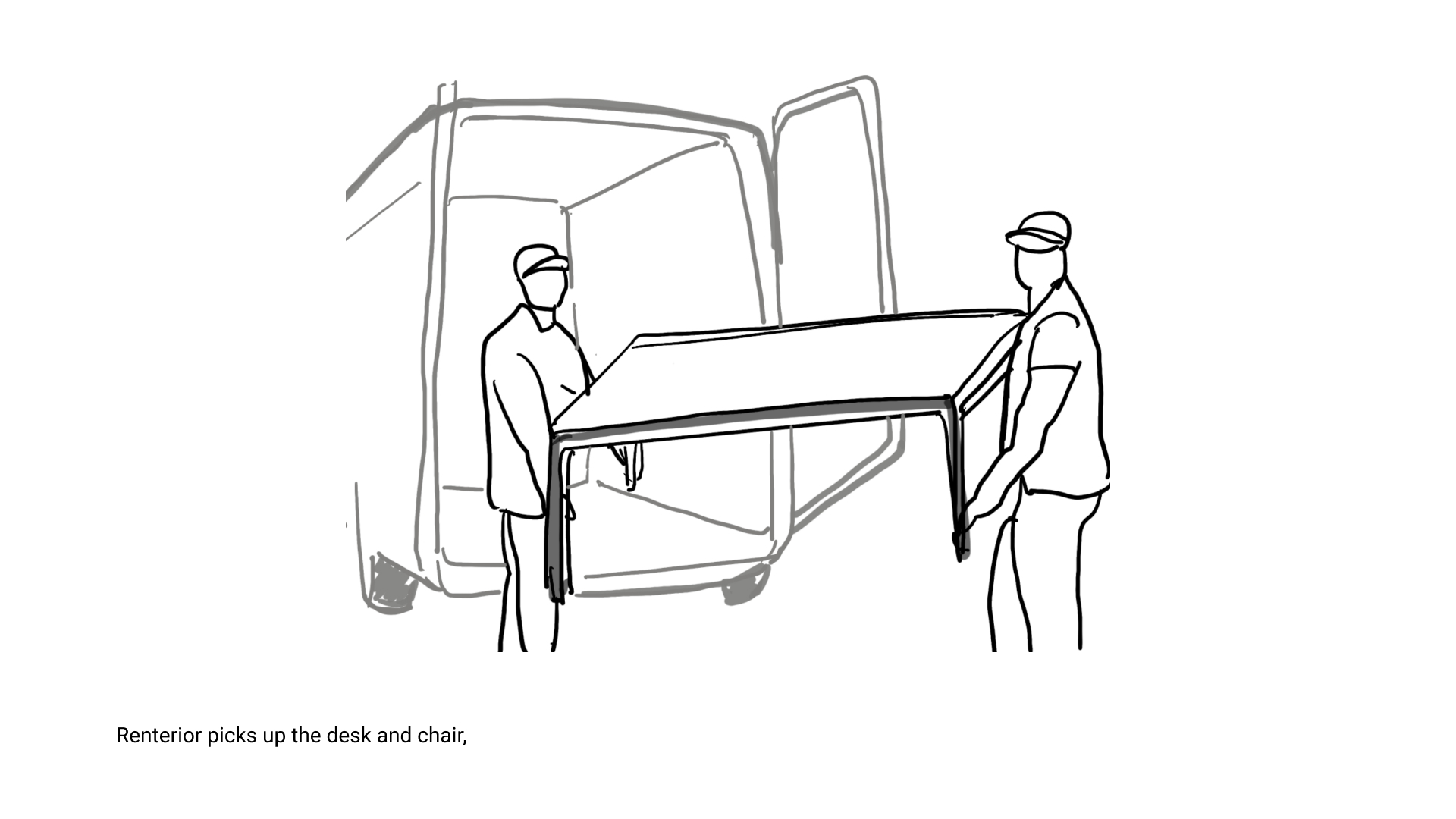
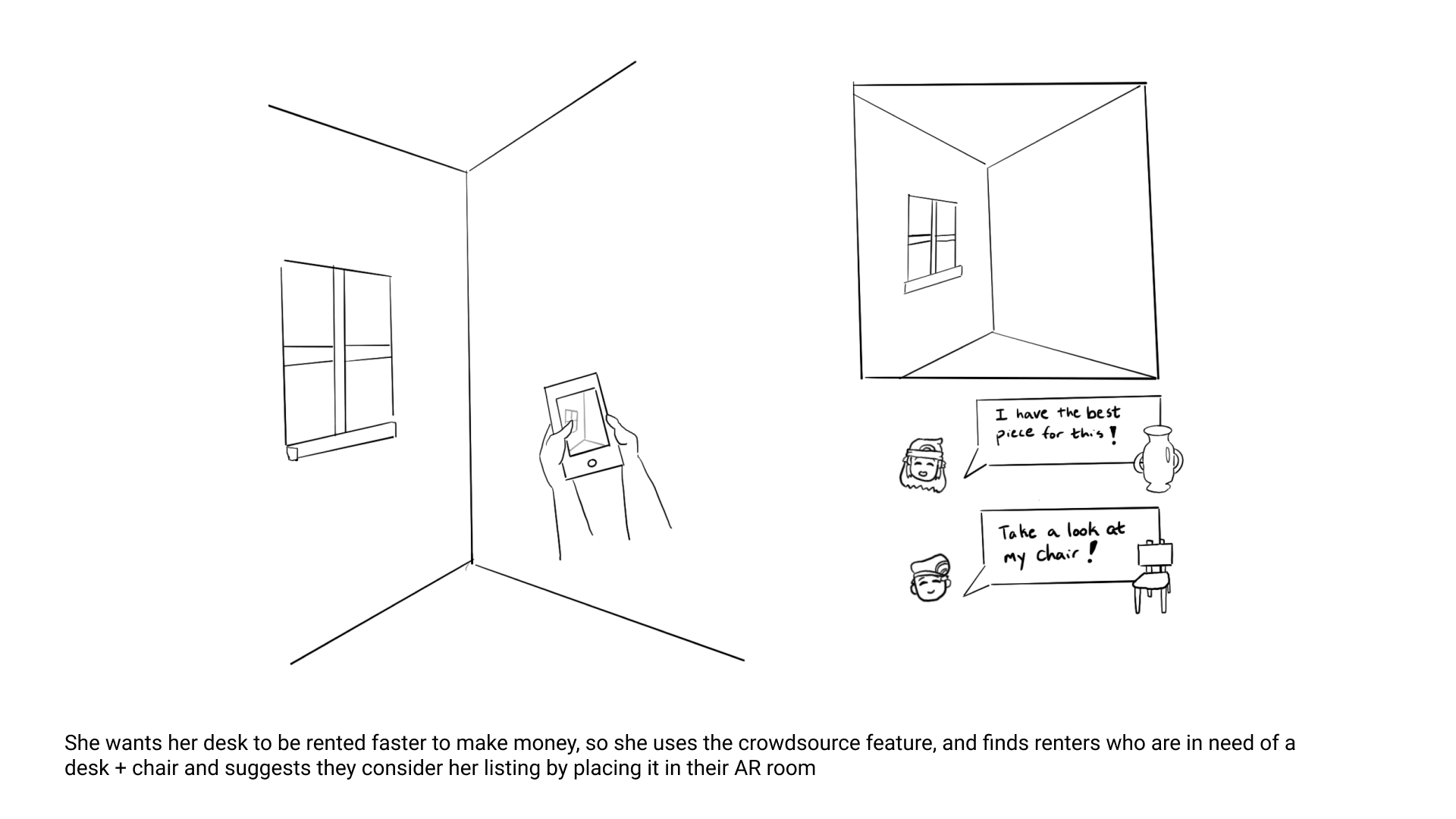
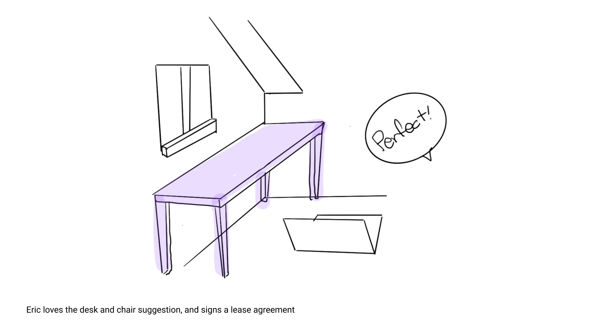
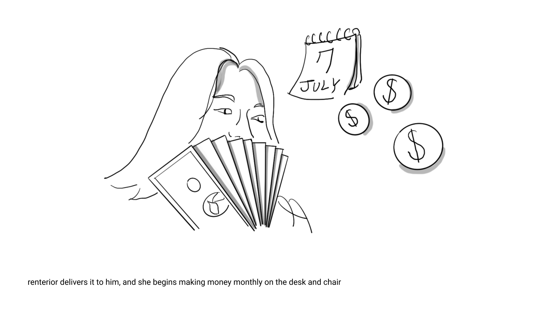
Early in our design process, we used storyboarding as a prototyping method to illustrate how target users would interact with Rentable. This was an excellent way to concept test our ideas among other designers, as well as our family and peers. Since this design solution combines technology with service design, we built storyboards from the perspective of both the furniture owner (the renter) and the rentee.
Storyboard from rentee's perspective
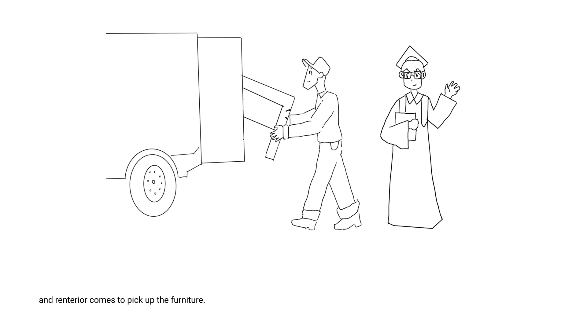
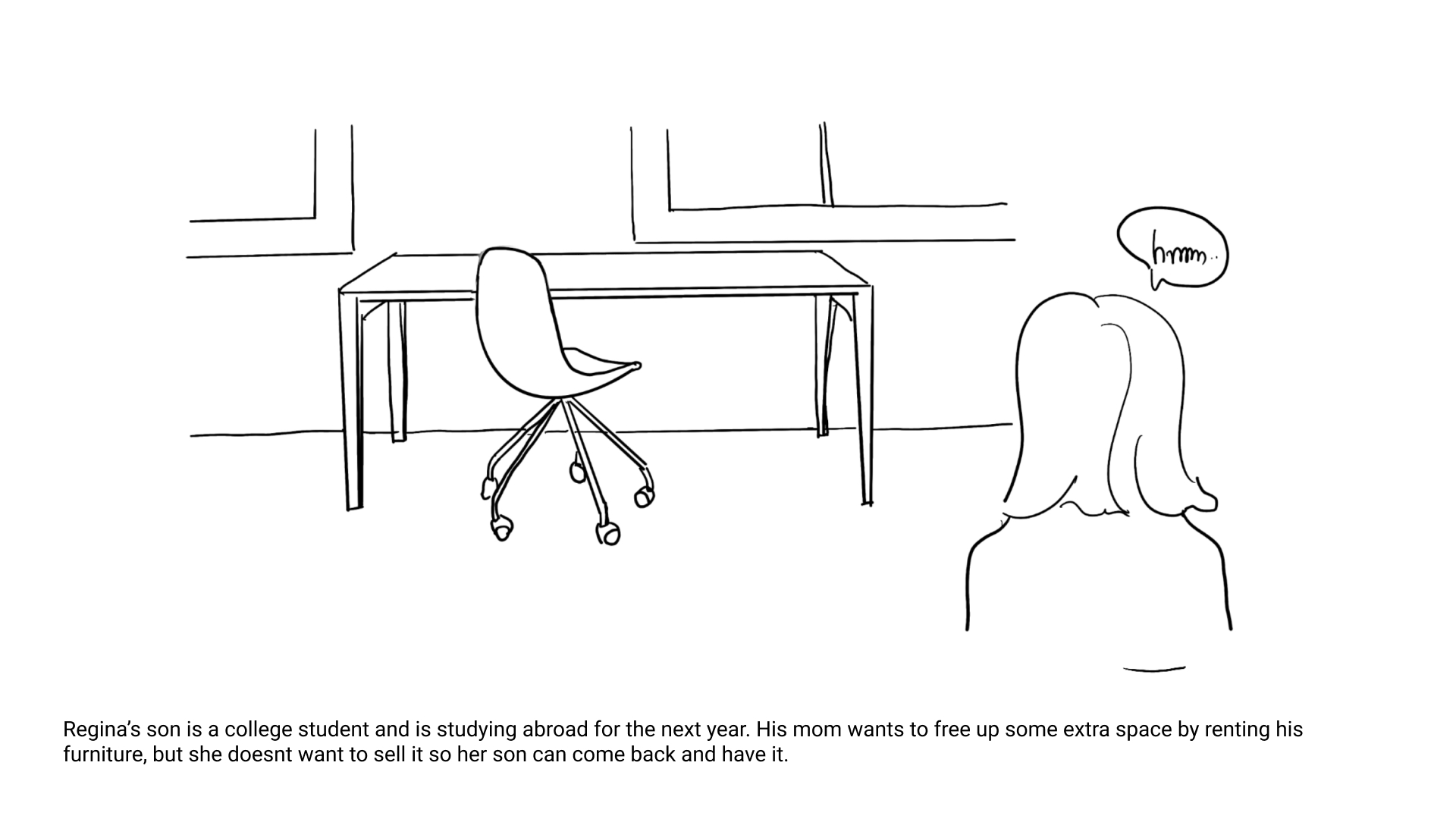
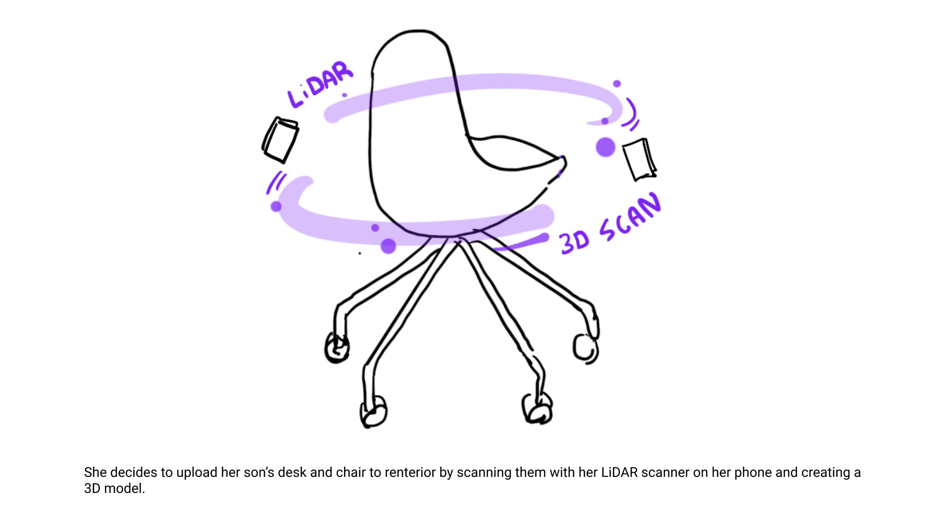
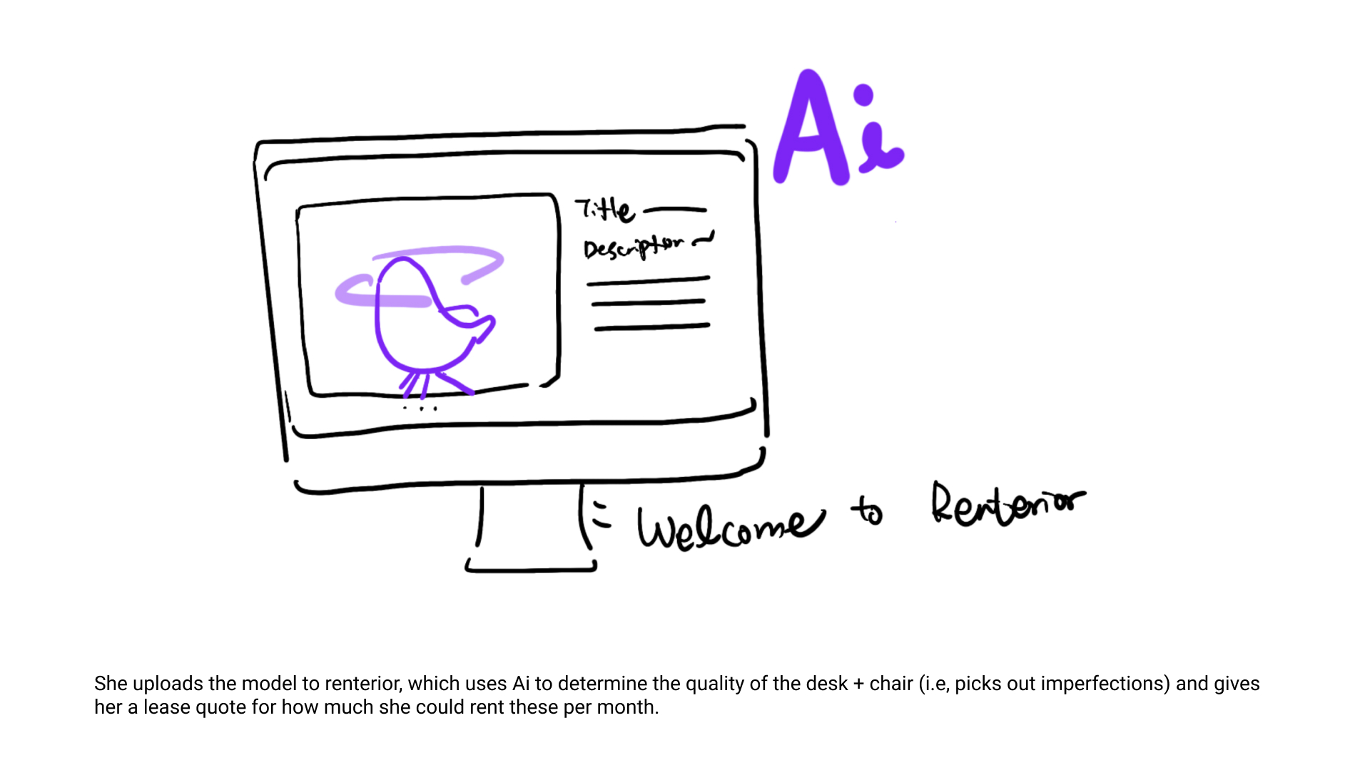
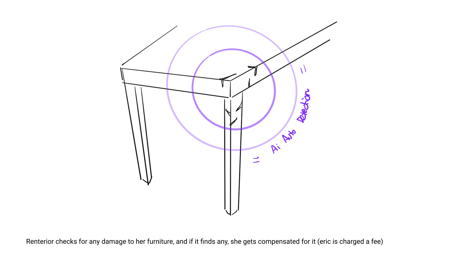
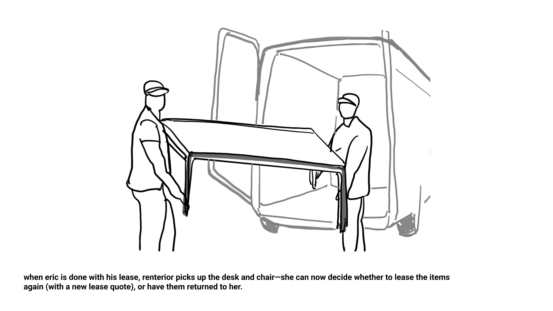
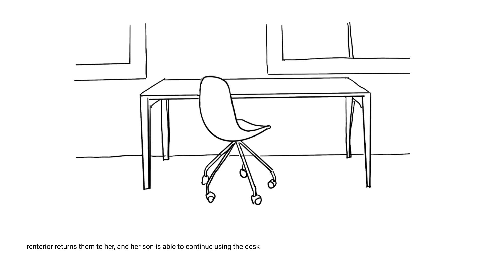
Storyboard from furniture owner's perspective
Refining Ideas
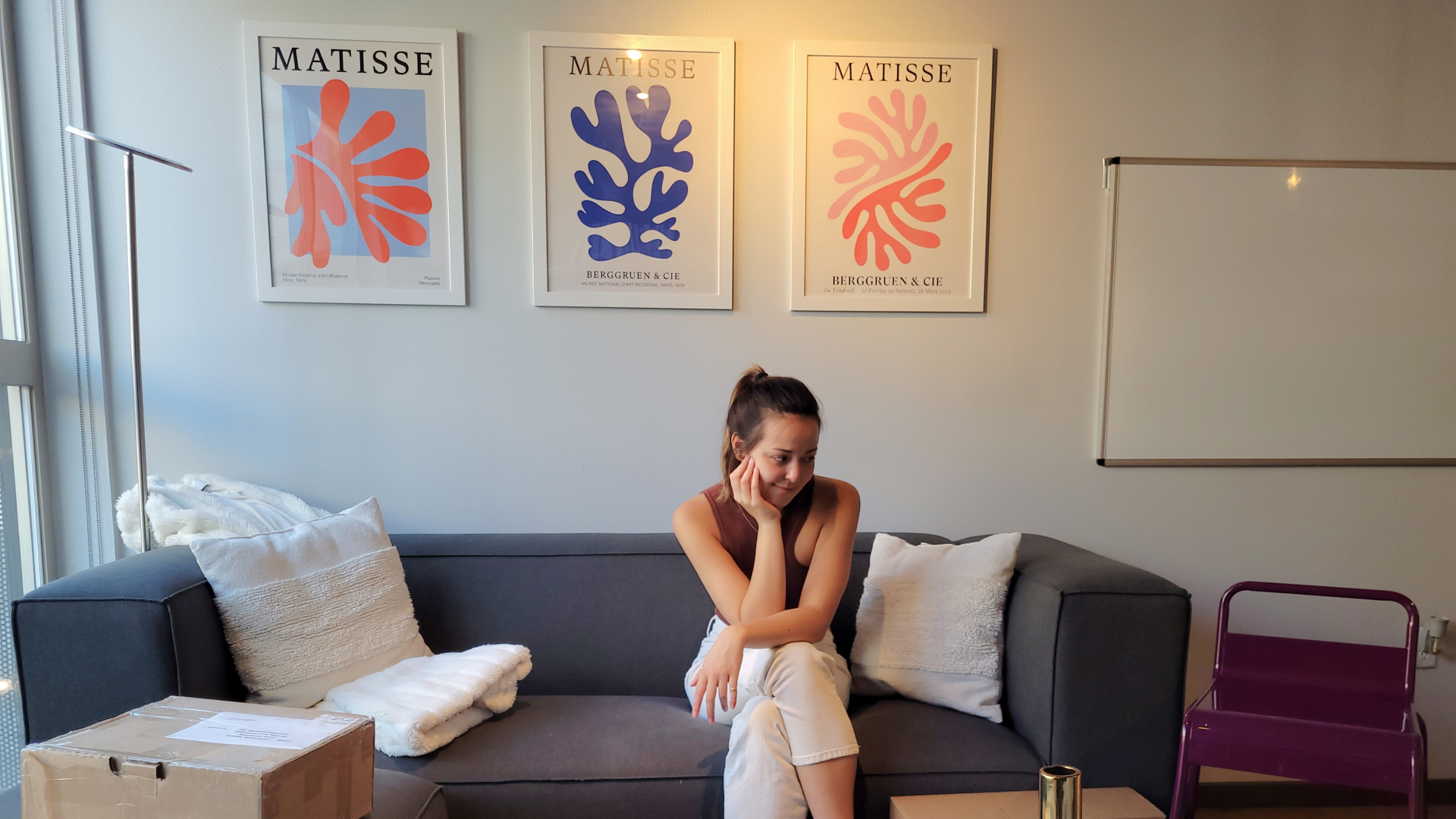
By presenting our storyboards to peers and other designers, we were able to refine our concept even further. Our storyboards became higher fidelity with mockups created in Figma and potography.
Prototyping in Figma
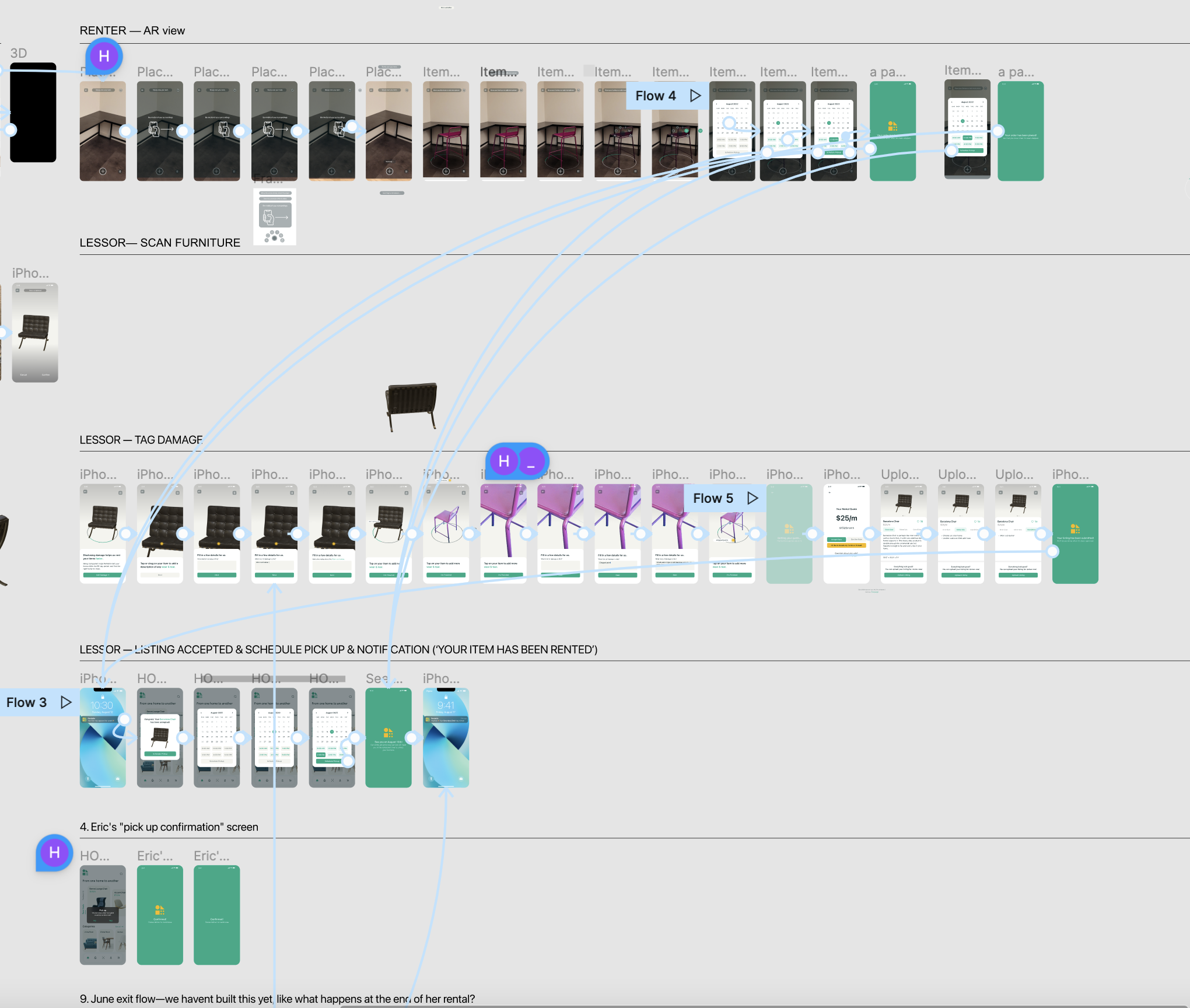
As we solidified the core flow we wished to prototype, the next step was to build our app's information architecture. Below is one of the diagrams I worked on to organize the features of Rentable, which helped our team decide which flows to design in Figma.

Creating High Fidelity Prototypes
The prototping process was extremely iterative. As we were building high-fidelity flows, we were constantly refining our information architecture. The prototypes were fully interactive and tested on our own phone screens.
Experimenting with LiDAR Scanning
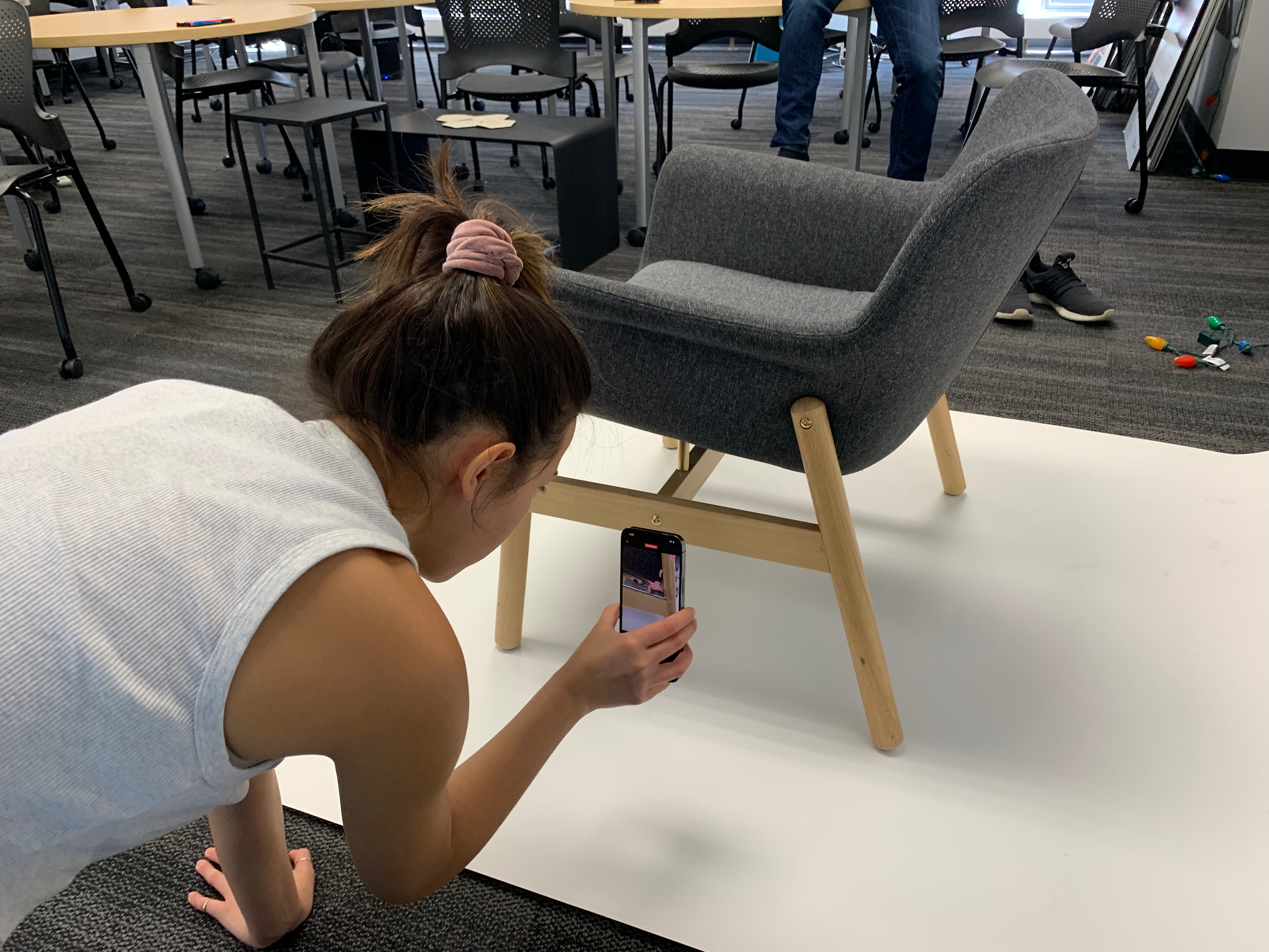
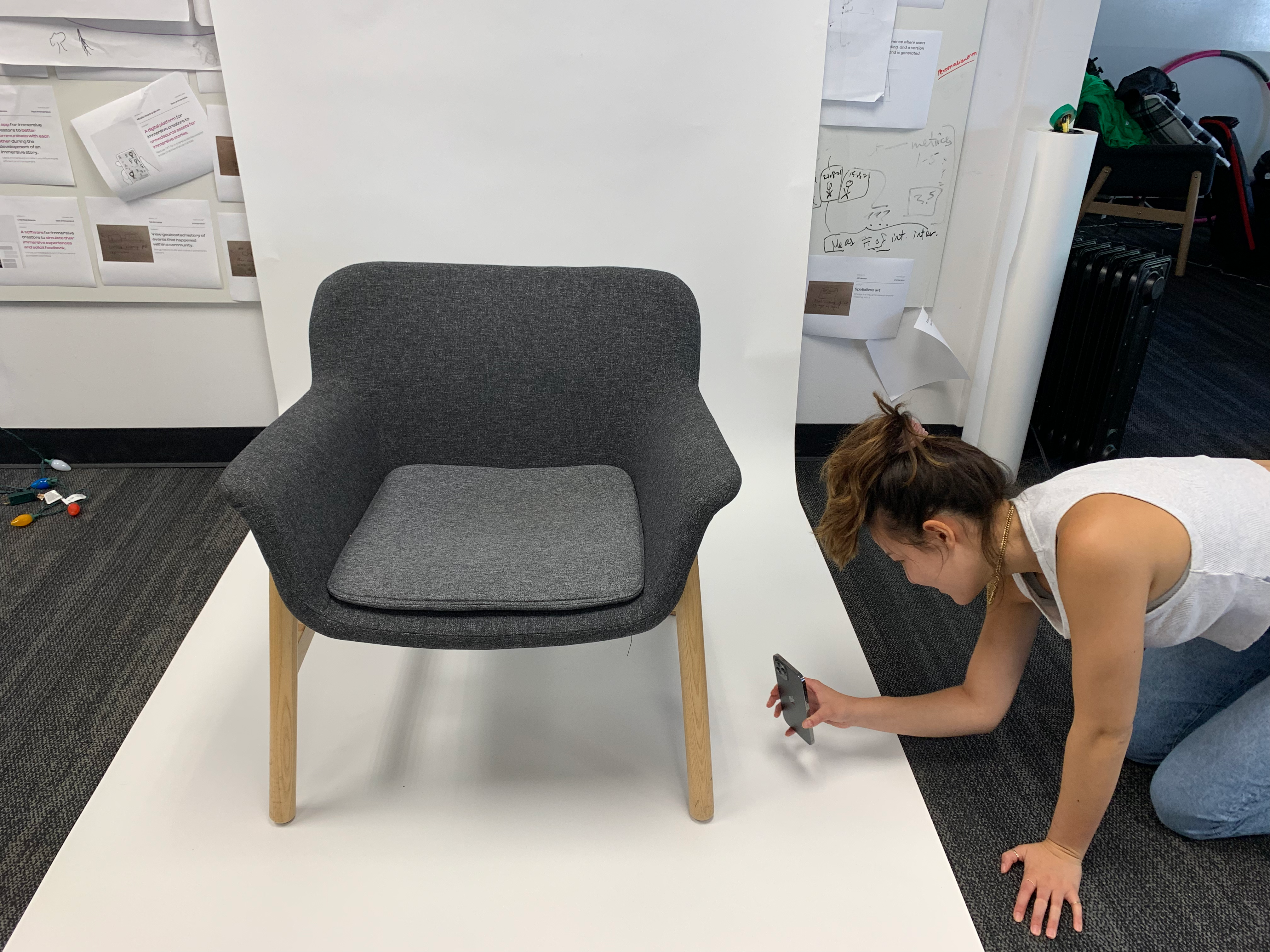
Since a key part of Rentable—creating 3D models of user's furniture—would involve LiDAR scanning, I got ahold of an iPhone 13 pro. I experimented with current 3D scanning technology, and used the models that we created in our app design.
A Video is Worth A Thousand Powerpoints
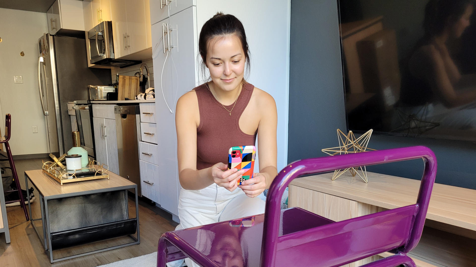
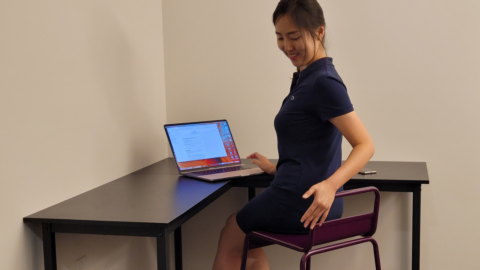
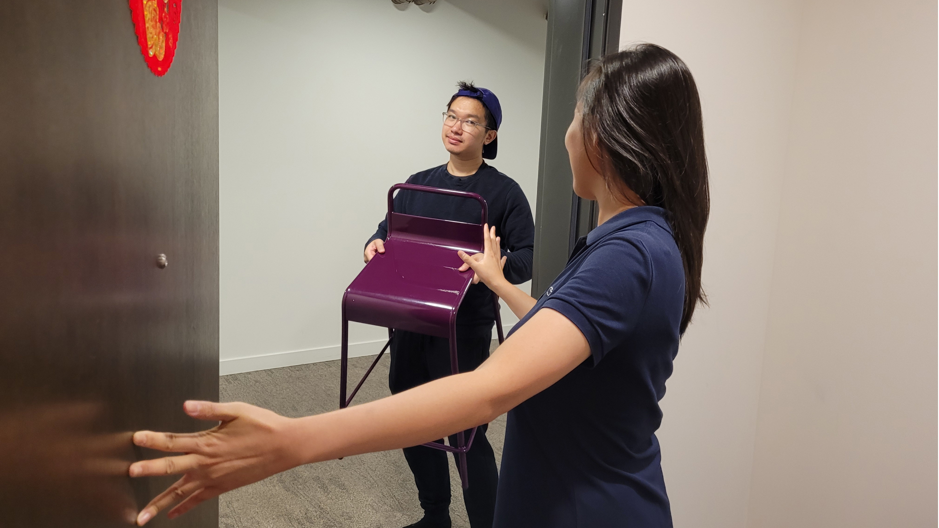
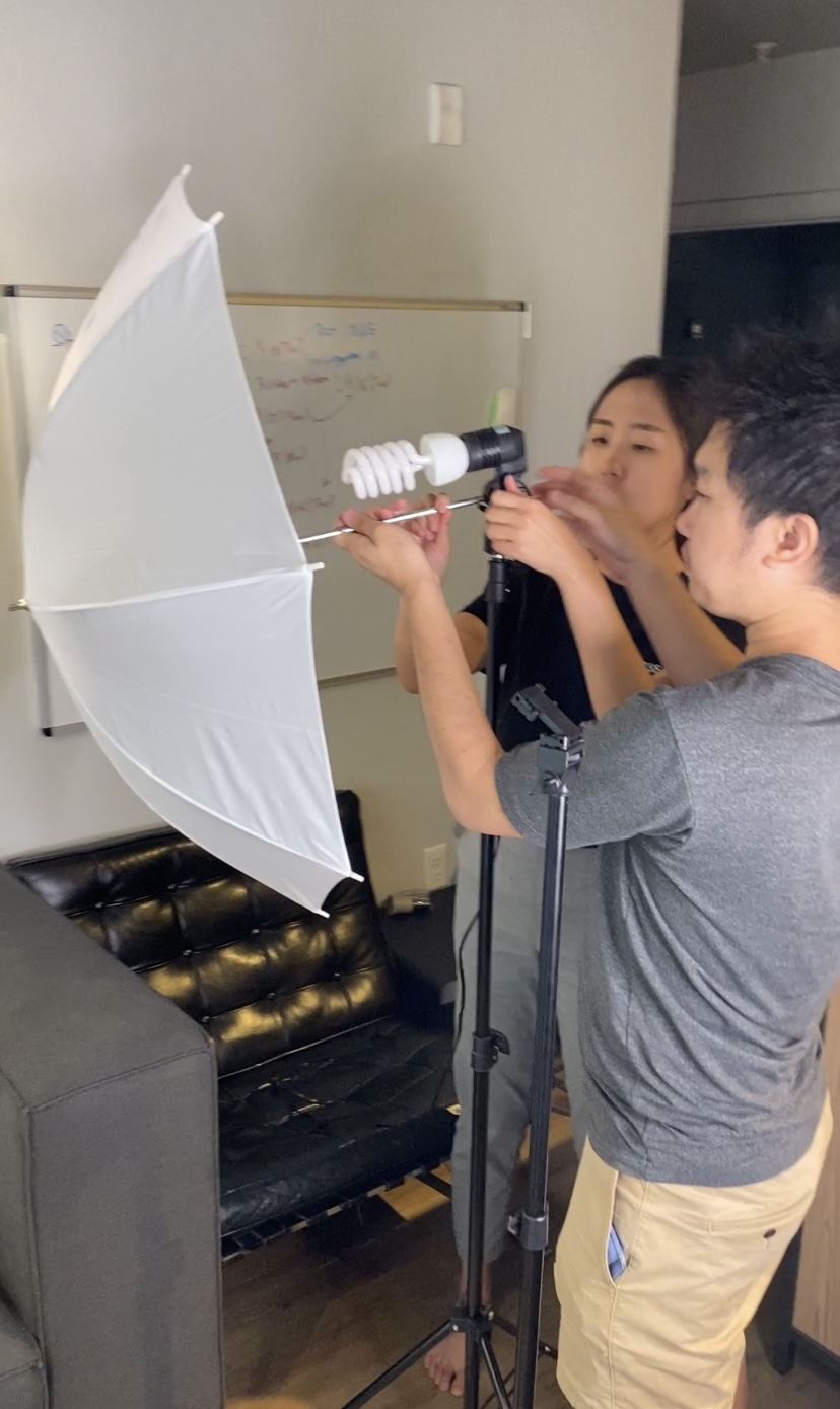
^ I believe this to be true. The best way to communicate a design solution is to show it in action, and video is an excellent tool for this. Using our phones, a few tripods and ligts, we turned my apartment into a production studio.
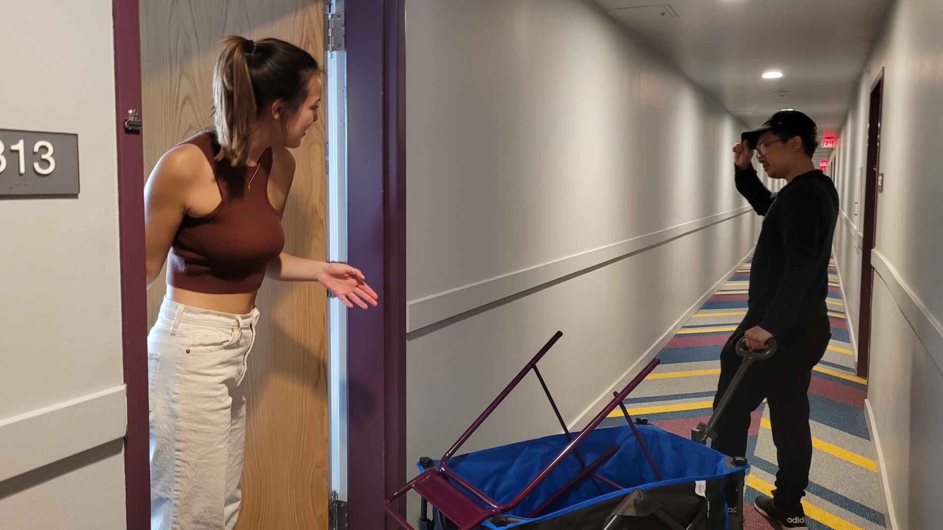
Far and away, video shooting was one of the biggest challenges during our design process. It involved hauling furniture between multiple locations across Seattle, and each of us acted as one of the characters in our storyboard. While this was difficult, it gave us complete creative control and we were able to problem solve on the fly as the video was being shot.
DESIGN
Key Features
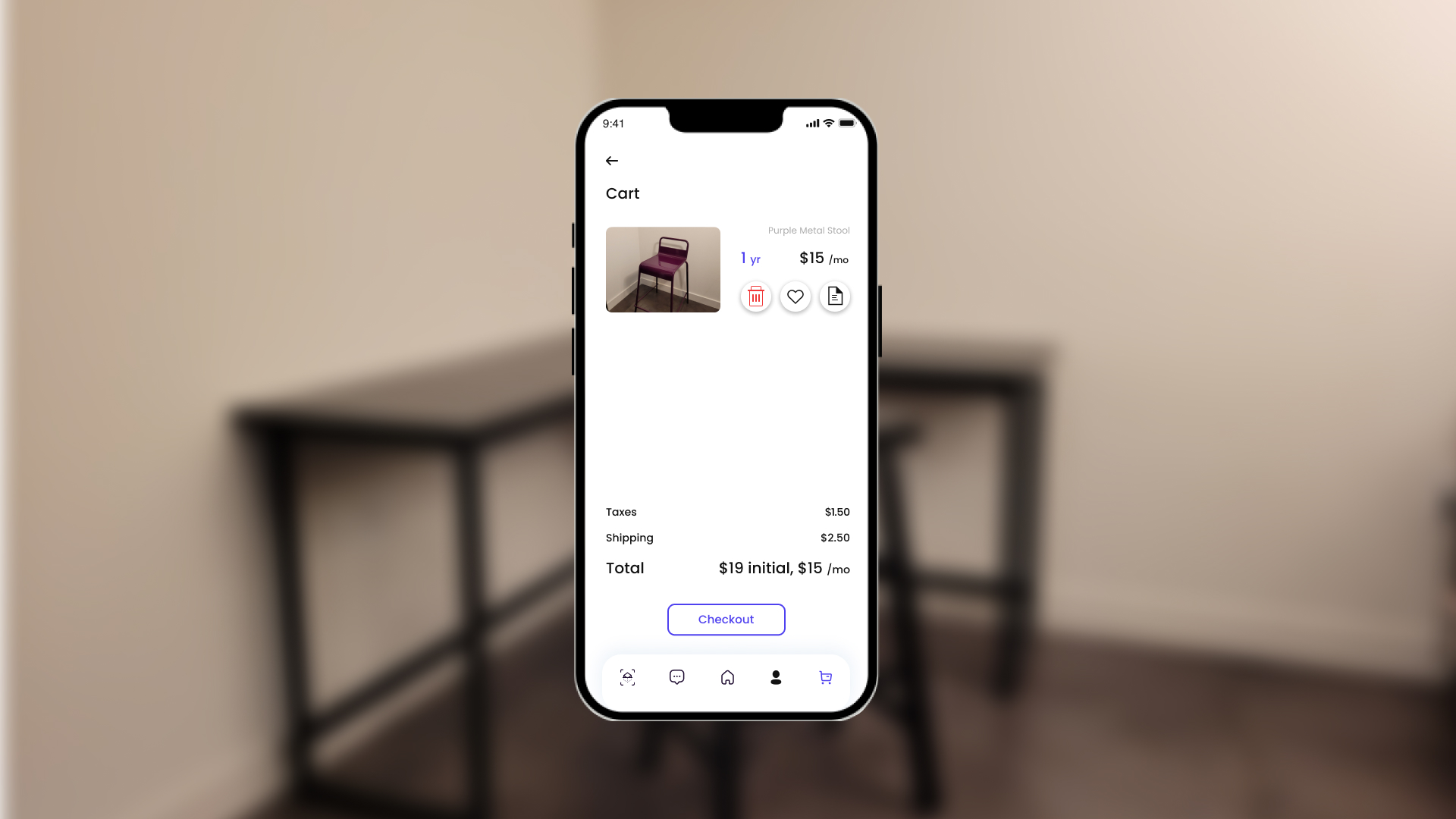
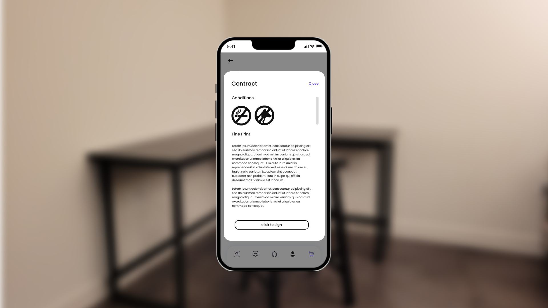
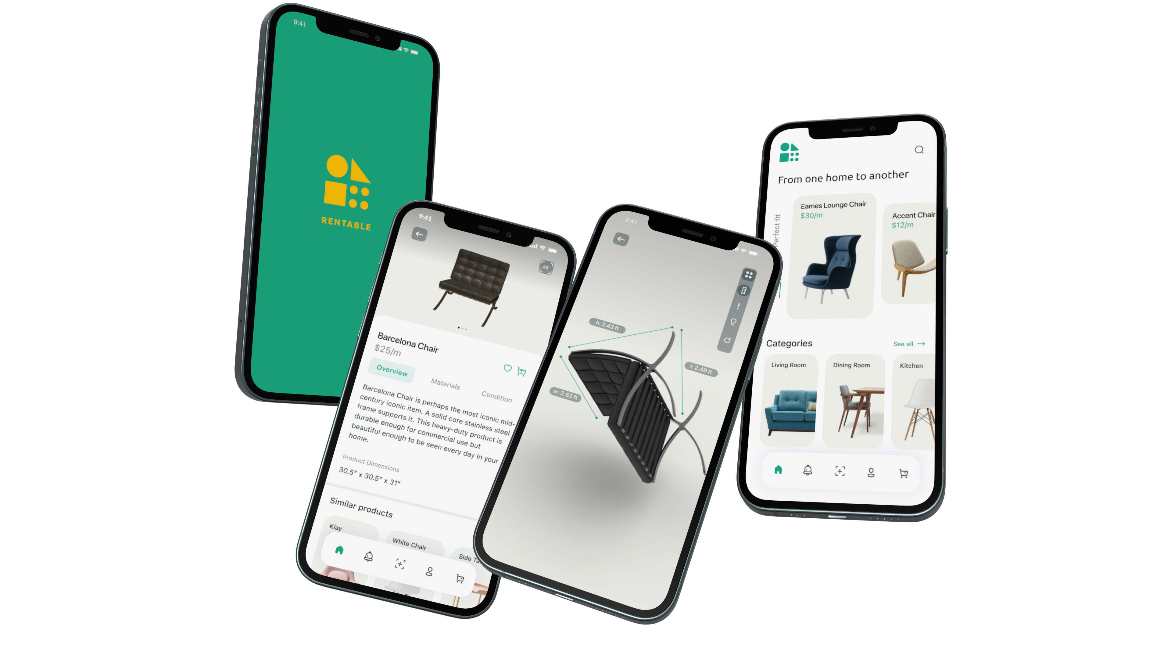
Below is a showcase of just a few of Rentable's key features and technologies. In no way is this exhaustive of everything that was prototyped, but this encapsulates many of the main touchpoints of the experience.
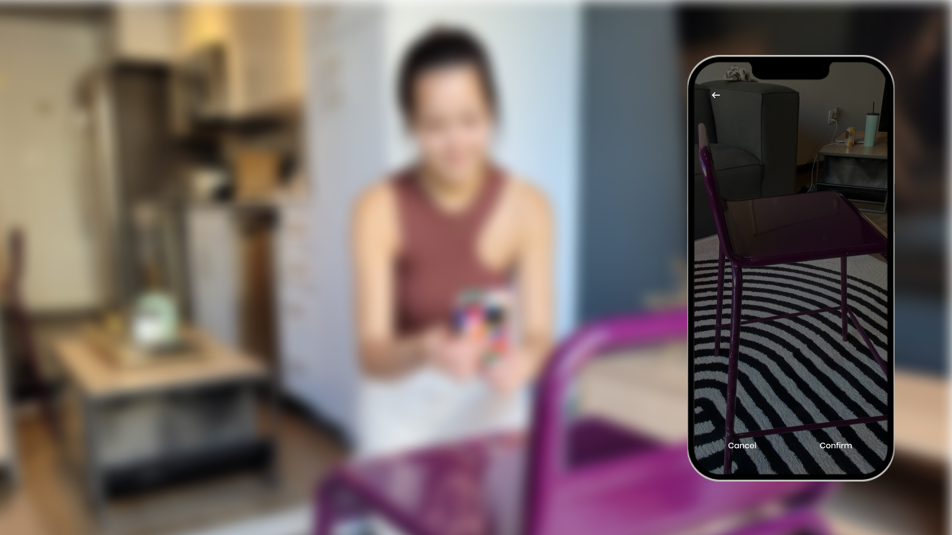
3D Scanning Your Furniture
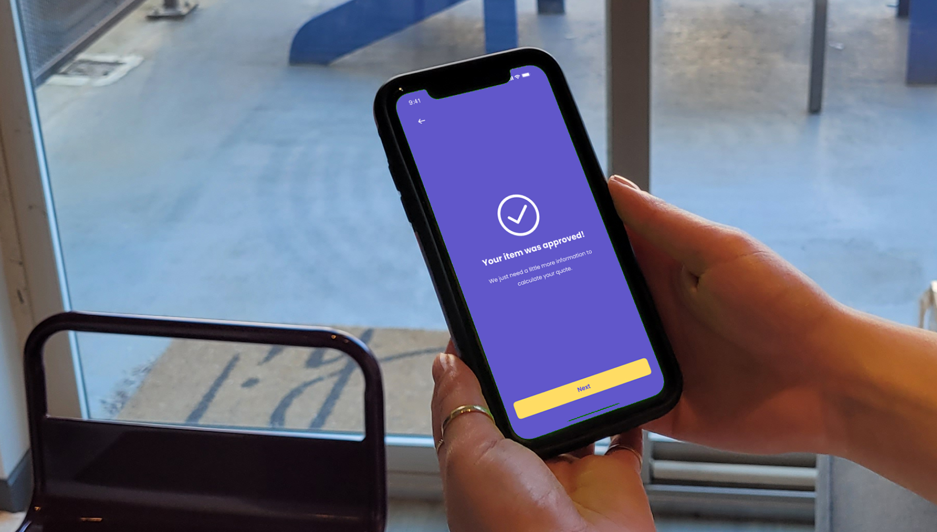
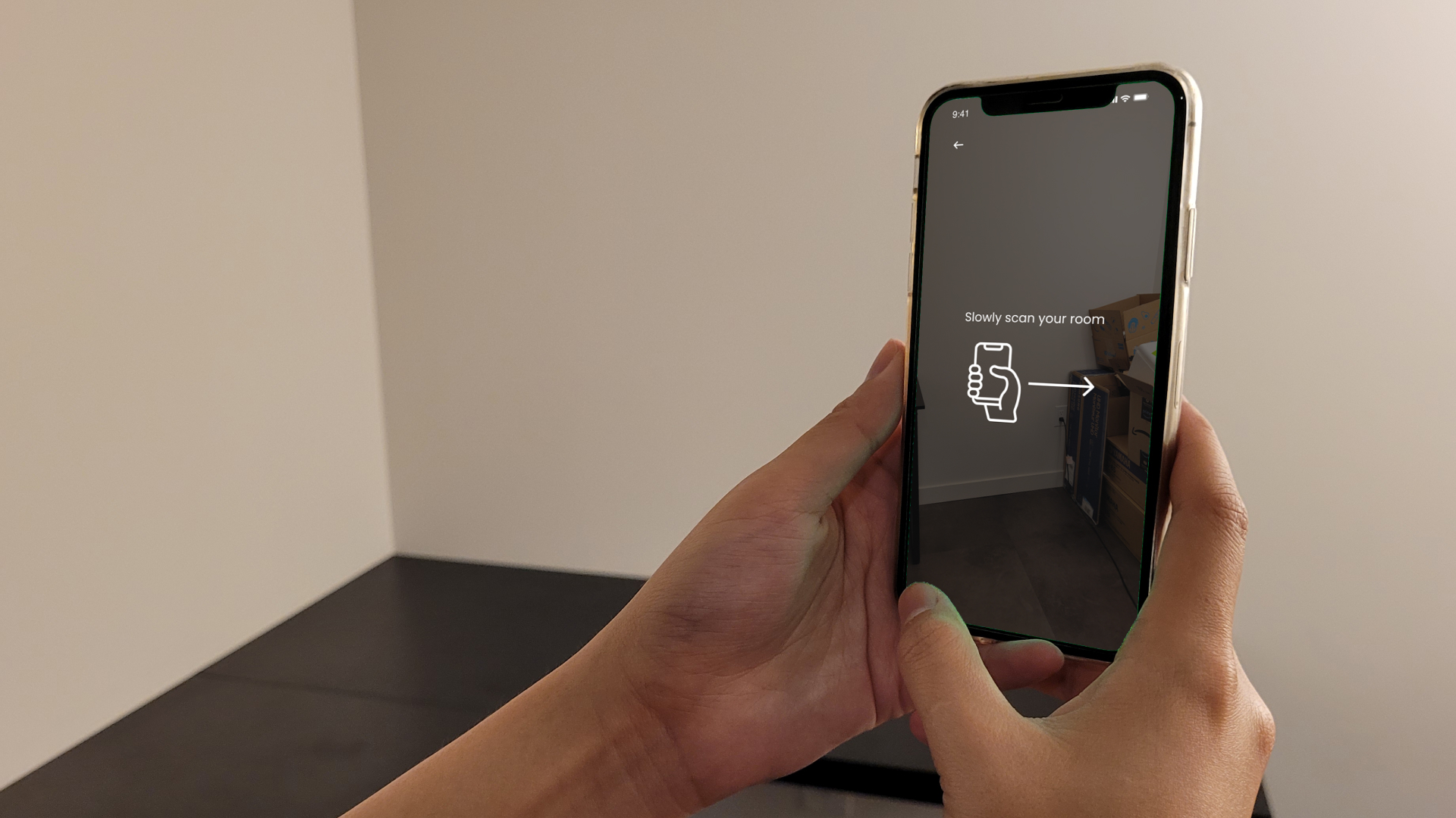
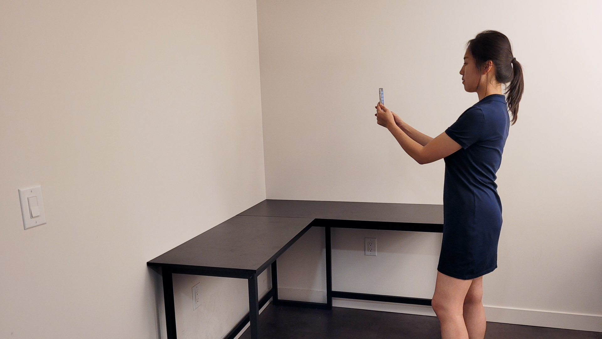
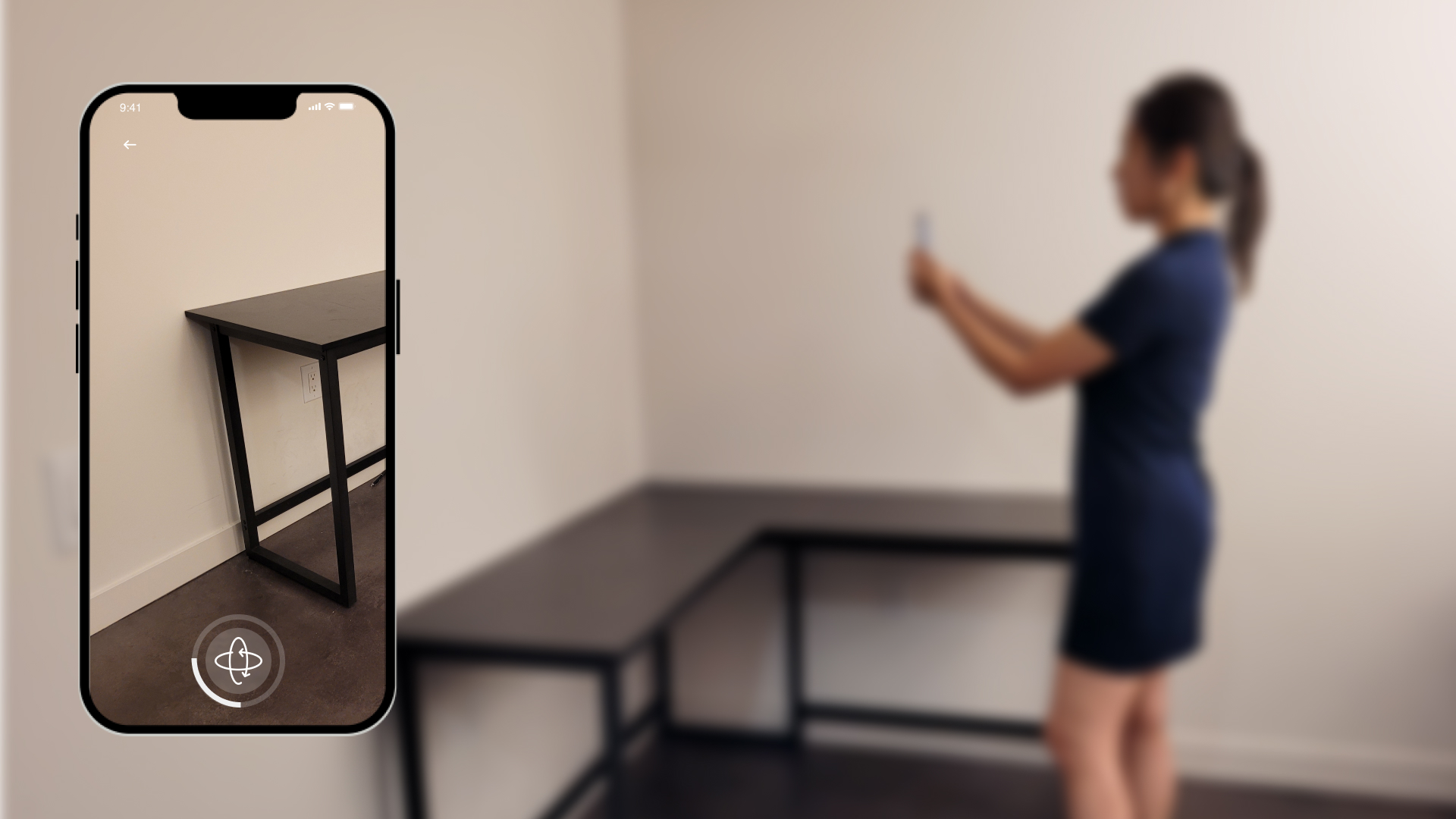
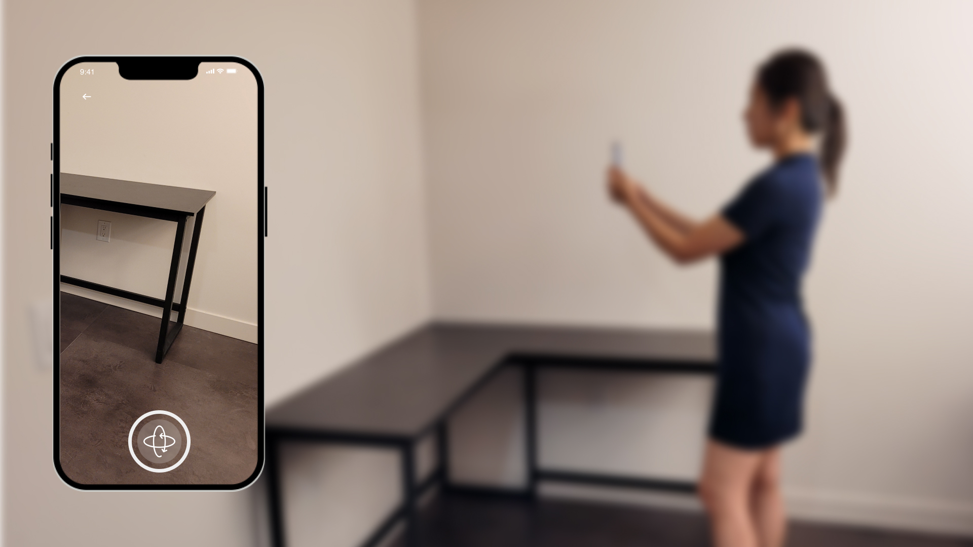
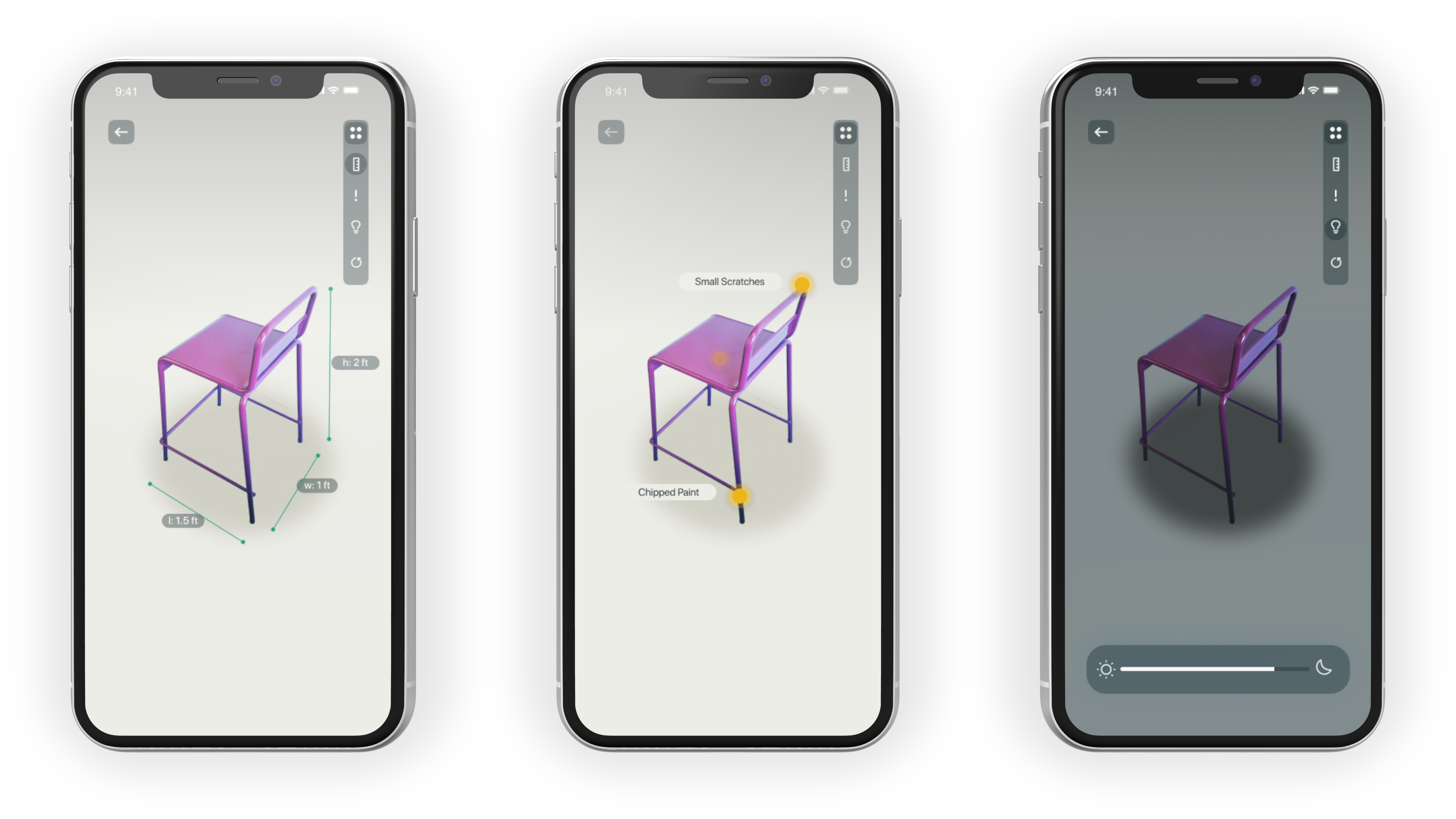
As the first step in creating a furniture listing on Rentable, we made the 3D scanning feature prominent within the home navigation. By tapping on the '+' icon, users will be walked through how to scan and upload a 3D model of their furniture. The app provides visual feedback to users as it uses surface detection to highlight which areas of the model have been successfully scanned.
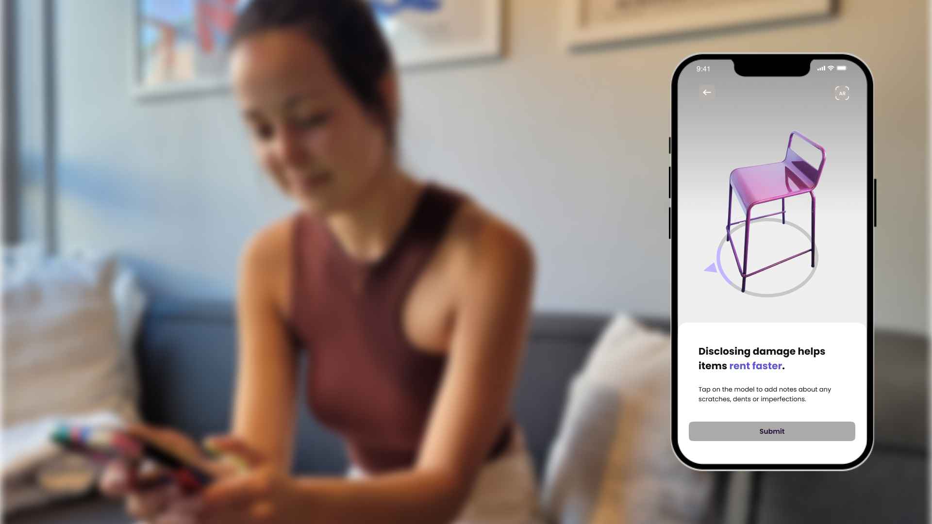
Tagging Wear & Tear
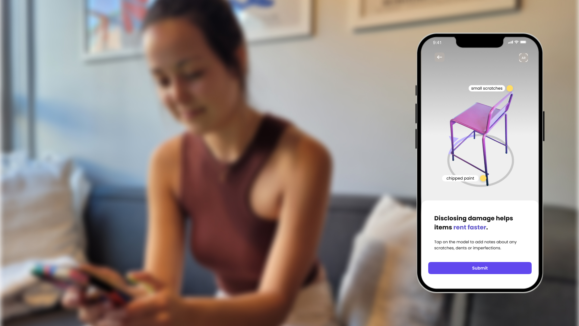
We prompt the user to disclose any wear & tear on their furniture by calling attention to the areas on the 3D model. Users can zoom in, tap on the model, and add a description for prospective renters to inspect.
Viewing Furniture In Augmented Reality
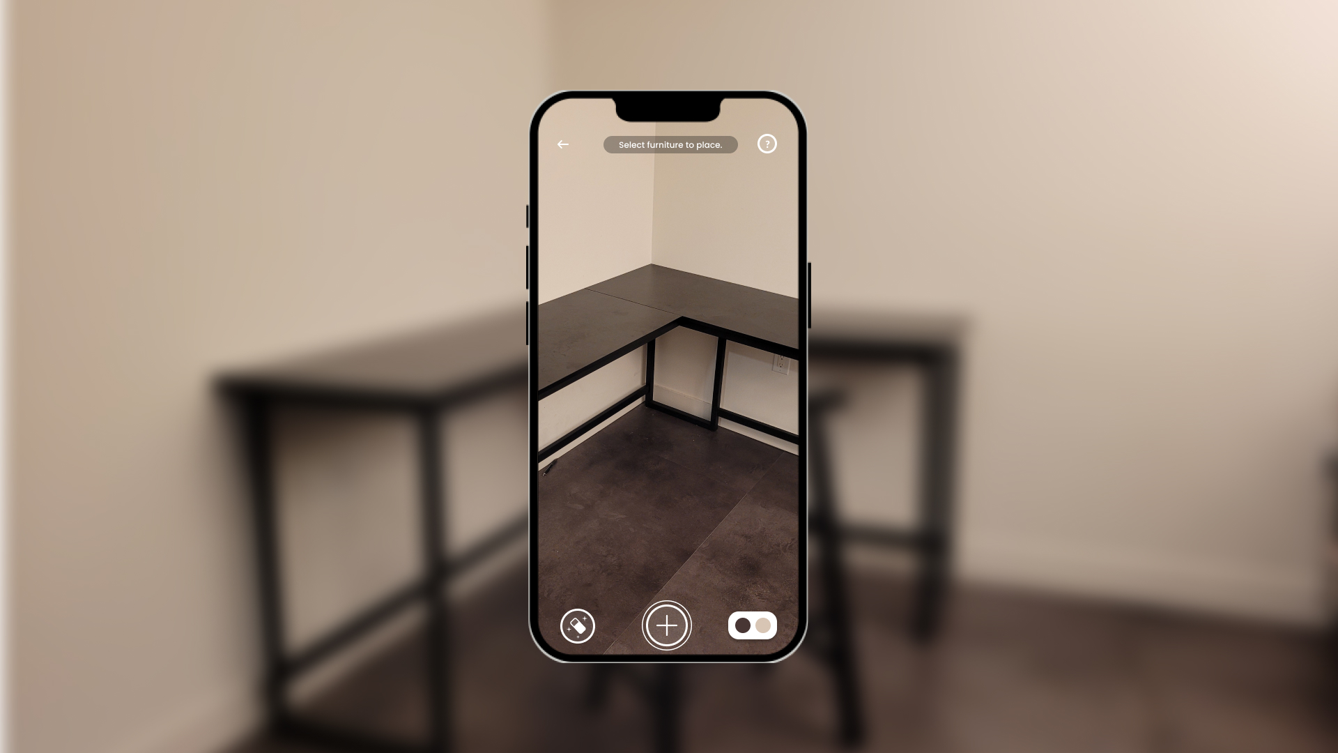
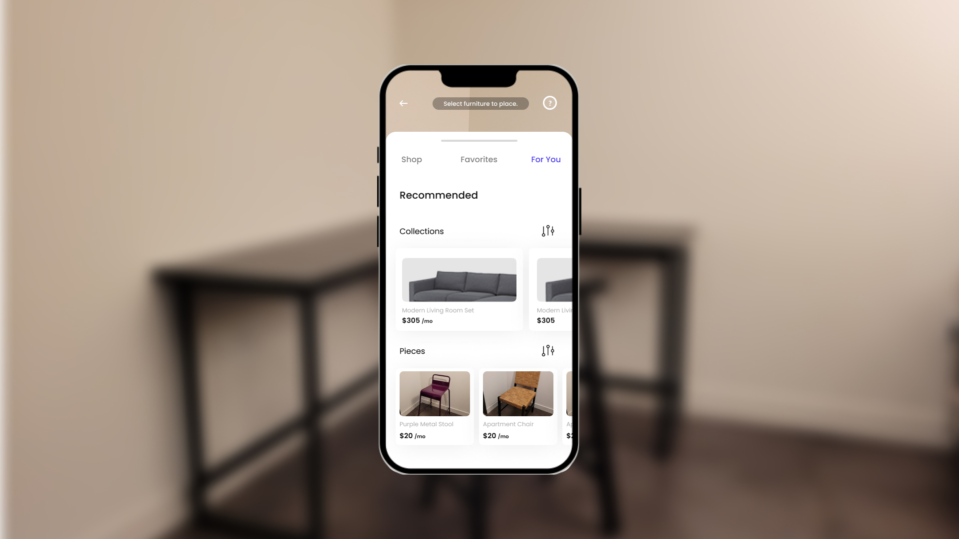
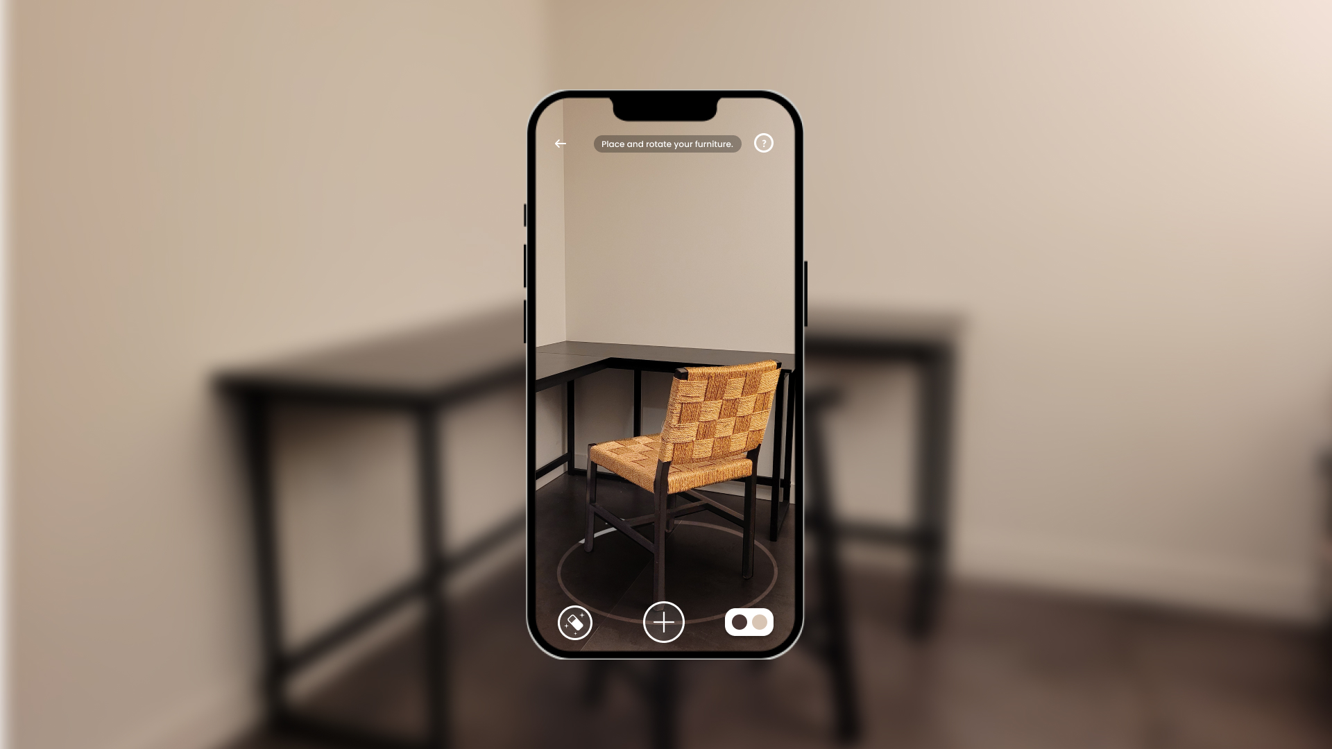
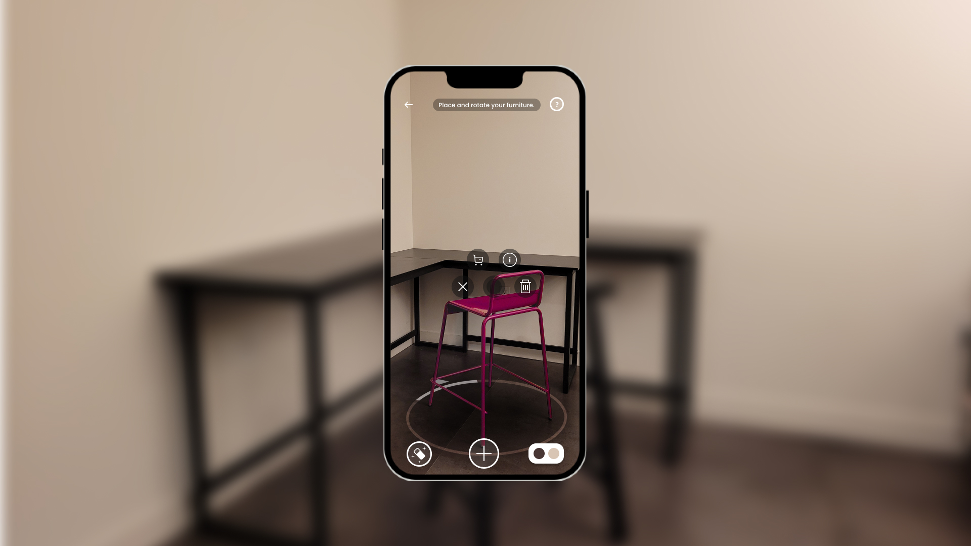
On the side of the rentee, users can preview and inspect true-to-scale furniture in their homes and design their own room. From the listing page, users simply tap the 'AR' icon to launch this experience.
Schedule Pickup Time
This is where Rentable's technology meets it's service design. After uploading their furniture listing to Rentable, users can schedule a time that works for them for Rentable to pickup their furniture and transport it to a hohlding location.
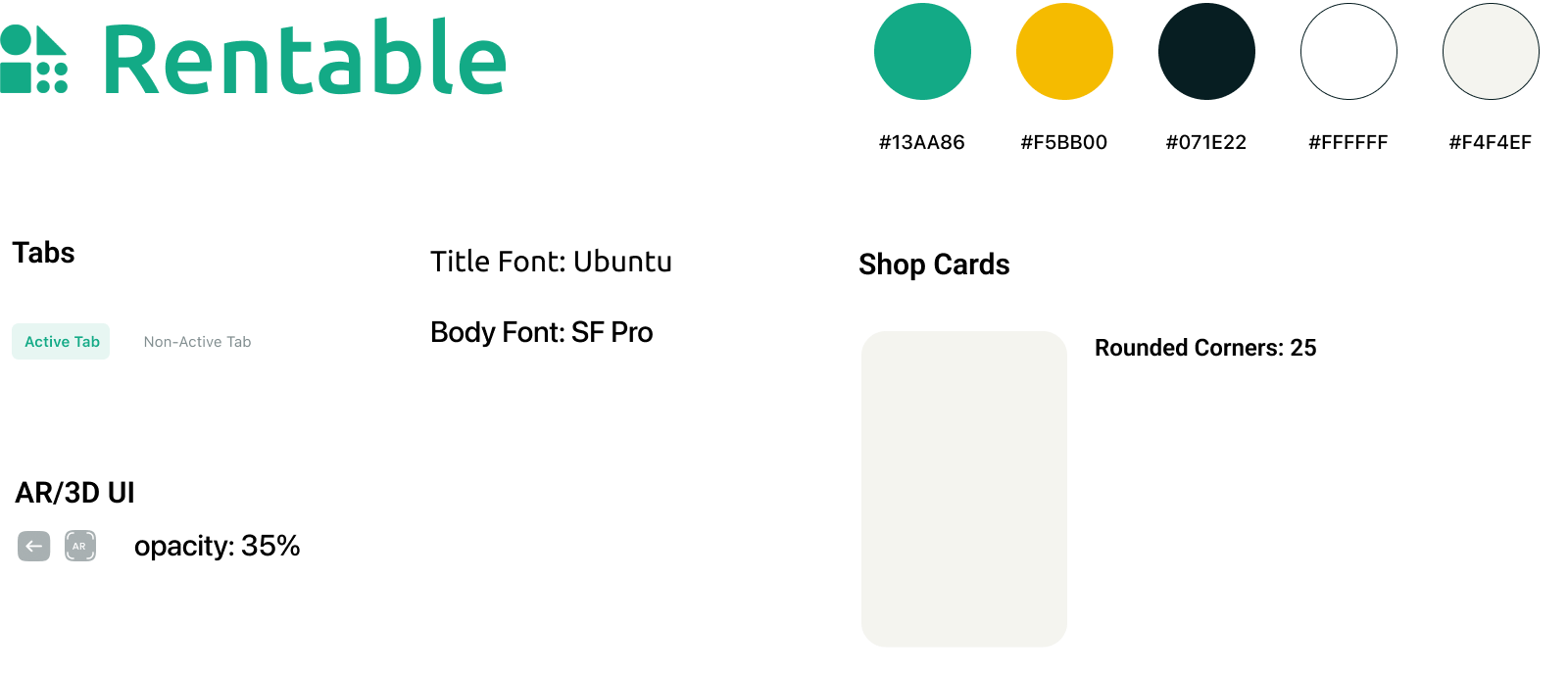
Design System
Product Mockups
REFLECTION & OUTCOMES
Looking Back & Running Forward
No project is ever perfect. Rentable was my capstone project for my masters in human-computer interaction + design at UW, an intense and fast-paced environment. Much of the research we wanted to conduct, features we wanted to build and prototypes we wished to test fell down the triage list in favor of other, high-priority items.
This project certainly challenged me. Our team was comprised of three UX designers, so I leaned on m previous experience in marketing and journalism durng our research phase. Working on a design-heavy team also meant a fair amount of delegation and compromise as Rentable's design system came together.
At the end of the day, Rentable is a project I'm incredibly proud of, and much of the feedback we received from professors, peers and industry folk was "when are you going to seek funding for this idea?" And, spoiler alert, I successfully defended Rentable and earned my master's degree.
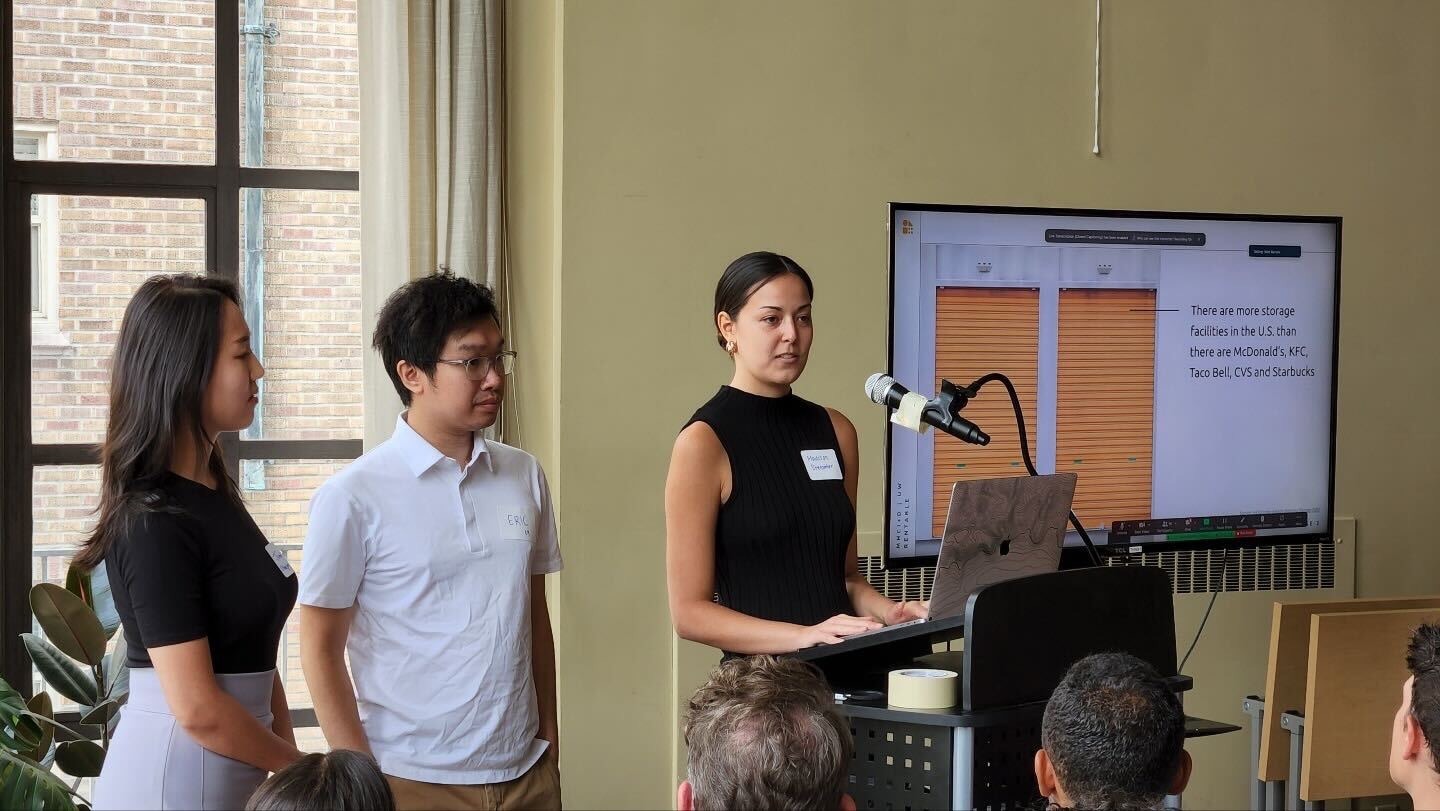
Presenting Rentable at our Capstone Showcase to instructors, industry folk, and peers
Next Steps
1. More User Testing
While we had the opportunity to test our storyboards and Figma prototypes on our peers, classmates and instructors, if given more time (and budget!) we would have liked to conduct full usability tests on Rentable. I'm certain there are improvements to the UI that would make our features easier to find or use, especially when dealing with emerging tech like LiDAR and AR that some users may be unfamiliar with.
2. Additional Research on Furniture Rental
Our research centered mostly on users who have bought or sold their used furniture, but since furniture rental is a *new* concept, this was extremely difficult to recruit for. We did manage to speak with one participant who had rented furniture previously. However, interviewing additional participants would make these findings more significant and reliable.
3. Testing Emerging Technology
LiDAR and AR are emerging technologies that many users are unfamiliar with. Not to mention, these technologies are not yet perfect. These technologies will continue to improve, but as it currently stands, if Rentable were to be launched now, we'd be working with many limitations. Likely, this would mean involving additional services or workarounds to our current design, including allowing users to uplaod images instead of 3D models, or providing a service to "clean" 3D models from LiDAR scans.
— taLK sooN?
projects
connect
chat
BASED IN SEATTLE, WA
MADISON STEMMLER
