TL;DR
#UX Design #Prototype #Augmented Reality
#UX Research
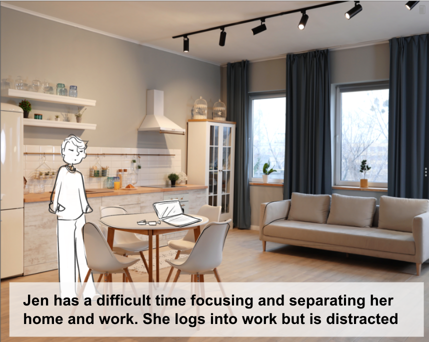
We helped to preserve the mental and physical boundaries between work and home life using augmented reality to create virtual offices for remote workers in small spaces, enabling them to create a healthier work-life balance.
Role
UX Designer, Interview Moderator, Prototyping, 3D Design
Tools
Figma, Adobe Aero, Blender, Premiere Pro
Team
Madison Stemmler, Nick Brown, Isha Agarwal, & Tashao Yu
Timeline
10 weeks
Have a sec? Check out this lil' demo ↓
Ugh. Another pandemic project?
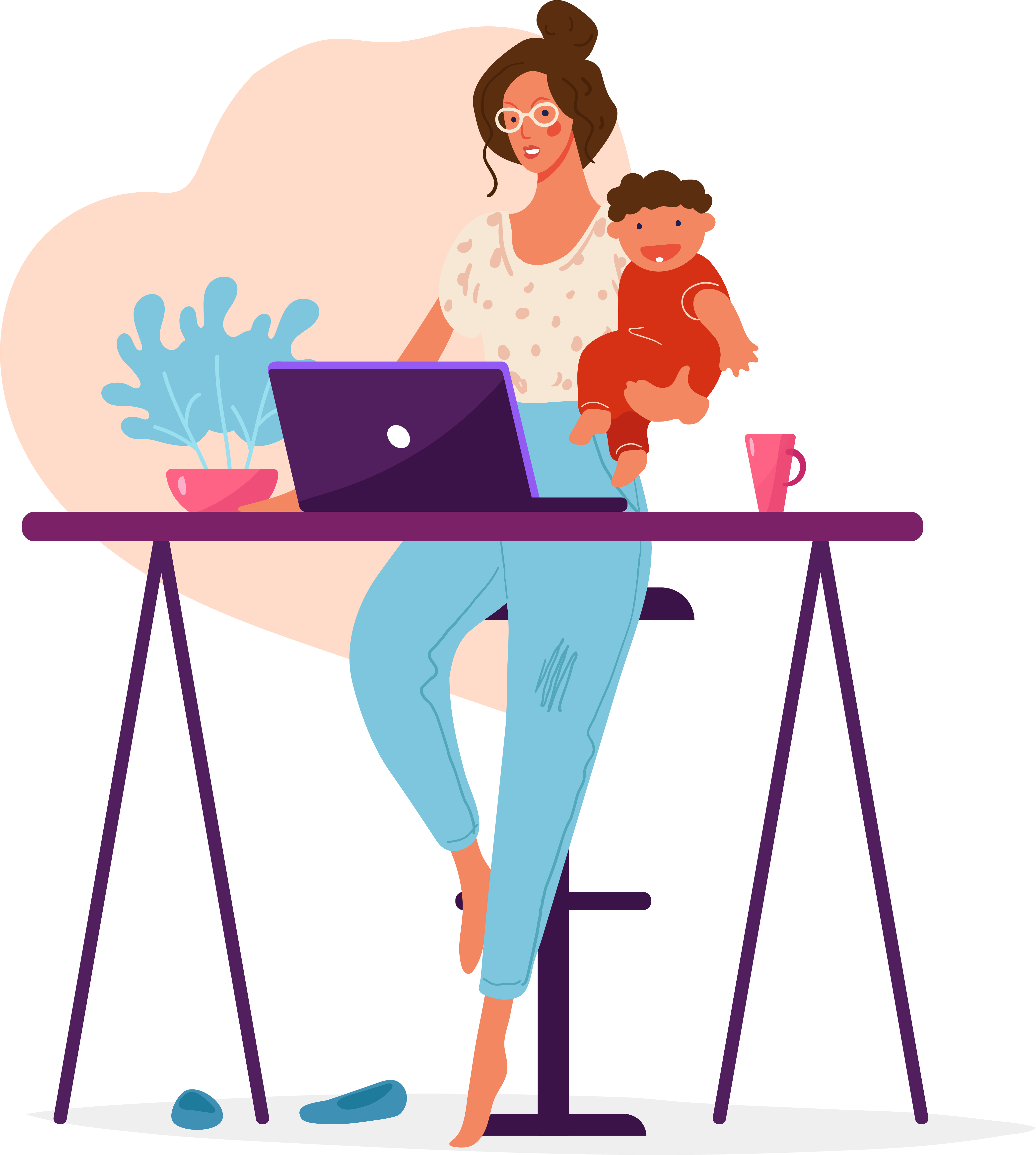
Don’t groan—yes, this is a COVID-inspired project, but really it tackles a problem workers have always faced: having an effective work-life balance. The pandemic simply exposed how easily our homespaces can be compromised by our workspaces.
Our homes weren't made for working.
When the lockdowns began, our places of rest—of refuge—from a stressful workday were invaded by swifty-assembled computer monitors and office desks from Amazon. Overnight, the living room became our office, gym and dining room all at once. Feelings of “stir craziness” were rampant, particularly for those who lived in small spaces like city apartments.
Our Design Solution
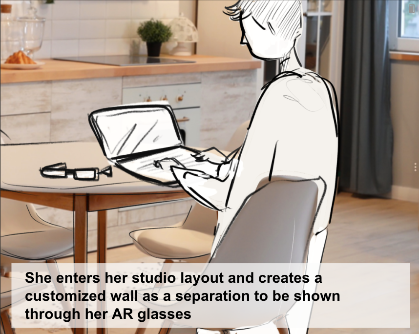
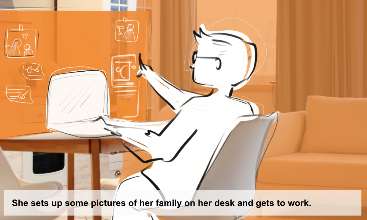
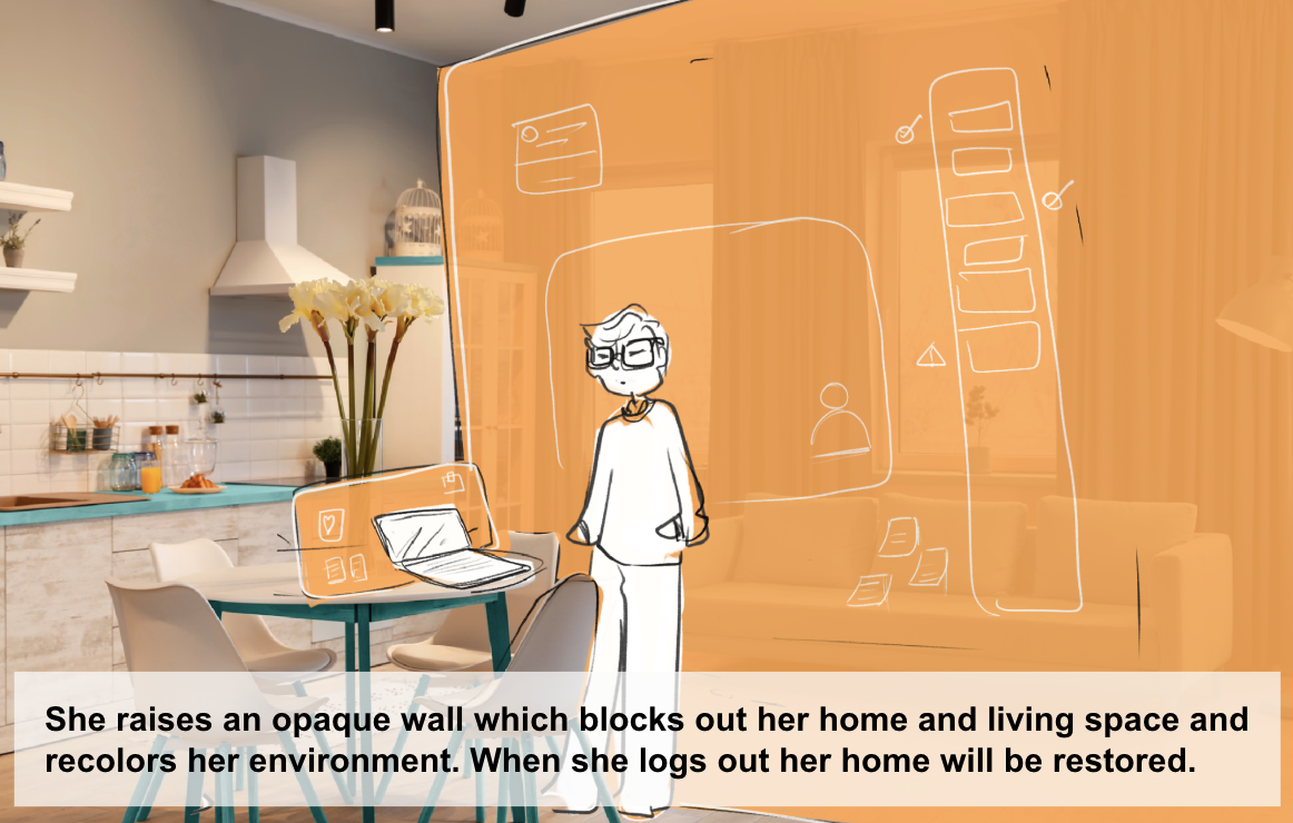
To promote a healthy work-life balance for remote workers, our team designed Cloak to preserve the mental and physical boundaries between their work and home lives. Using augmented reality and a head-mounted display, Cloak enables workers to design a personalized home office. Remote workers can customize their office how they see fit with walls, windows, widgets and workable surfaces like whiteboards. Cloak works to minimize distractions during the work day, keeping home feeling like home at the end it.
EXPLORATION
Research Methods Overview
Literature Review, Survey, Screener, Semi-Structured Interviews, 3-day Diary Study
Constraints
The two biggest constraints of this project are the two most common constraints of any project: time, and budget. Namely, the lack of either. Our team had zero budget to recruit individuals to our study, nor to build prototypes with. We were also pressed for time as this entire project came to its culmination after 10 weeks.
You can check out our study plan here →
Secondary Research Findings & Early Assumptions
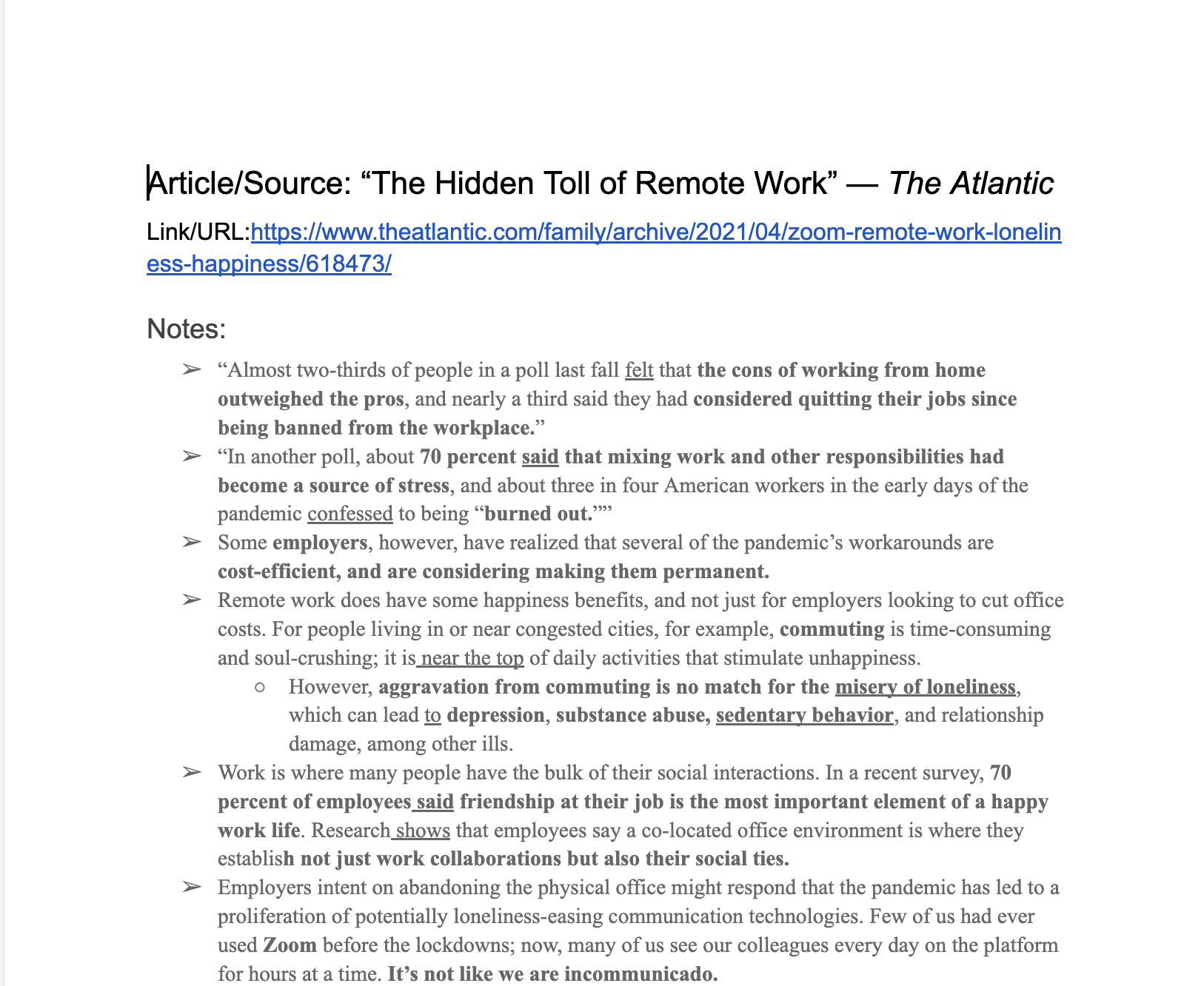
Before designing the primary phase of our research study, I wanted to begin with a comprehensive literature review on how remote work was affecting people durig the pandemic. This research would give us a good foundation to conduct our own research.
(Office) Desk Research
As I began to investigate how the pandemic affected our relationship with our home lives, I started with a comprehensive literature review on the topic. While some research dated back to the invention of the mobile phone and laptop, most of it was from the previous two years as the pandemic molded our lives anew.
Primary Research
Hey there, this is the default text for a new paragraph. Feel free to edit this paragraph by clicking on the yellow edit icon. After you are done just click on the yellow checkmark button on the top right. Have Fun!
For once, recruitment was easy
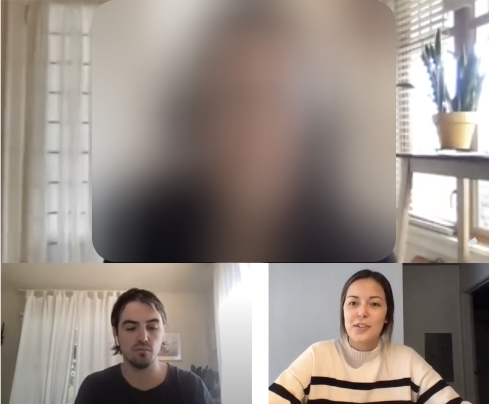
Participants were recruited for our primary study via LinkedIn through a survey link. Naturally, in the COVID-19 era, recruiting for remote workers was a cinch: we had 48 esponses to our survey.
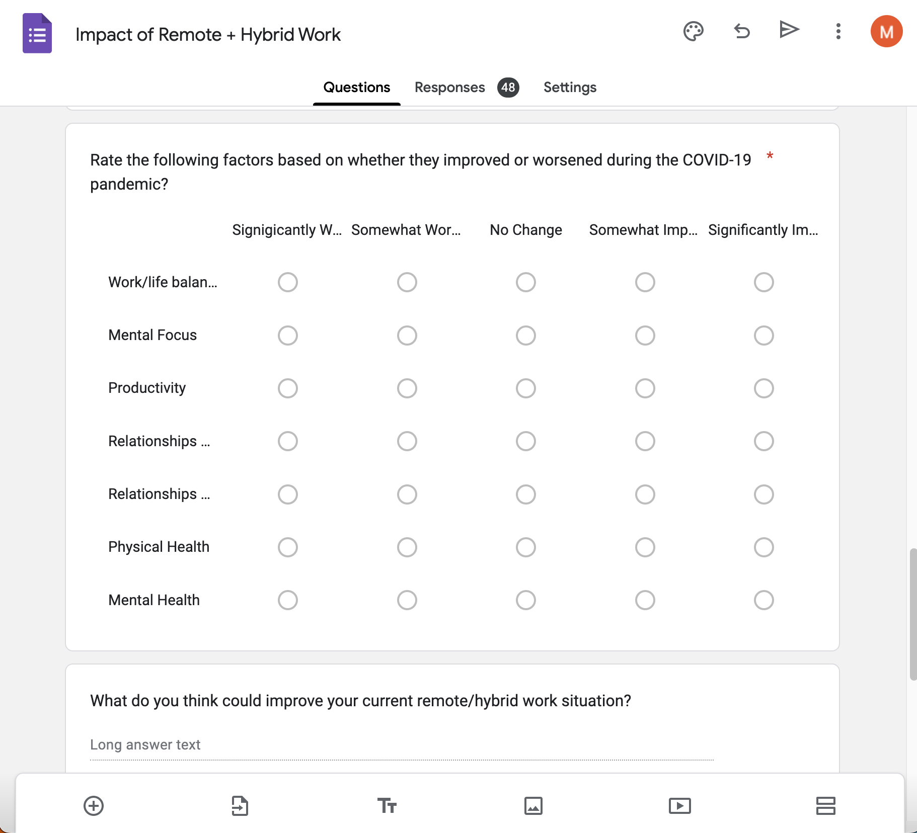
Interviews were conducted on Zoom, naturally.
We elected to conduct semi-structured interviews with eight remote workers to hear about their personal experience since moving to work-from-home. Interviews were conducted via zoom, in which I acted as moderator while another teammate took notes. I also authored a session guide with specific questions and probes to keep interviews consistent between participants.
Diary (Study) of a Remote Worker
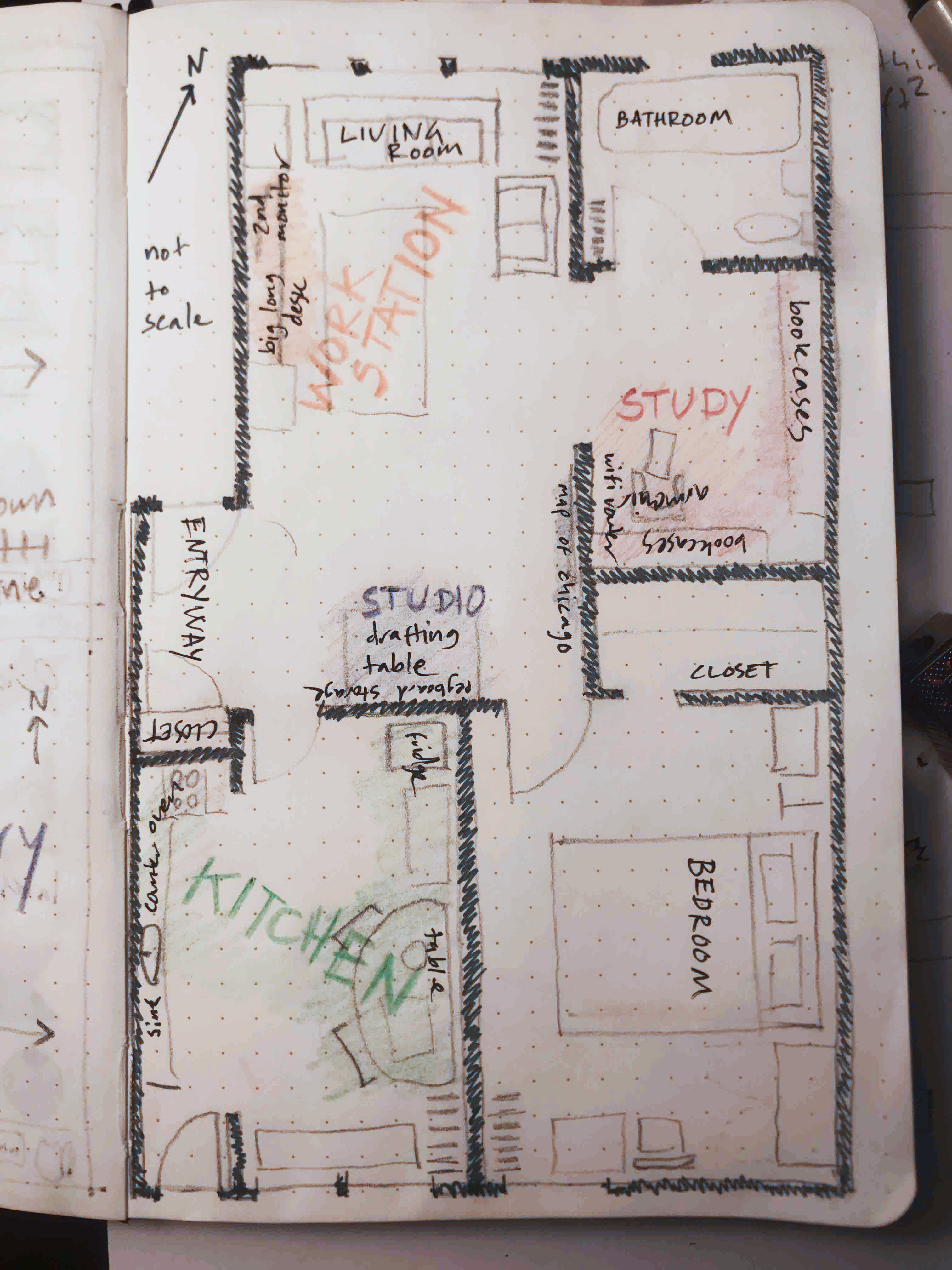
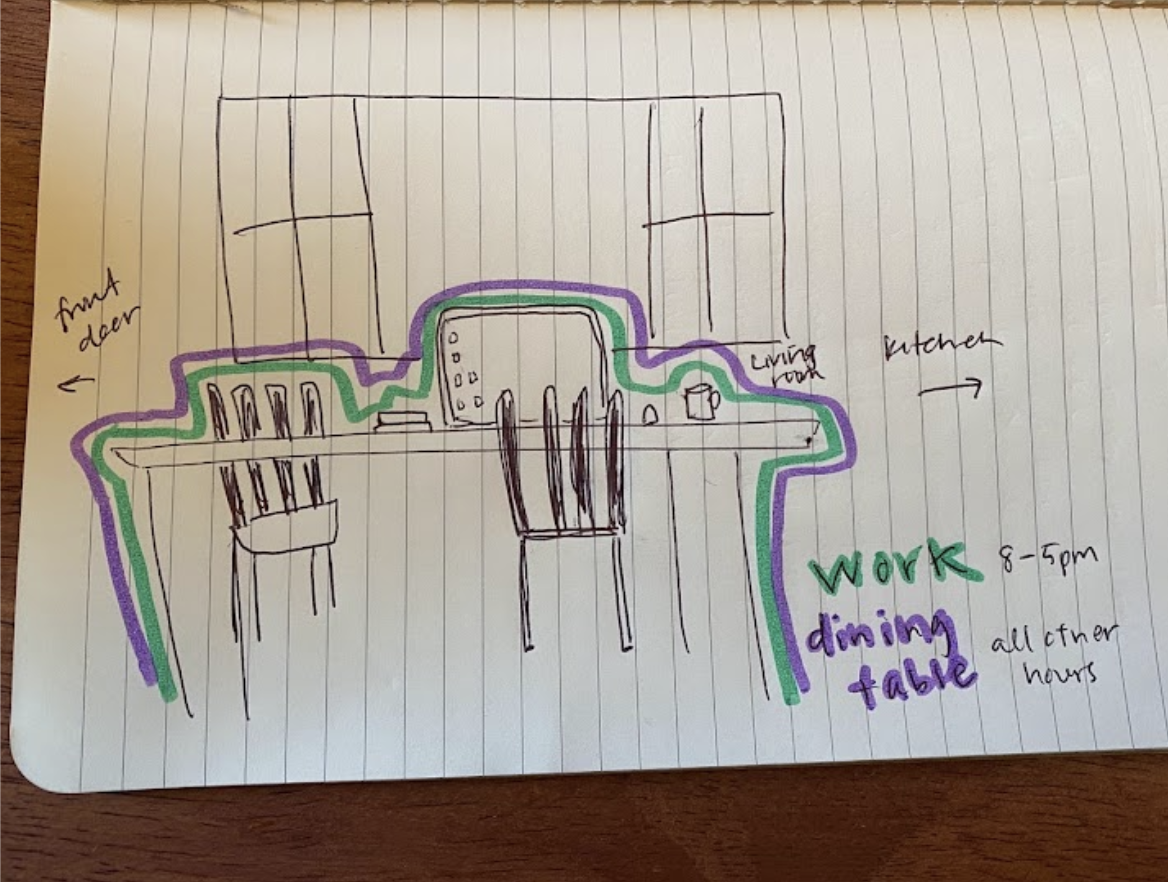
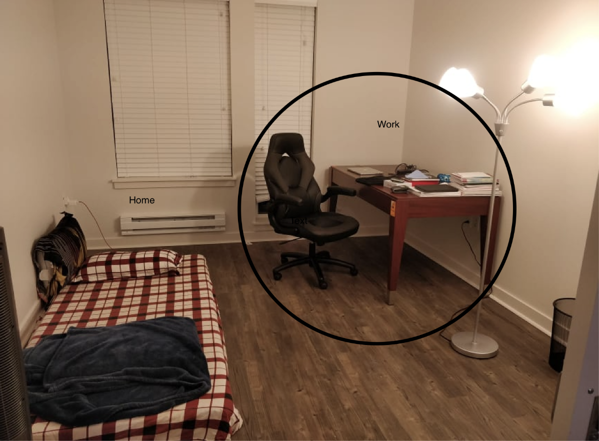
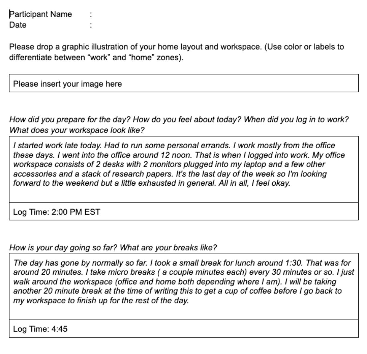
At the end of each session, participants had the opportunity to opt-in to the second phase of our study, which included a three-day diary study. The diary study required participants to track their daily work habits—from login time, to breaks, to logout—so we could assess to what extent their home lives and work lives were affected by each other.
Affinity Diagramming
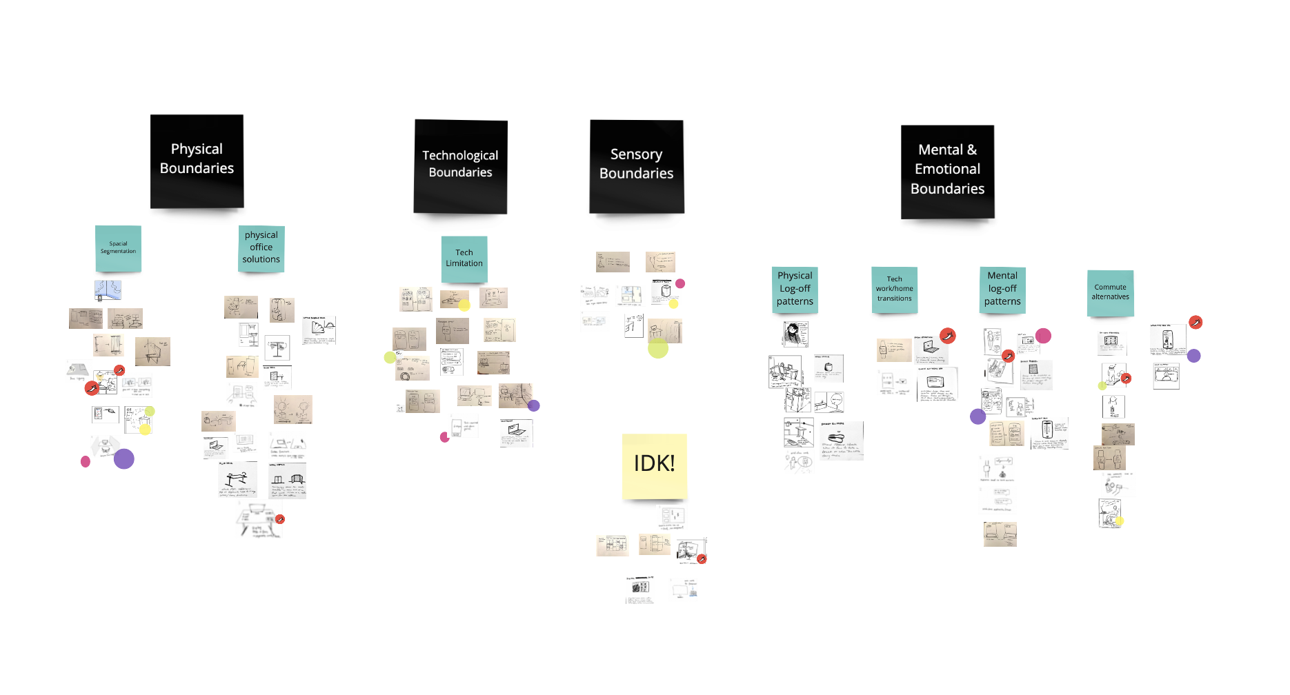
To synthesize all of our findings, we jumped in FigJam to affinity diagram. We identified several key themes abouut how people attempt to create boundaries between their work and home lives.
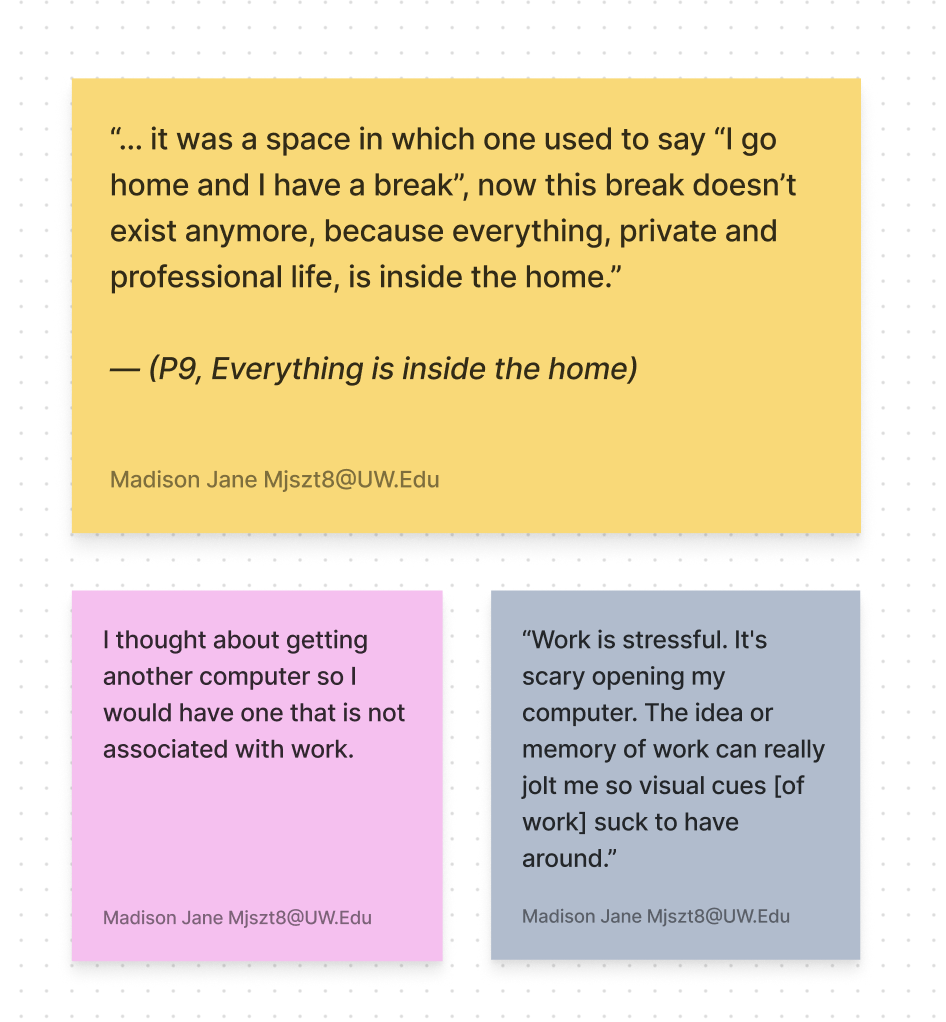
INSIGHT #1
At home, visual cues of work are stress triggers.
Having reminders of work around the home can keep someone from fully relaxing and being able to recoup from a day. Even seeing artifacts like a notebook or computer from work can raise stress levels.
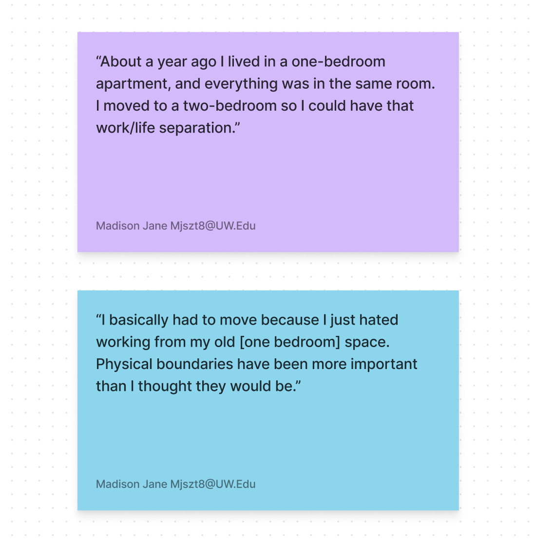
INSIGHT #2
Physical boundaries—like doors and designated offices—are important for mentally separating work and home life.
More than one participant literally moved to new apartments or homes to create a designated office. The blending of their spaces was having an adverse affect on their mental health.
INSIGHT #3
With no physical distance from work, unplugging is nearly impossible.
Without a formalized commute, remote workers are unable to unplug because of the absence of mental decompression and preparation. Instead, participants are engaging in other forms of “commuting”.
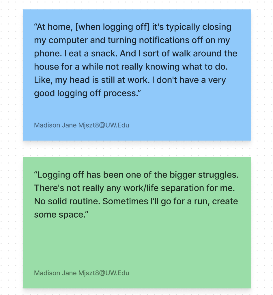
INSIGHT #4
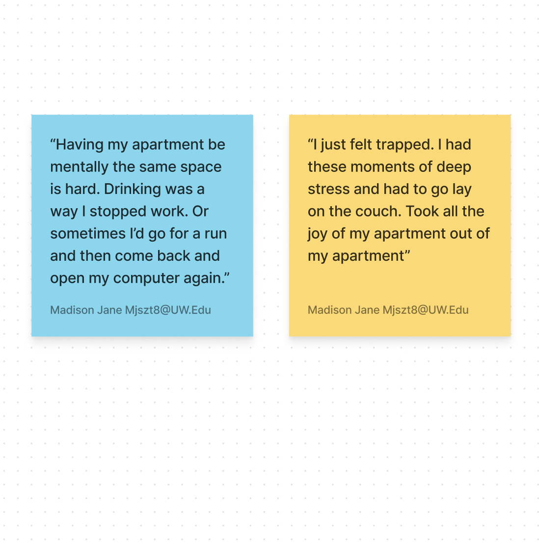
With a lack of routine, people created log-off coping strategies to separate from work.
Lacking a physical spatial change, people develop coping strategies to help “turn off” work mode. Home is no longer a place of rest and refuge.
INSIGHT #5
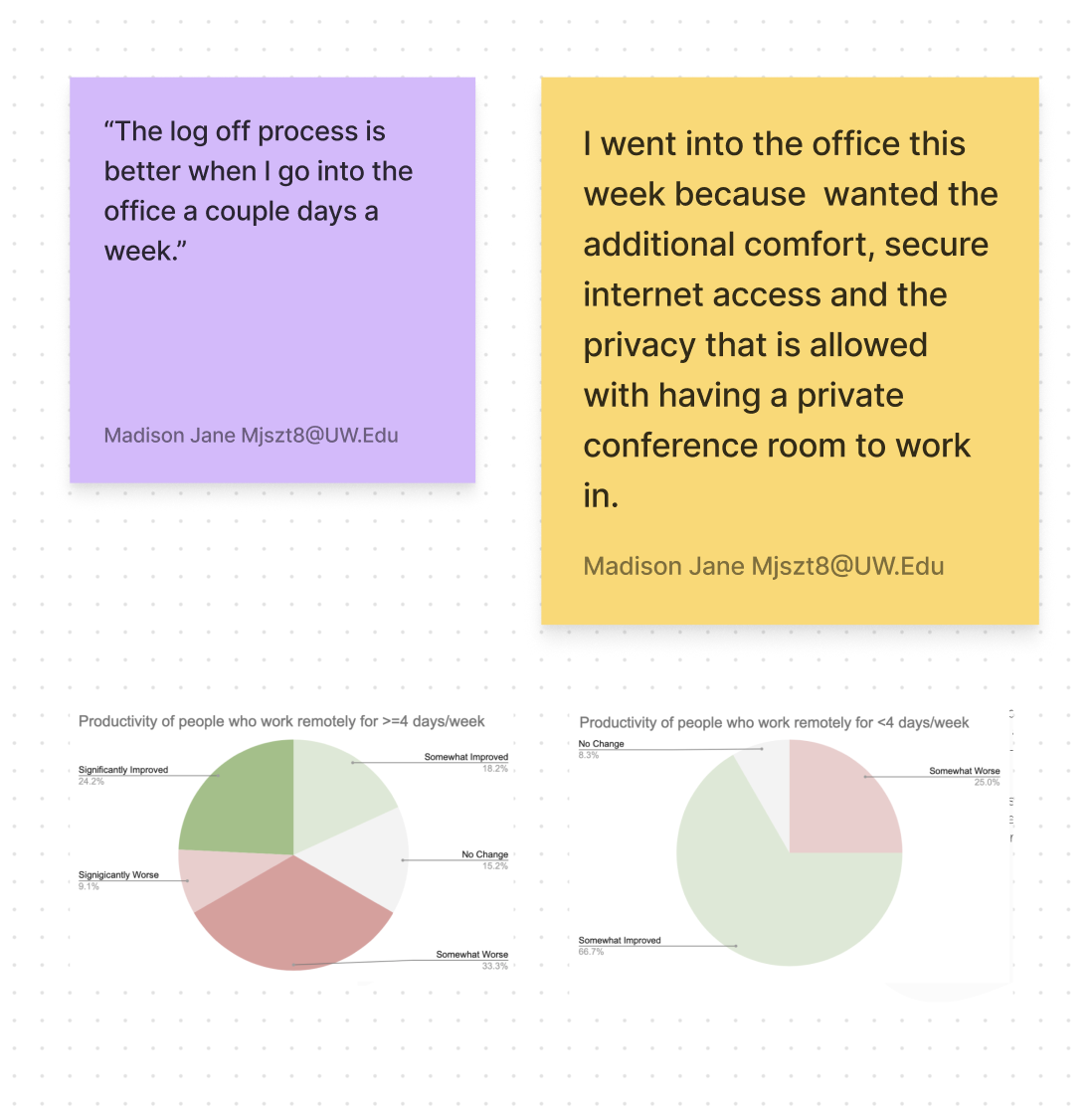
Counterintuitively, people reported being able to unplug more easily when they went in to the office a few times a week.
There are always trade offs—the flexibility provided by remote work comes at a cost: losing work/life separation. The remote work “sweet spot” is 2-3 days a week, allowing people to capitalize on the benefits remote and in-person work.
IDEATION
Identifying Desired Outcomes
1. Mitigate negative mental health impacts of working and living in the same space
2. Restore and maintain the home as a place of rest and refuge for hybrid/remote workers
Time to Sketch It Out
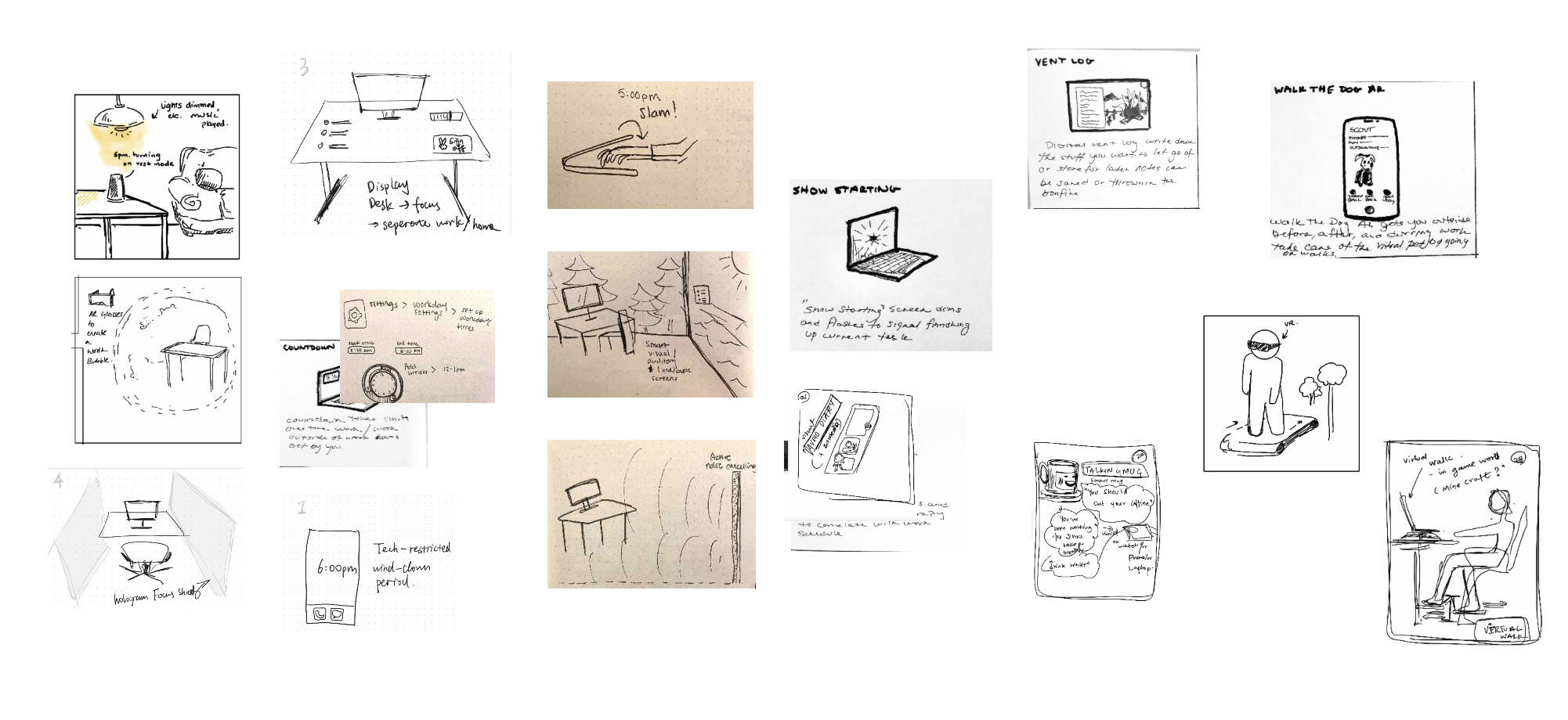
Our team sketched, conceptualized and evaluated more than 120 different design solutions. A few of the sketches are shown below. Ultimately, we narrowed it down to three concepts to flush out and build storyboards for.
Exploring 3 Design Solutions With Storyboards
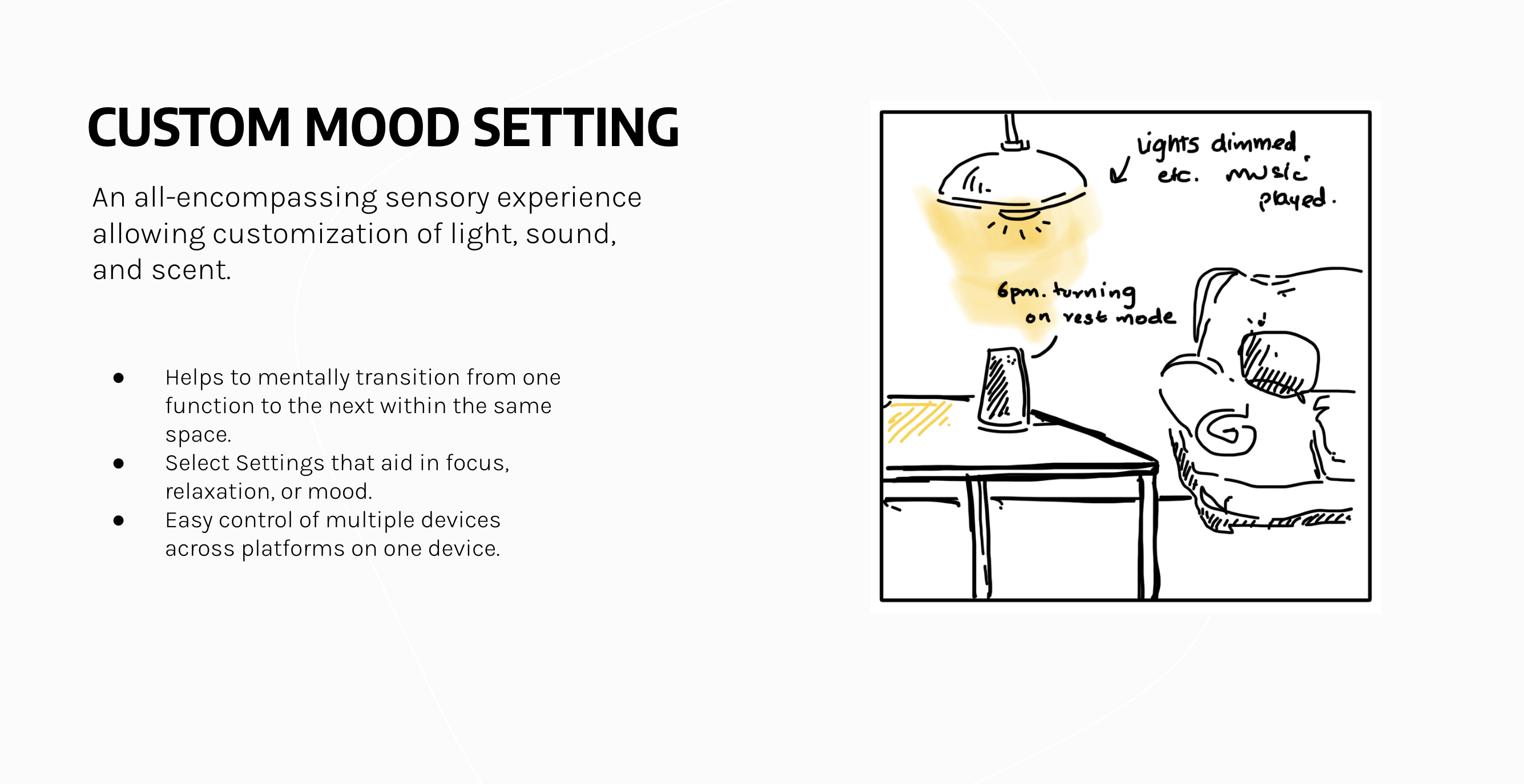
Concept #1: Custom Mood Setting
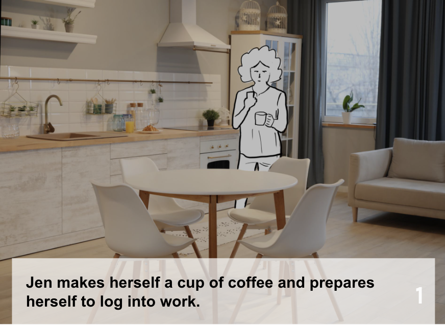
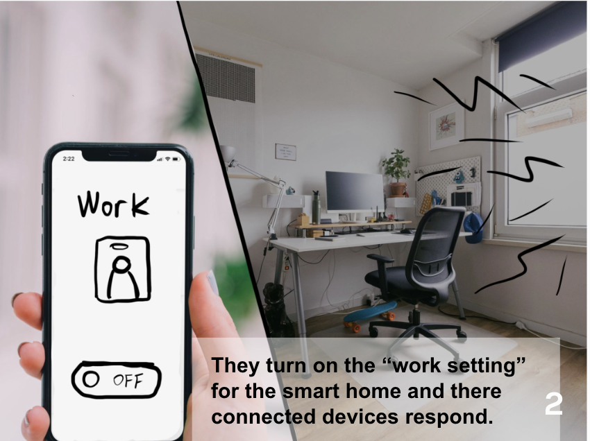
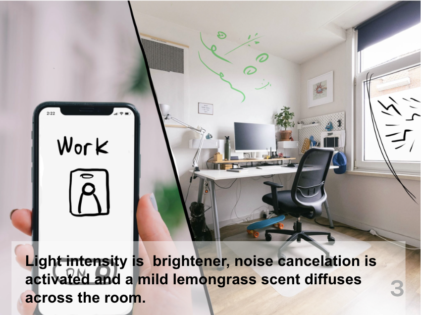
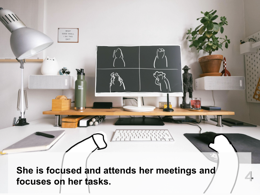
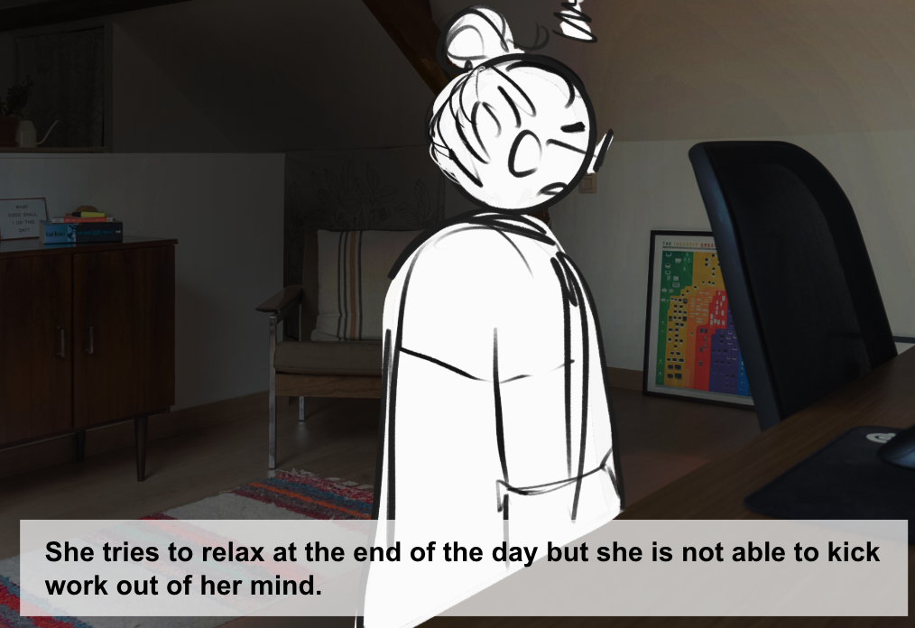
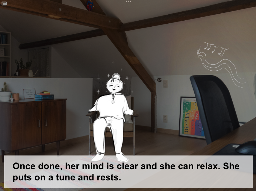
Giving users control over their environment—from lighting, to sounds, to colors—could help them customize different "modes" for work and home life. The idea was to give users the ability to "transform" to help separate work and life.
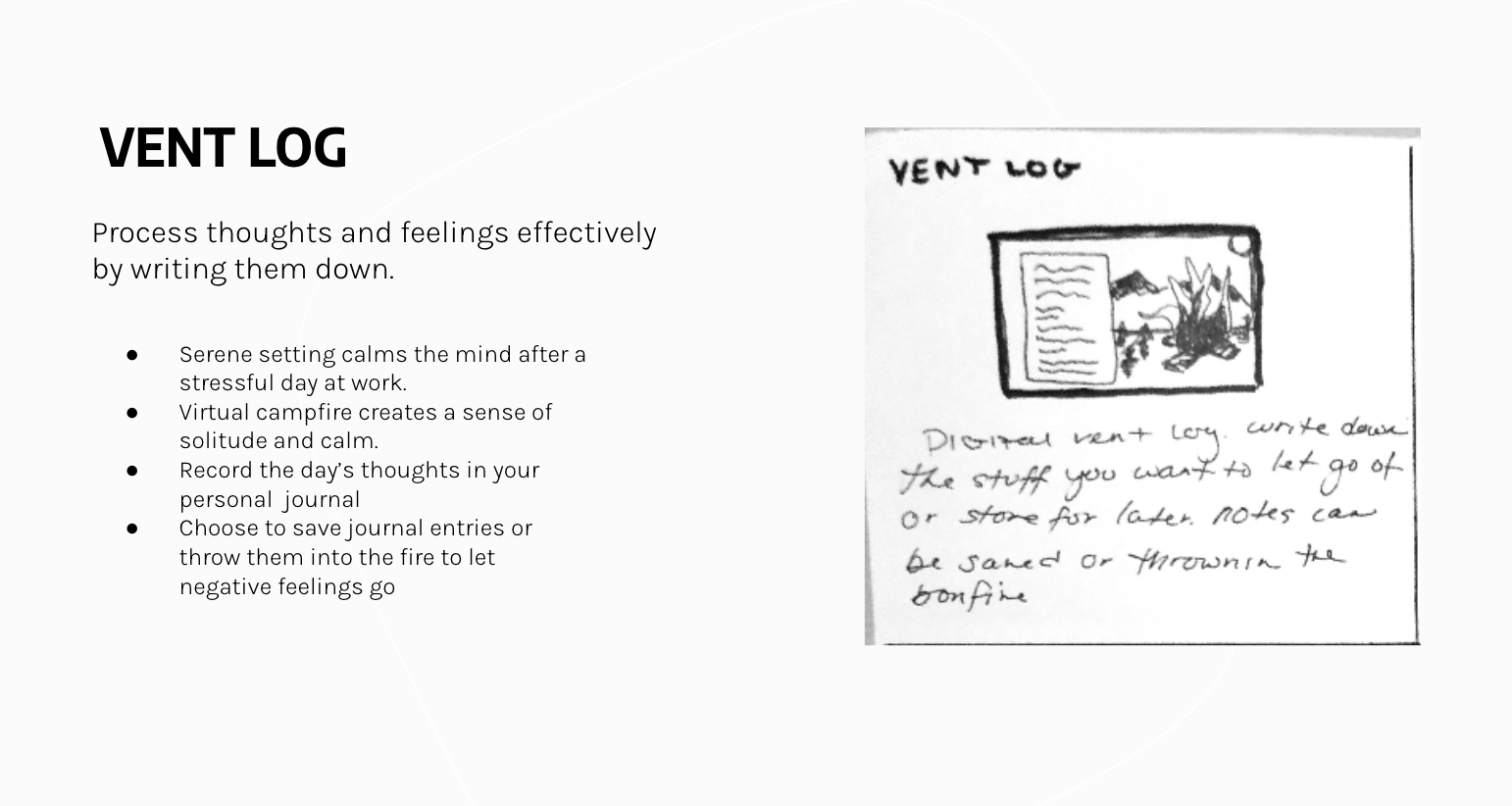
Concept #2: Vent Log
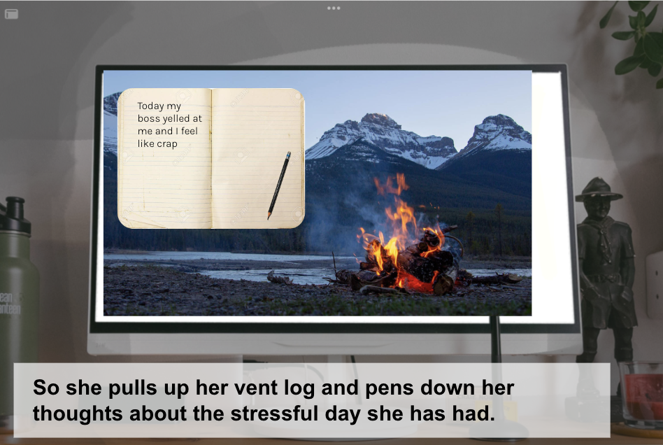
Giving users control over their environment—from lighting, to sounds, to colors—could help them customize different "modes" for work and home life. The idea was to give users the ability to "transform" to help separate work and life.
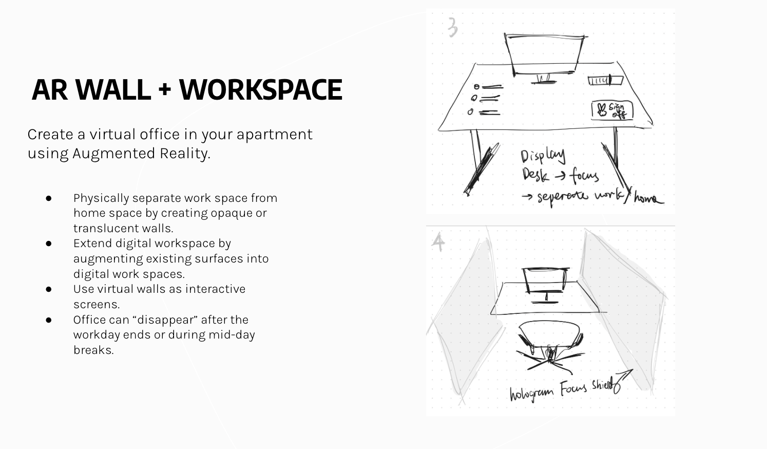
Concept #3: AR Workspace
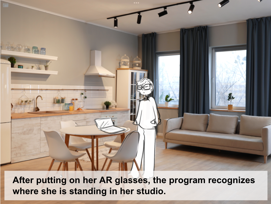
Giving users control over their environment—from lighting, to sounds, to colors—could help them customize different "modes" for work and home life. The idea was to give users the ability to "transform" to help separate work and life.
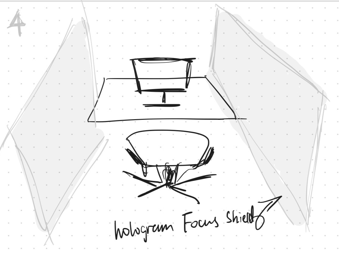
The Winning Idea:
AR Workspace
PROTOTYPING
Prototyping Methods
Hey there, this is the default text for a new paragraph. Feel free to edit this paragraph by clicking on the yellow edit icon. After you are done just click on the yellow checkmark button on the top right. Have Fun!
notes: dont forget to mentin what kind of prototype these are (aka, feasibility prototype, concept, simulation, lofi, mid fi, etc.)
Prototype #1: Virtual Walls
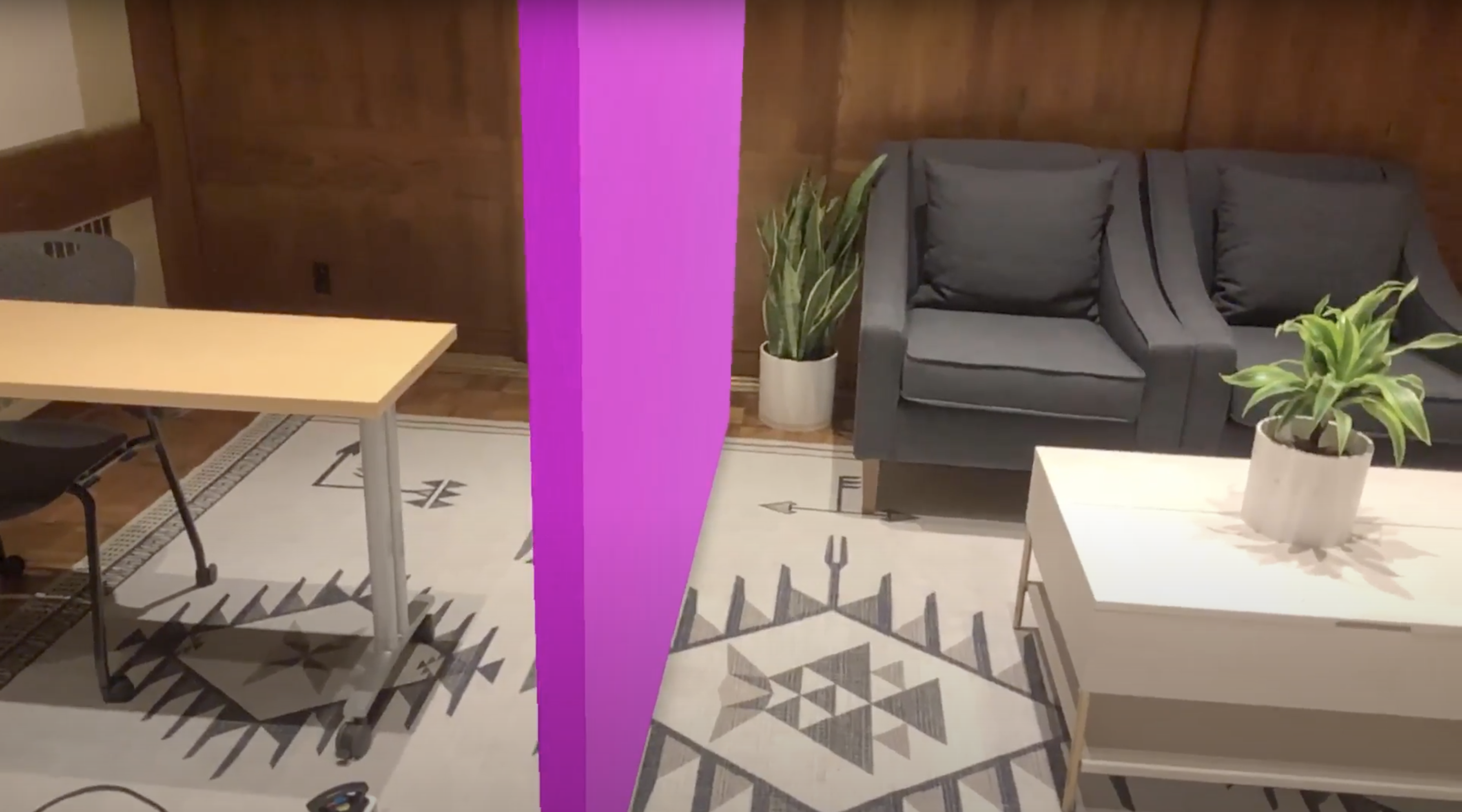
Crucial to our design concept was whether virtual walls (that is, walls that aren't real) act as effective barriers. To assess this, participants were introduced to a simulated apartment floorplan and invited to interact with a 3D virtual 'wall' using an iPad while I, as moderator, asked them questions about the experience.
Prototype #2: Form Factor
Our goal was to understand the emotional reactions related to the form of the artifact and the transition to a virtual workspace. Using a 3D printed headset and wizard-of-OZ techniques, we attempted to simulate the experience of a user taking on and off their glasses.
Our goal was to understand the emotional reactions related to the form of the artifact and the transition to a virtual workspace. Using a 3D printed headset and wizard-of-OZ techniques, we attempted to simulate the experience of a user taking on and off their glasses.
Prototype #3: Widgets + Interactivity
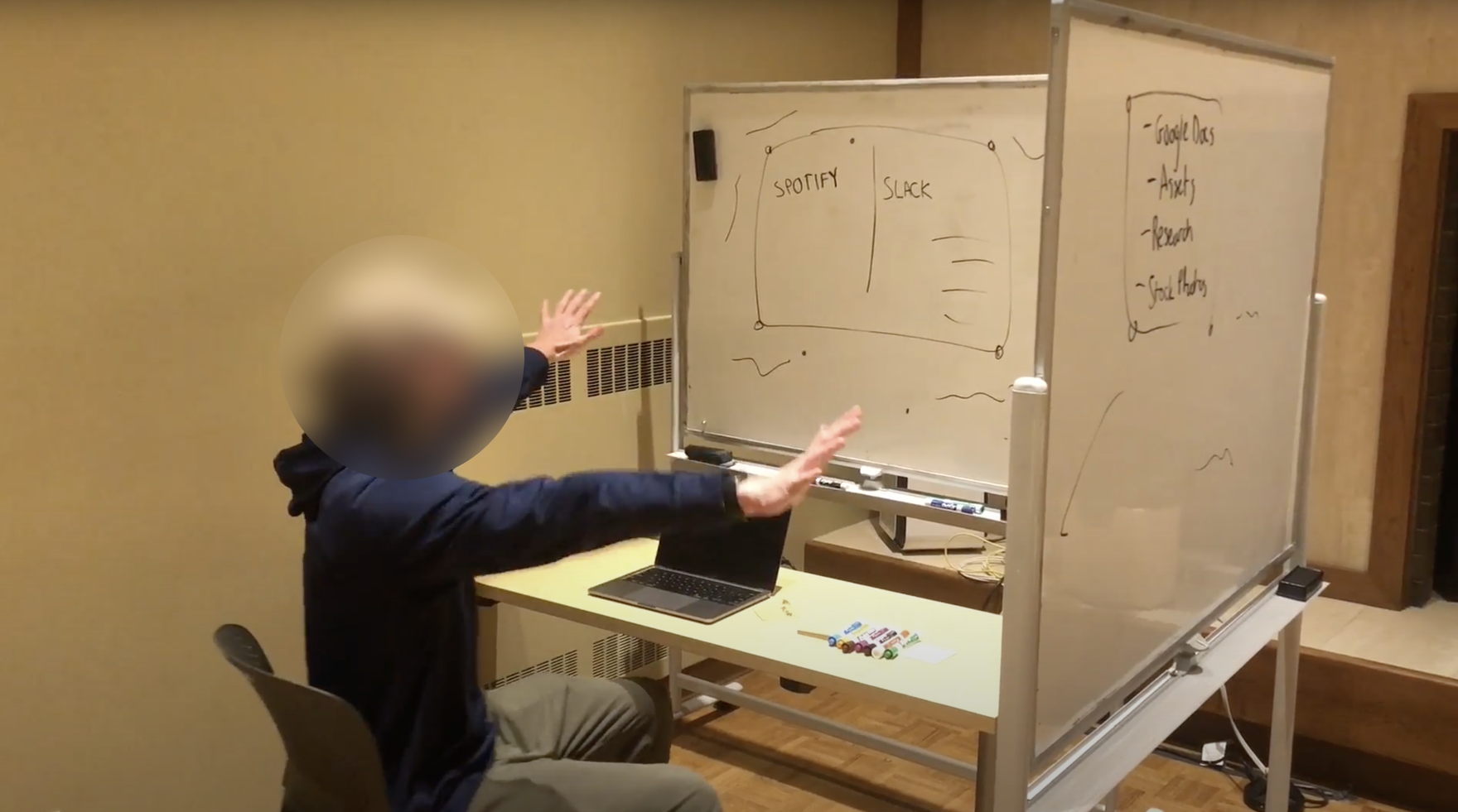
This prototype explored how a user might interact with a virtual workspace. We wanted to understand how users would customize their experience and how individual workstyles might influence these decisions.
Prototype #4: Customization
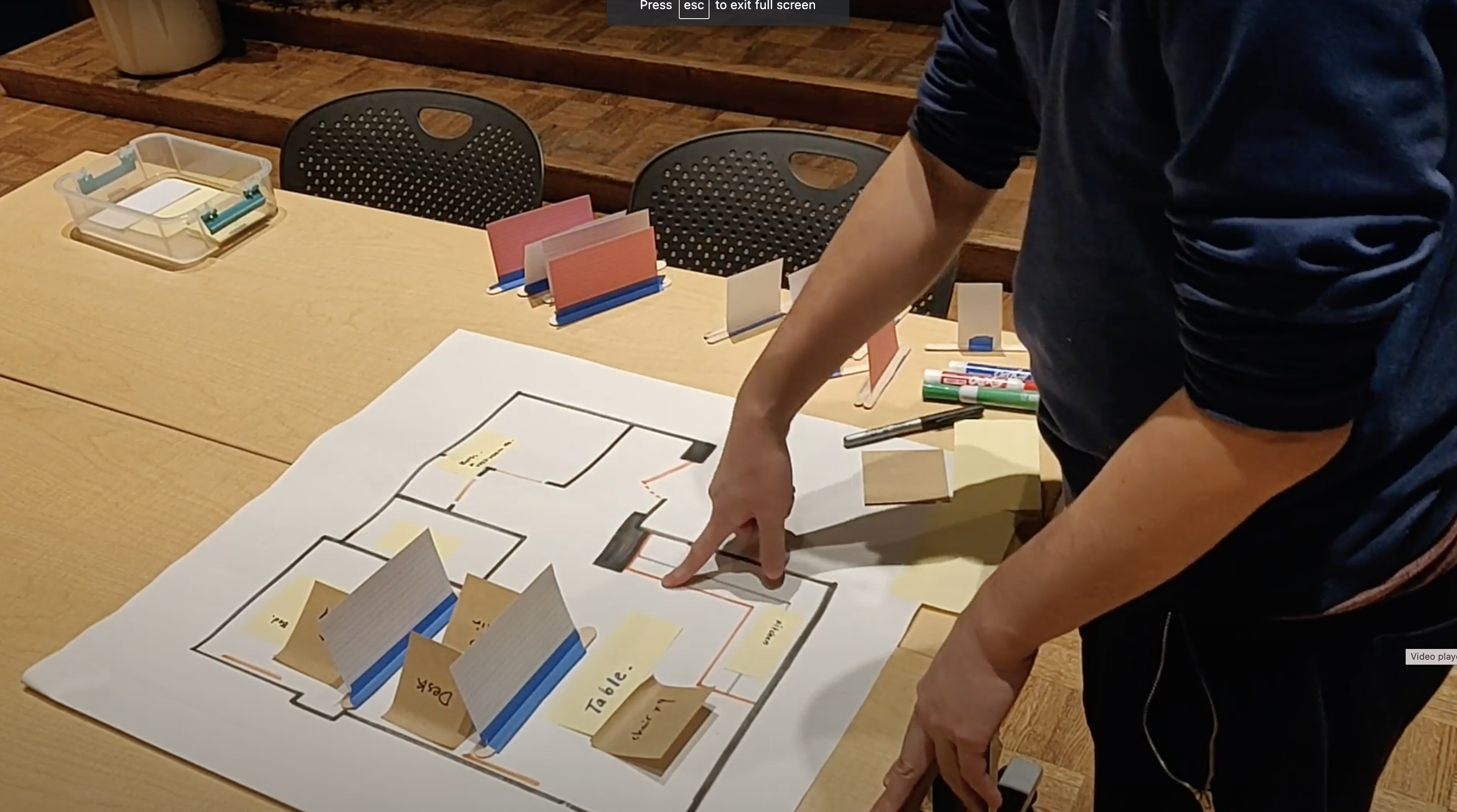
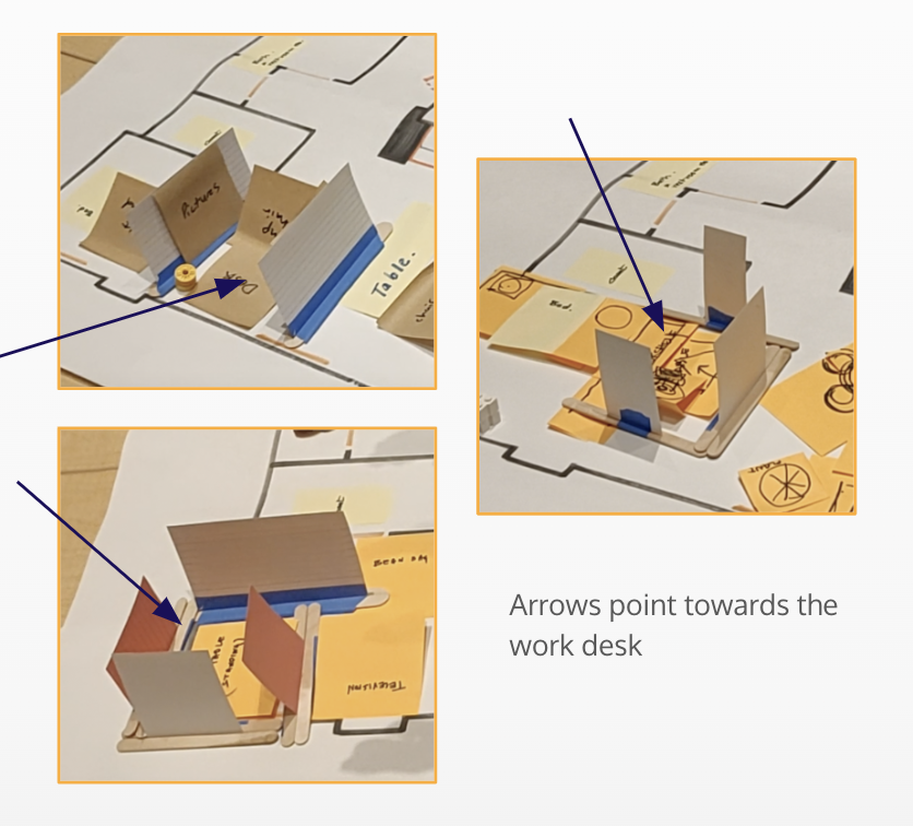
This low-fi paper prototype explored the relationship between the users and their physical home. We wanted to understand how users spacially relate to their workspace—do they customize small spaces,—around a desk for instance—or the entire room?
EVALUATION
User Testing Prototype #1
For each prototype, I identified several key takeaways from user testing that could improve our design solution.
FINDING #1
Virtual ‘walls’ are effective at creating a sense of separation, or divide, within the room.
“It feels like an actual wall between me and the couches over there.”
FINDING #2
Sound, in addition to a visual barrier, is key in creating a work-conducive environment.
FINDING #3
“It doesn’t help with the problem of sound, but it might help with focus. But it would be nice to block out my [noisy] partner.”
Participants desired more natural-looking walls that blend in with their surroundings.
“I think this color is a little abrasive—the bright pink—so I would definitely want to customize that to be a little more mellow.”
FINDING #4
There is a difference between minimizing distractions and privacy.
“It would help me feel less distracted from things going on around me, but I also feel like my partner [in the other room] could still walk through the wall and bother me.”
“It definitely creates a ‘pseudo privacy’, I think. But if someone walks in, there’s no one going to stop them.”
User Testing Prototype #2: Form Factor
For each prototype, I identified several key takeaways from user testing that could improve our design solution.

FINDING #1
Users have concerns about the transition experience of taking on and off the glasses.
“Could have a bit of nausea when it is removed. If there is a gradual change when it is removed it is usable.”
FINDING #2
Some users expressed concern about extened wear of the glasses.
“If it's weighted, then it could also cause fatigue or tiredness if you're not used to wearing glasses. I used to wear it so I know.”
User Testing Prototype #3: Interactivity & Widgets
For each prototype, I identified several key takeaways from user testing that could improve our design solution.
FINDING #1
Not everything has to be interactive. Some users want purely aesthetic features.
“It would be really nice to have like a mood board or space to put up things that you might put up on your office wall like pictures or posters.”
FINDING #2
Customizing transparency of the wall is extremely important based on location and use.
“If i’m in a public space I want to be able to see what’s going on around me”
FINDING #3
Users want recurring settings or “modes” that can be quickly accessed or replicated
“It would be nice to have saved settings for different functions.”
User Testing Prototype #4: Customization
For each prototype, I identified several key takeaways from user testing that could improve our design solution.
FINDING #1
When designing their workspace, users go through multiple iterations experimenting with placement, size and content.
On average, users created 3 different "floorplans" during testing.
FINDING #2
Users heavily consider their physical environment when designing their workspace.
“...it would be better if they match the color of my home walls.”
“...leave some room, cause that’s the way to the bathroom.”
FINDING #3
Users customized designated spaces, rather than the entire room.
DESIGN
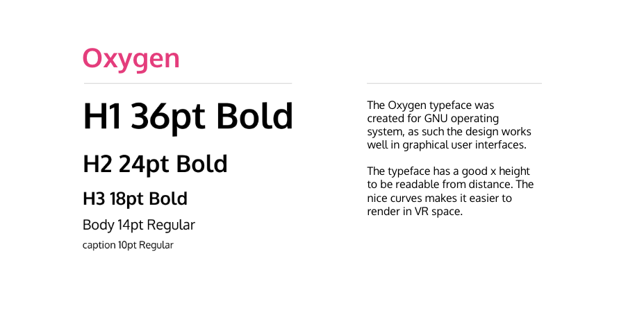
Design System
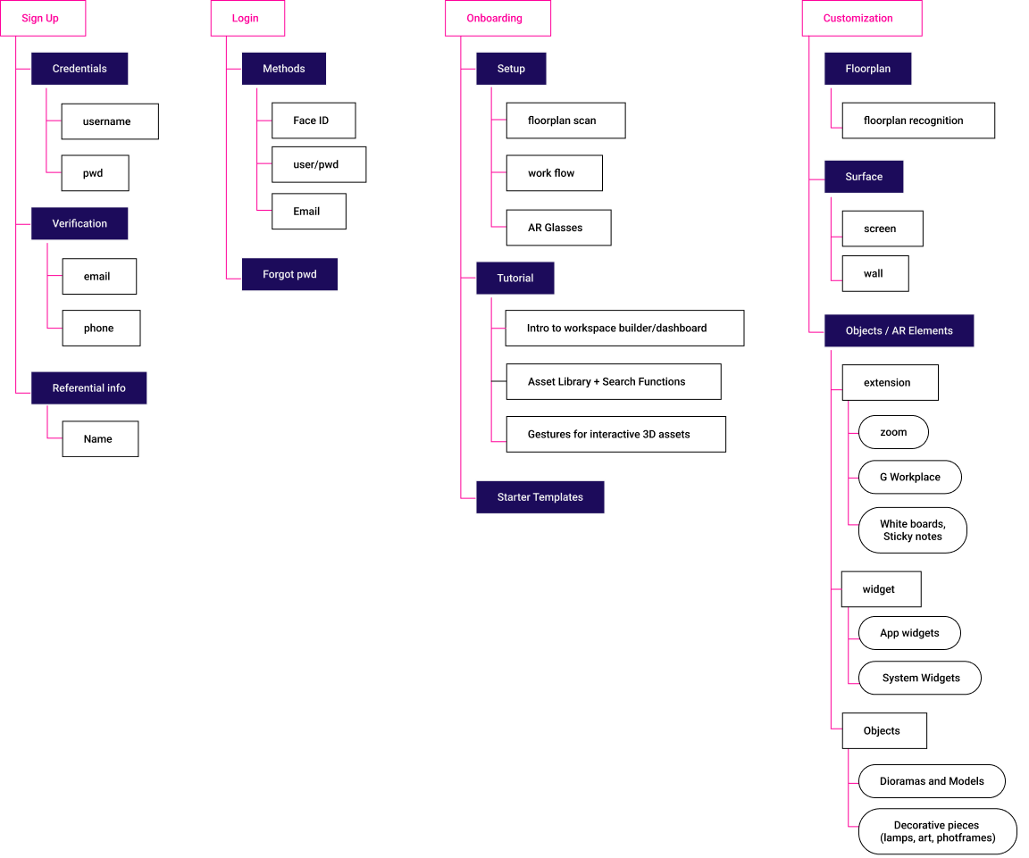
Architecture
Mockups
— taLK sooN?
projects
connect
chat
BASED IN SEATTLE, WA
MADISON STEMMLER
